Concept:
For my visualization, I wanted to see if the holiday season, and specific holidays (thanksgiving( 1-26 ), Christmas (12 -25) , Hanukka(12-6 / 12-13), New Years (day and eve), had an effect on bike riding.
Process:
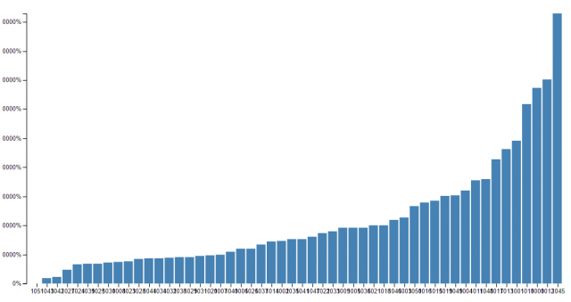
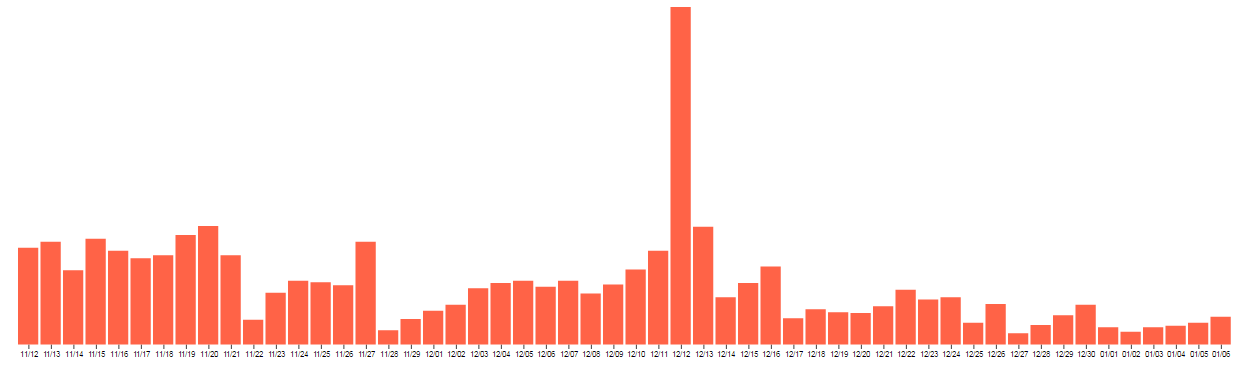
I cleaned up the data through processing and excel so that I’d only have data on the start dates of the rides, then I made an array of how many rides occurred on each day.
Then I used code from the D3 examples to make a bar code by plugging my data in, and playing around with the colors and the text
Conclusion:
My findings were largely inconclusive. For Thanksgiving and Christmas, there seems to be an increase the day after, for New Years, there is an increase on the eve, and a decrease for New Years Day and for Hanukka it seemed relatively steady. December 12th is weird, though, because it has about three times as many rides as the next highest data, but I think that’s an error on the side of whoever put together the healthy rides data (there were a lot of errors in the data set).
I couldn’t get the number of rides to display, so I just got rid of the left axis labeling, but the highest number is about 600
I thought that the word tree by Martin Wattenberg & Fernanda Viégas was really interesting. I’ve always been intrigued by linguistics and the ways that people use language, so I was naturally drawn to it. The particular example image that I included is the data visualization of a set of sentences in which the speaker/writer, a man, reveal in their personal ads that they are married. It’s interesting to see the different ways that different people can go about saying essentially the same thing, and this data (I wish it was easier to read as the text gets smaller, but I couldn’t find anything of a higher resolution) reveals a lot about the people who wrote these adds. For example, you can clearly see that about a third of them were upfront about their marriages, but the others are not. The image is presented as sentences that do reveal that men are married, but only one occurrence of the word “married” is very apparent, which means that the other mentions are hidden deeper within the sentences and kind of hidden. I also thought this chart was interesting in that it ties in extremely well with Markov chains that are construction sentences. If you inputted the same data in a Markov chain and made a sentence from it, you would be able to track the new sentence through this chart, because it shows the likelihood of the groups of words that come after other words.
This is a visualization of the spatial locations of faces in the Teenie Harris archive. Teenie Harris photos are generally taken in a 4:3 ratio which means I only had to plot 2 arrangements: the vertical case and the horizontal case. Since all of the photos were resized to have a max side-length of 1600, I just plotted where the faces would land on a 1600×1600 pixel grid assuming the photos were placed closest to the upper left hand corner.
Each box represents a 40×40 pixel grid and the color is representative of how many faces overlap with that 40 x 40 pixel grid.
I used R to create a matrix of where the faces were, exported it as a tsv and then imported it into javascript. Although I think the visualization is effective, one thing I don’t like is how the gradient of colors don’t really reflect the gradient of values. It makes some rings look like they contain more faces than what are actually located there.
The First Button is for Horizontal Pictures
When I think of the power of information visualization, I think about how it can be used as a way to show data in a convincing way to force people to rethink what they thought they knew. I’m not really interested in seeing the latest stock projections, or pro-baseball player stats updates, or Citi-bike riding statistics. These sorts of visualization have their own merits and uses, but I’m interested in seeing information about infrastructures, politics, philosophy, and everything that people take for granted. Choosing an artist/designer to talk about here is a little bit challenging for a couple reasons.
I’m not sure if I should be looking for aesthetically and compositionally impressive charts or for meaningful (that’s subjective ofc) information. Maral Pourkazemi does both well … I think … probably…
http://monoment.io/9-questions/
In his piece, 9-Questions, Maral Pourkazemi created 9 statements, all of which really got me thinking. What answer would I pick? What answer did others pick? Does that data even matter? It is very interesting to me how he is able to accomplish what I said earlier about “forcing people to rethink what they thought they knew” without visualizing any data at all.
I like his other work too, aesthetically, but 9-Questions is the sort of stuff that gets me going.
I first considered writing about the catholic mom twitter bot at first because of its ability to incite and continue a heated argument without even having an actual sense of reason (I’d love to see an Atheist version), but I decided to talk about @thricedotted’s soft-spoken twitter bot: *.
In my art, I always try to achieve a certain kind of mood. That could vary depending on the art piece, but there always need to be some direction that I try to push people towards thinking about. @thricedotted’s twitter bot isn’t quite poetry, but it’s more than just random quips. The bot constructs these short sentences in a way that directs our imagination into a certain realm of thought.
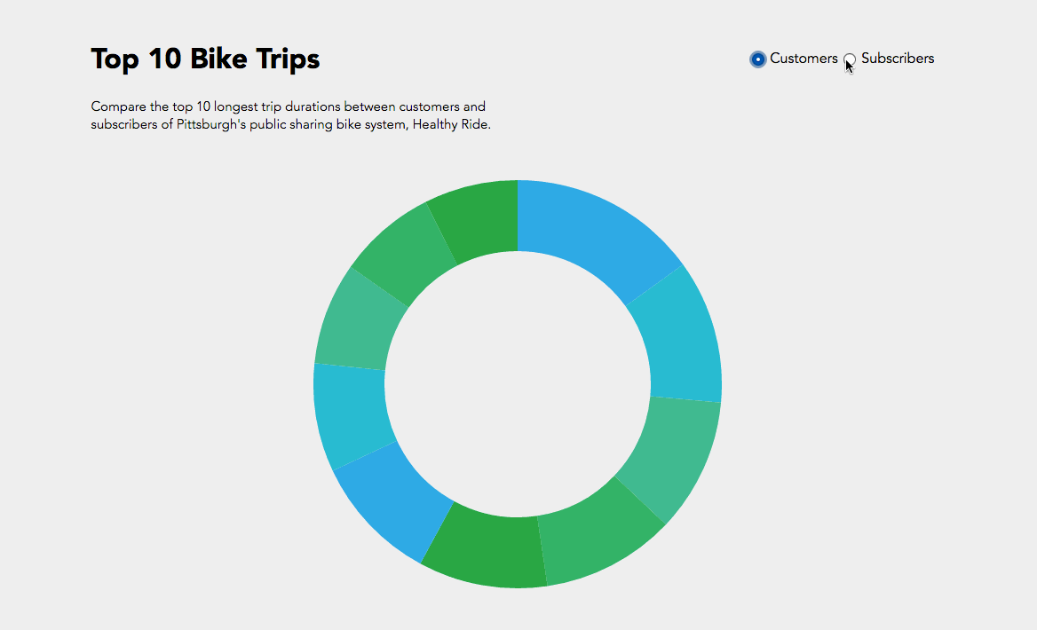
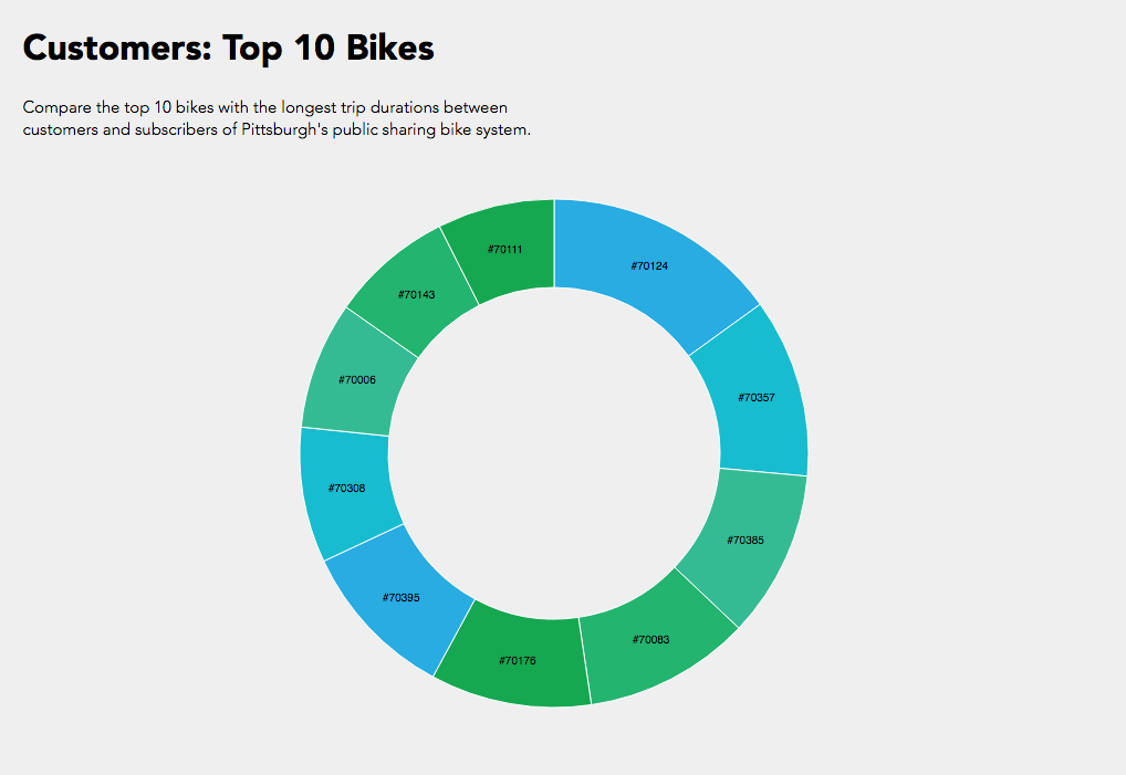
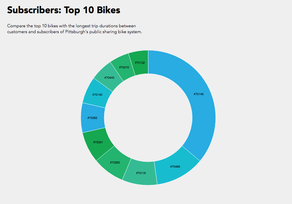
Initially I was interested in how do customers or subscribers choose their bikes? Do they examine the newness / wear and tear of the bikes? Of course our data set did not have a rating of the bike’s physical condition but maybe a trend in the bike ids would show something?
In the end I compared the top 10 bike trip durations and their bike id’s between customers and subscribers. While I was able to achieve the simple interactive component of toggling between customers and subscribers, I could not manage to get the text working like the following where I was exploring static d3 bl.ocks.
Overall a bar graph would have been more effective for understanding what the information where the trip duration is numerically visualized instead of just proportional section, or another bl.ock where I could include more information like start and end stations. While it’s interesting to see that subscribers logged a lot of hours in bike #70145, if this bike was placed in the customer pie chart, it would have been more than half of the pie chart.
Hope I can one day ride the legendary #70145 bike.
__________
Just for some fun because I was thinking how I could get other people interested in data visualization about bikes…
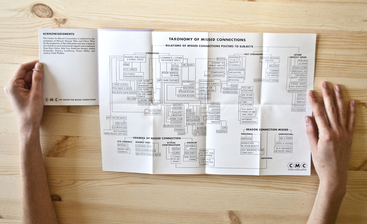
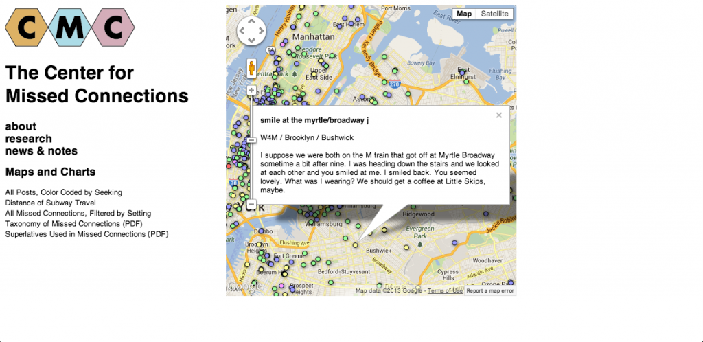
I chose to write about Ingrid Burrington primarily because I love her website, resume, and general sense of humor. That being said, I also really appreciate the cool projects she has done, many of which are not really data visualization, but just humorous or nice-looking things. One project that is a little more data-visualization-y is “The Center for Missed Connections.”
It’s an art project disguised as a think tank dedicated to the study of loneliness in cities. It comes in the form of a booklet full of maps, charts, and forms, and while these may be a bit fictionalized, they are still presented as one would present real data, and it almost takes more artistic and critical thinking to fictionalize and plot data than to just plot data you got from somewhere else. Perhaps a little off-the-mark for a data-vis Looking Outwards, but I think it is still a nice project, whose real value comes not from the “data” but from the idea behind studying loneliness in the first place.
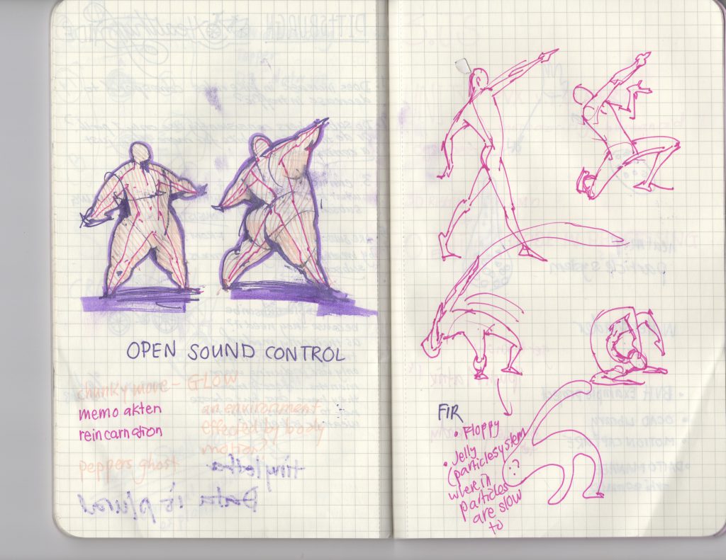
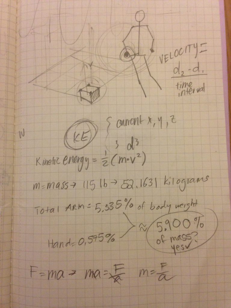
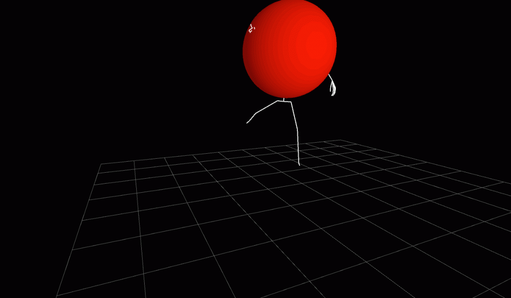
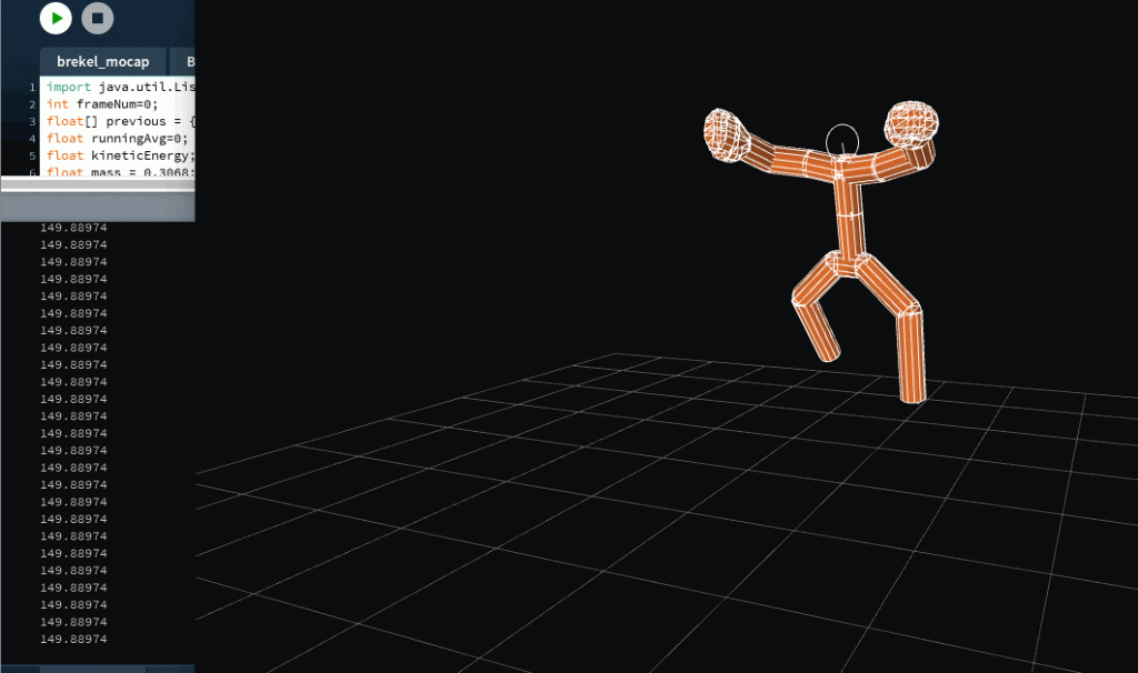
I had wanted to create a program to find out the kinetic energy used at each joint (not to be confused with velocity because kinetic energy depends on acceleration and mass as well). It’s a foundation that is incredibly scalable. I had spent the good chunk of the week trying to work out 3.js and brainstorming ideas….actually I spent a little too much time on that. By the time I did give up on getting my 3.js up and running, it was crunch time for crash coursing 3d in processing.
Based off kinetic energy, there could’ve been a particle system that reacted to higher levels, wherein greater motion will generate more. Or rather an environment – tiny particles at each unit of the 3d grid where the gravitational pull of a part of the body is increased according to its change in kinetic energy. I thought that would be the most interesting because the person would be ‘there’ in the environment by…’not’ being there. The negative space within the environment saturated with floating particles would indicate the human form, but would be more dynamic and better understood while in motion because the particles would gravitate towards it.
On a interaction standpoint, with this hooked up to real time data, people with larger mass will comparatively have larger gravitational pulls if they move at the same speed as someone of smaller stature. With multiple people, there is an interesting competition between who’s kinetic energy draws upon more of the floating ‘ star’ particles within the void.
etc, etc, etc, idea after idea, different modes for different ‘planets’ (planetary pull effects weight), comparing motion, calculating joules from kinetic energy and based of weight and mass assumptions – visualize calorie consumption, etc etc
etc, etc
But having lots of ideas is sometimes a detriment – there is too much to know where to focus on. So I started off with just calculating KE.
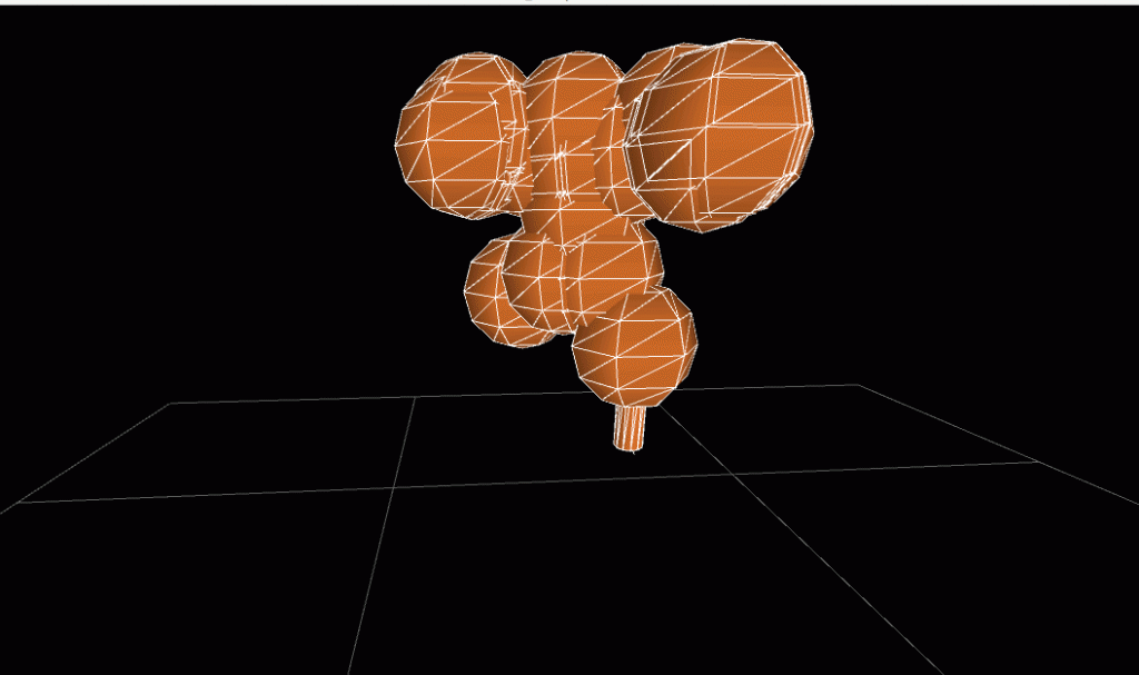
In impromptu collaboration with the fabulous Guodu:
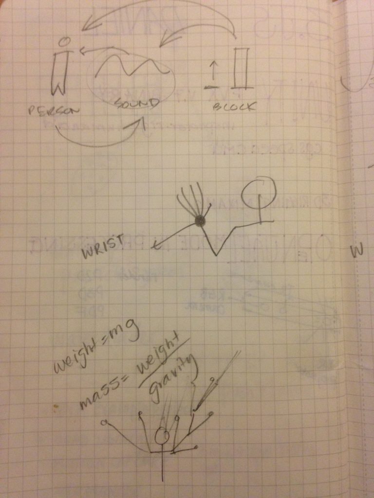
The idea we came up with had a focus on the interaction design. We built the foundation first on being able to calculate the kinetic energy each
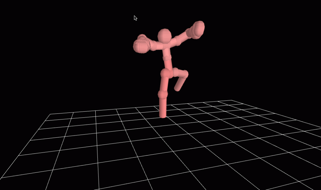
Originally, we wanted the kinetic energy of each limb to be expressed by an iridescent bar chart. The individual bars would represent different parts of the body, and change colors and height according to the limb’s kinetic energy (the limb would as well, so there would be some sense of what represents what).
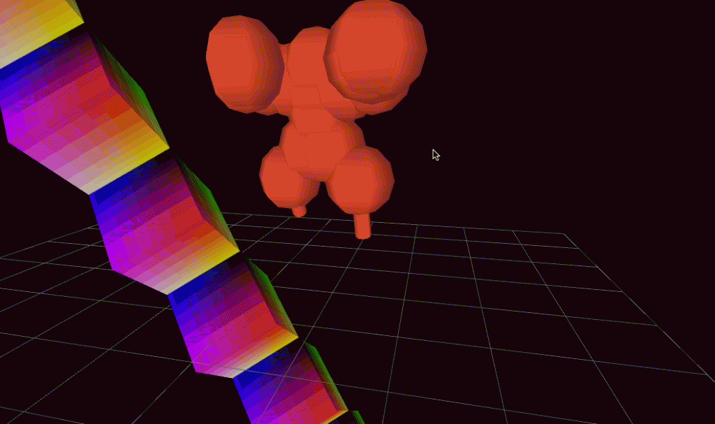
The bars going up and down would look like the wave formations of audio files. While it wouldn’t have matched specifically, we were really looking forward to manipulating amplitude and frequency of sound waves in processing according to kinetic energy. This way, anyone could dance ‘in sync’ with the music. Never worry about missing a beat when the music is generated according to your dance!
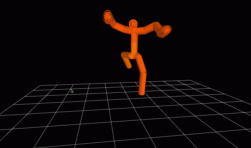
We had some trouble with transformations (translation/orientation) in 3d space. Great learning experience together! Neither of us have ever touched 3d programming/3d in general before this assignment so I’m happy that we have had the chance to crash course through it.
Here we put BVH files of ourselves dancing:
THE BLOG STOPPED TAKING MEDIA UPLOADS. ERROR ERROR ERROR – THE REST OF THIS IS AVAILABLE ELSEWHERE –
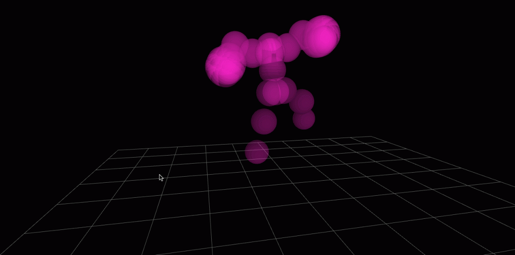
Did you notice it was smoother? We changed our formula to make the reactions of the balls smoother. Since we were only smoothing distance to a running average, and kinetic energy is velocity squared, the easing had little to no effect. We decided that instead of expressing kinetic energy, we would just visualize velocity instead.
Overall, I can’t say I am too proud of how the end result translated the movement visually. But I am happy to have had this opportunity as my first exposure to 3D programming/animation/anything.
For documentation purposes, I will try to get another BVH file rendered of someone moving their body parts one by one to show how the program works, before recording a live video of someone interacting with it and the computational results in sound and visuals being shown.
I’m excited to use the velocity data to inform the physics of a particle/cloud system.
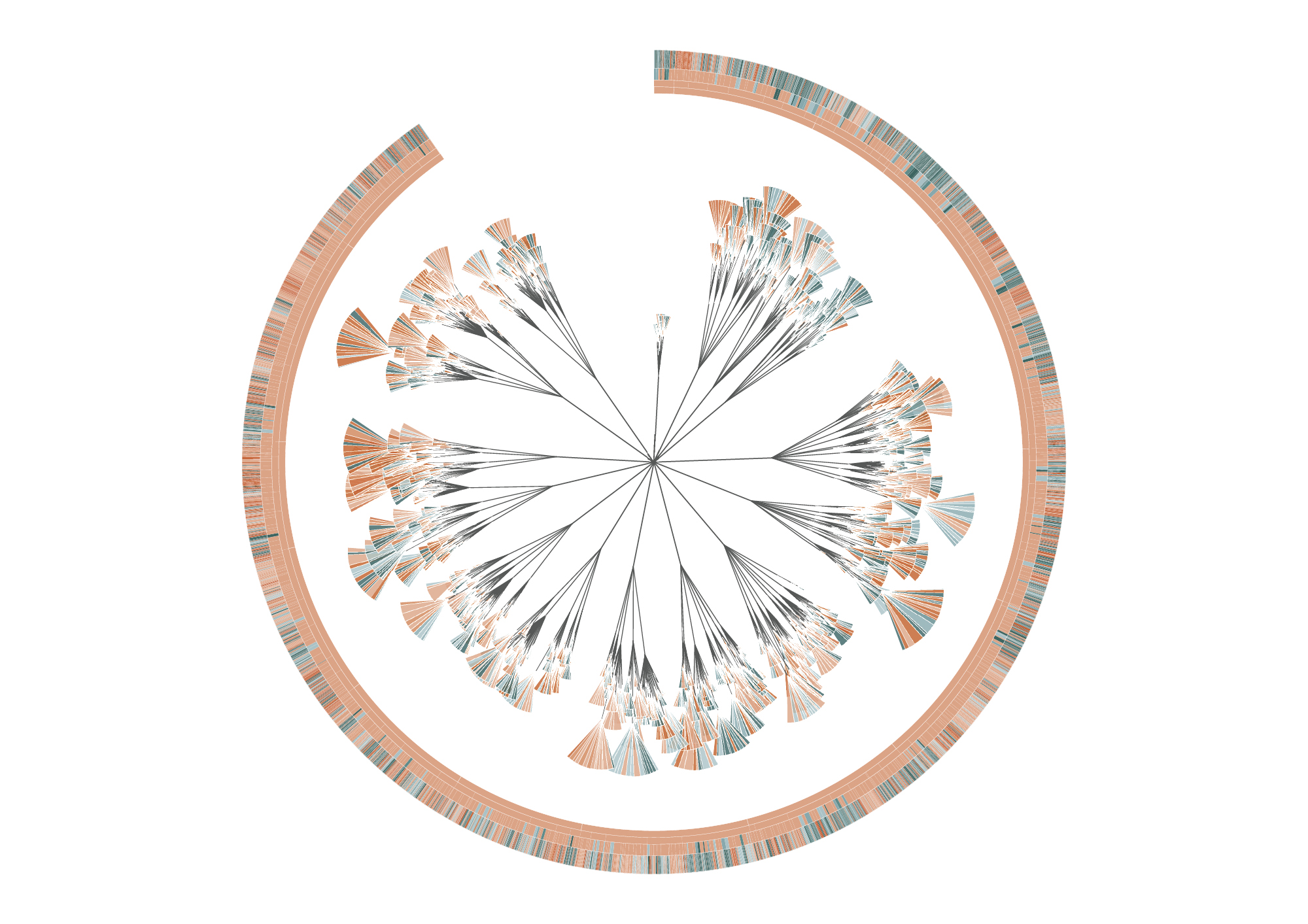
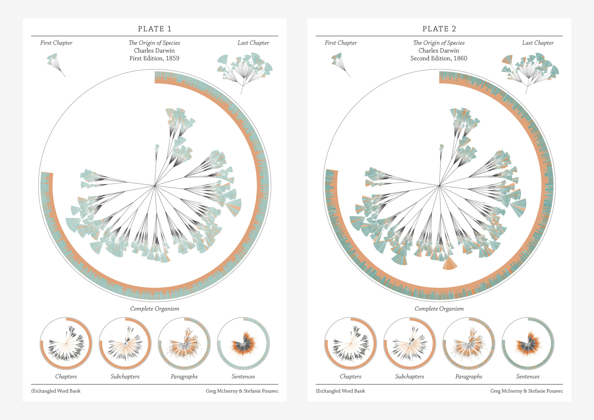
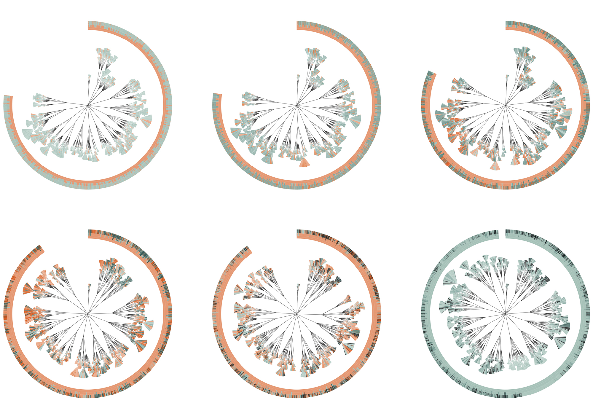
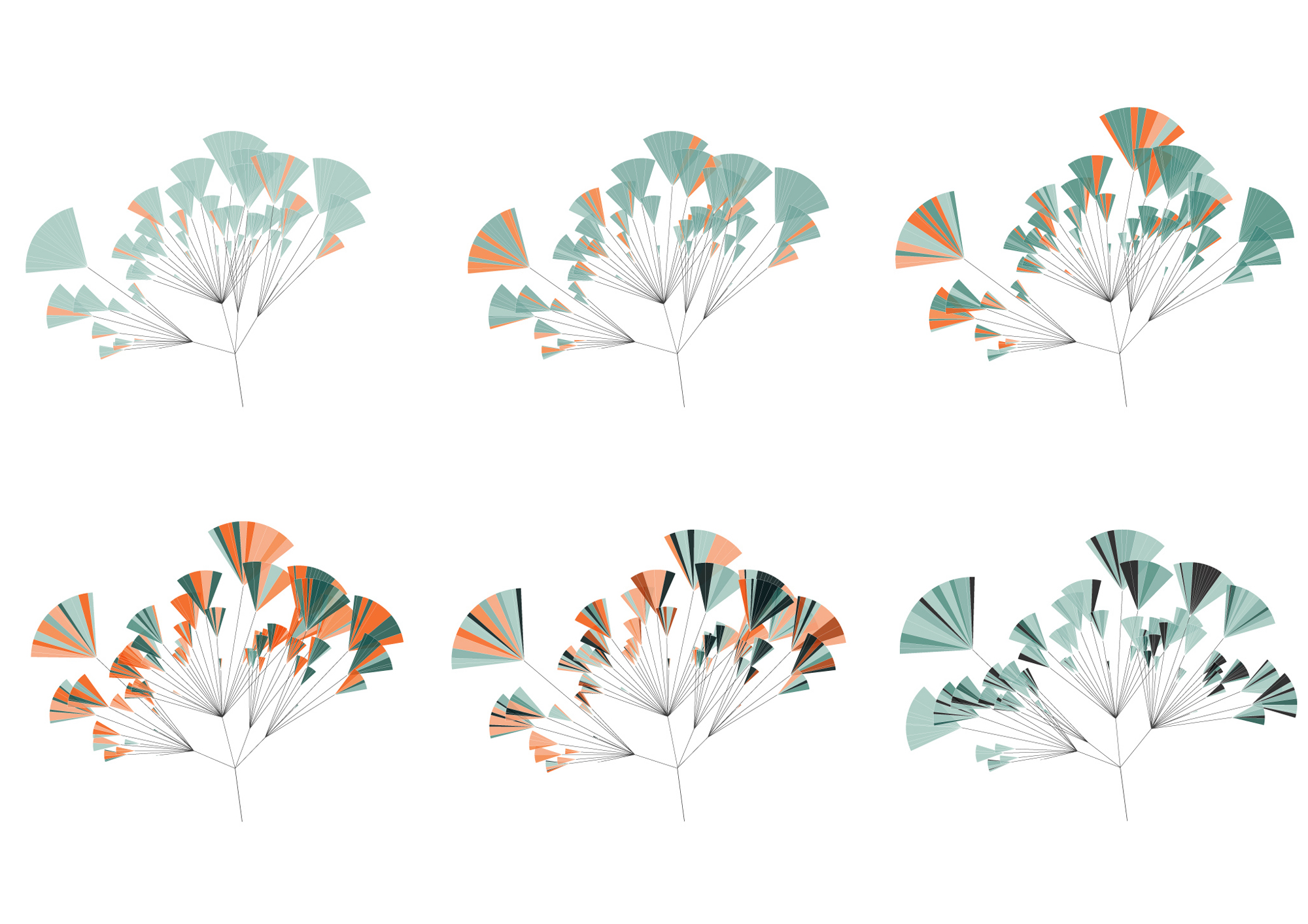
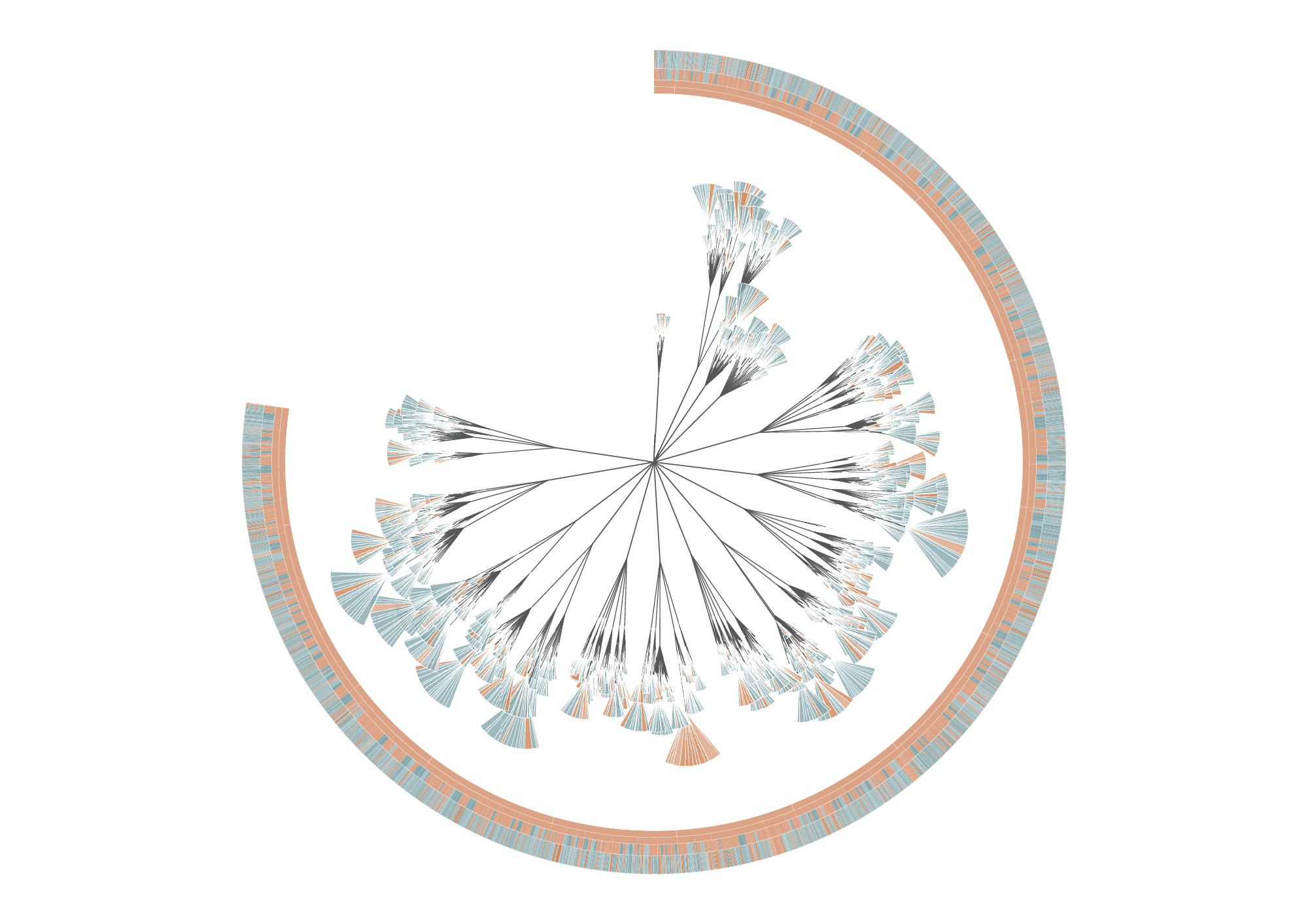
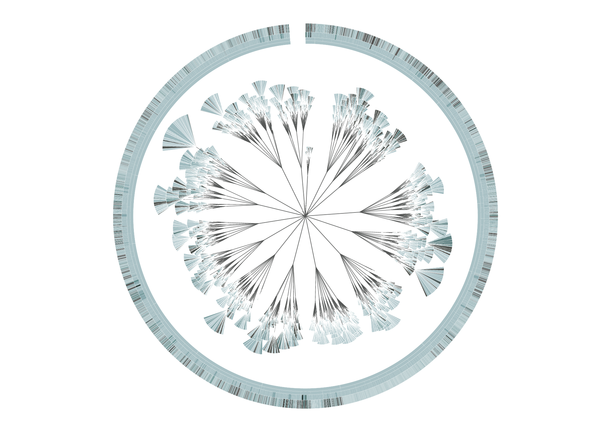
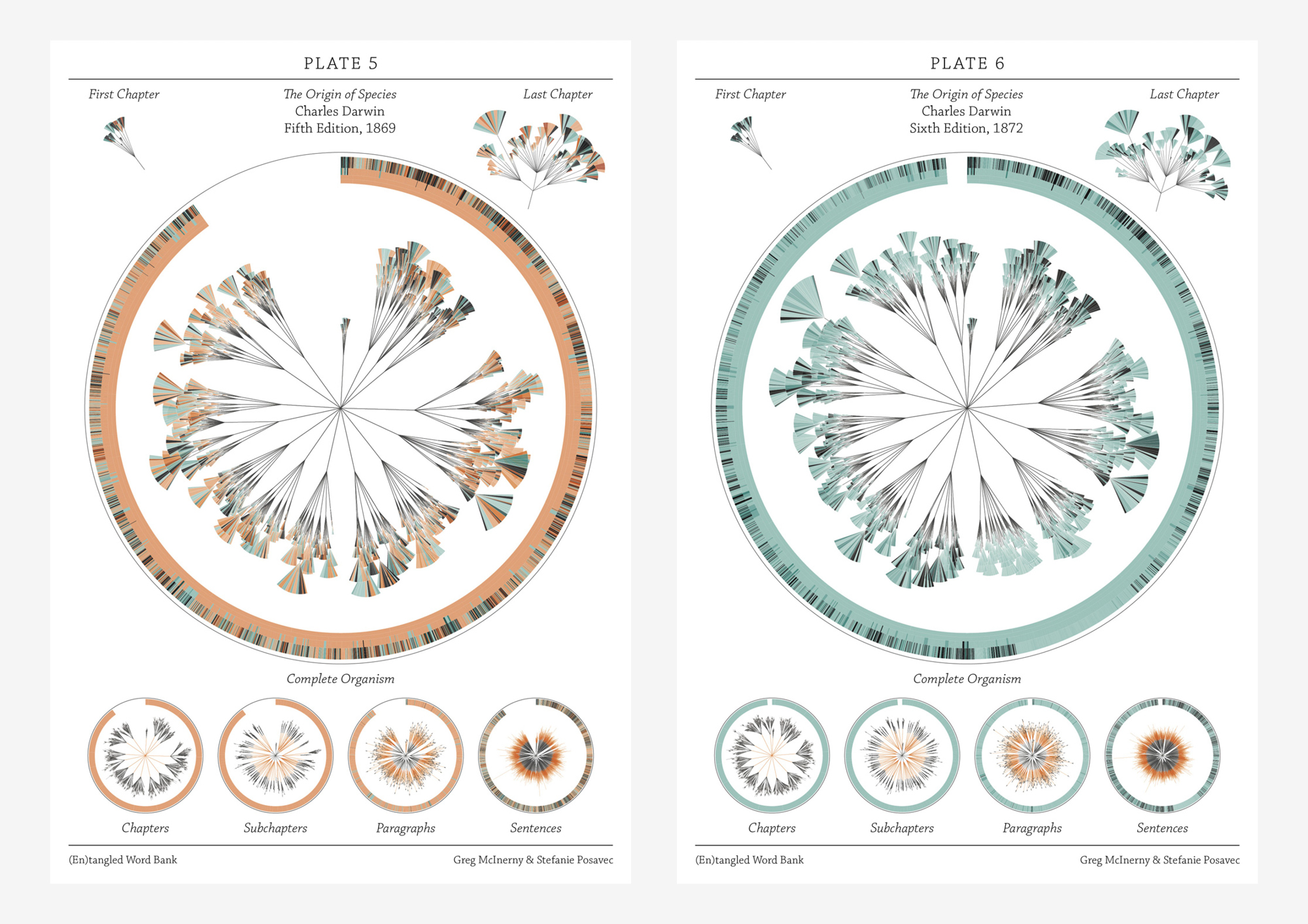
The (En)tangled Word Bank is a collaborative project between Stefanie Posavec and Greg Mclnerny that visualized the insertions and deletions of text through the six editions of The Origins of Species by Charles Darwin. Each diagram represents an edition of the series, and is modelled on the ‘literary organism’ structure used for On the Road by Jack Kerouac. The visualization essentially represents the meat of the text, where chapters are divided into subchapters (as per Darwin’s original text), and these subchapters are divided further into paragraph ‘leaves’; the small, wedge-shaped leaflets represent sentences, where they are colored according to whether that sentence survives to the next edition (blue), or deleted beforehand and not be within the next edition (orange). Some of the executions of the diagrams were published as large banners, where each depicted a specimen plate per edition, mimicking a botanical illustrative design. Each plate shows the original diagram, first and last chapter excerpts from the original diagram, and four extrapolations of the diagram detailing the chapters, subchapters, paragraphs, and sentences in each edition.
This design initially appealed to me from a visual perspective–I hadn’t quite evaluated or digested the data that was being represented yet, and did not really decide whether or not the design template was practical or appropriate for the data subject. I felt it was visually strong–well-executed and very organized without being overwhelming. Upon reading the intent and description, I feel what is the most successful and amusing aspect is that the tree structure is used to represent The Origin of Species of all possible texts: there is the implementation of nature in both subject and interface, especially reminiscent of taxonomy structures in biological sciences. In this way I feel like the overall design is strong in combining aesthetic appeal with its slick branches and leaves, and relevance to the subject being presented. I also like the layout of the printed banners in organizing multiple circles focusing on different depths of information.
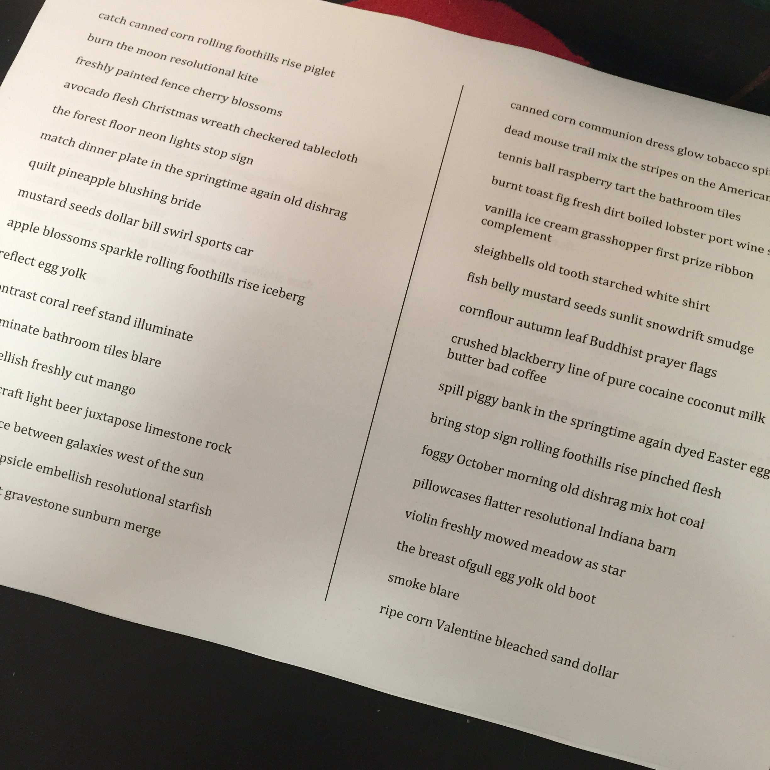
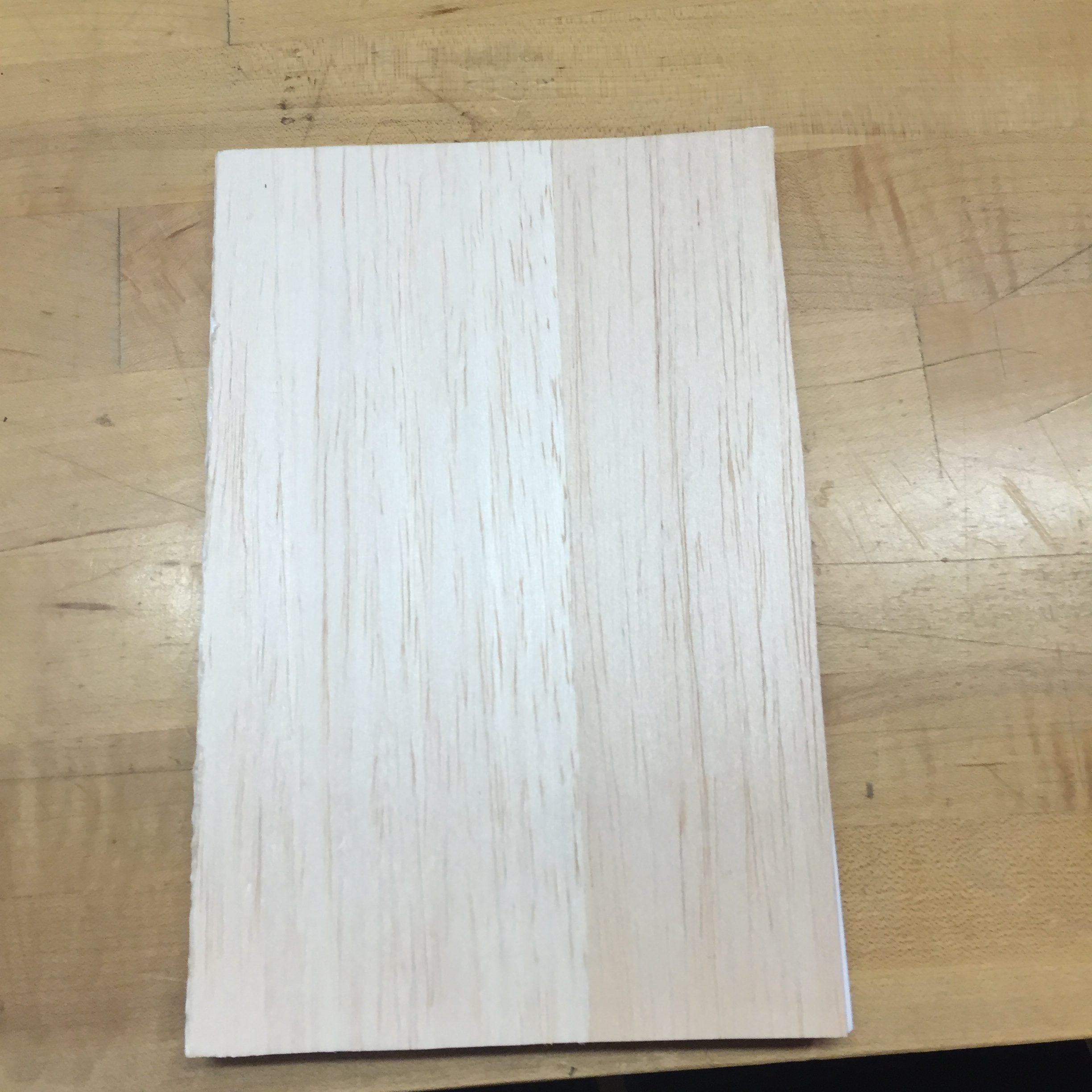
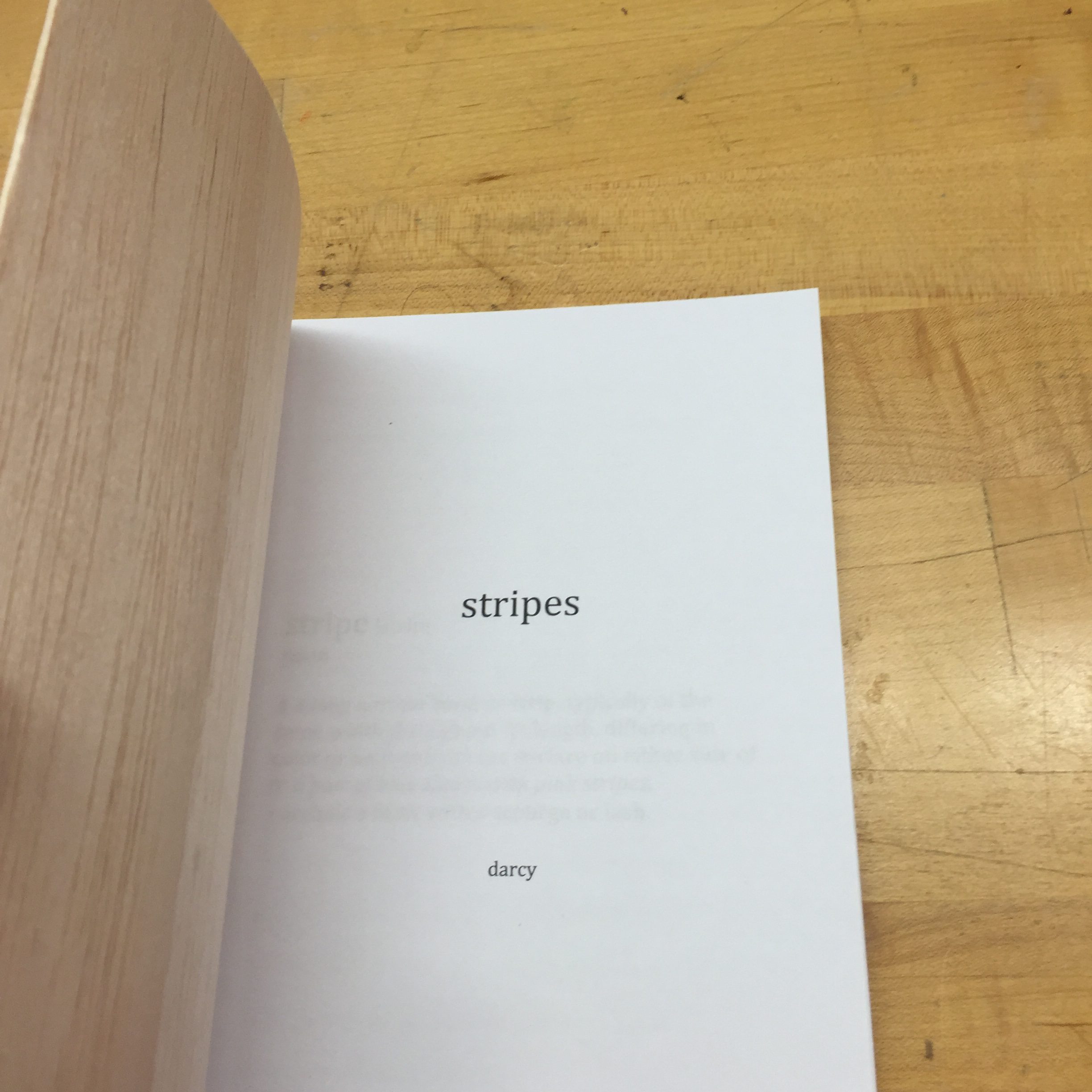
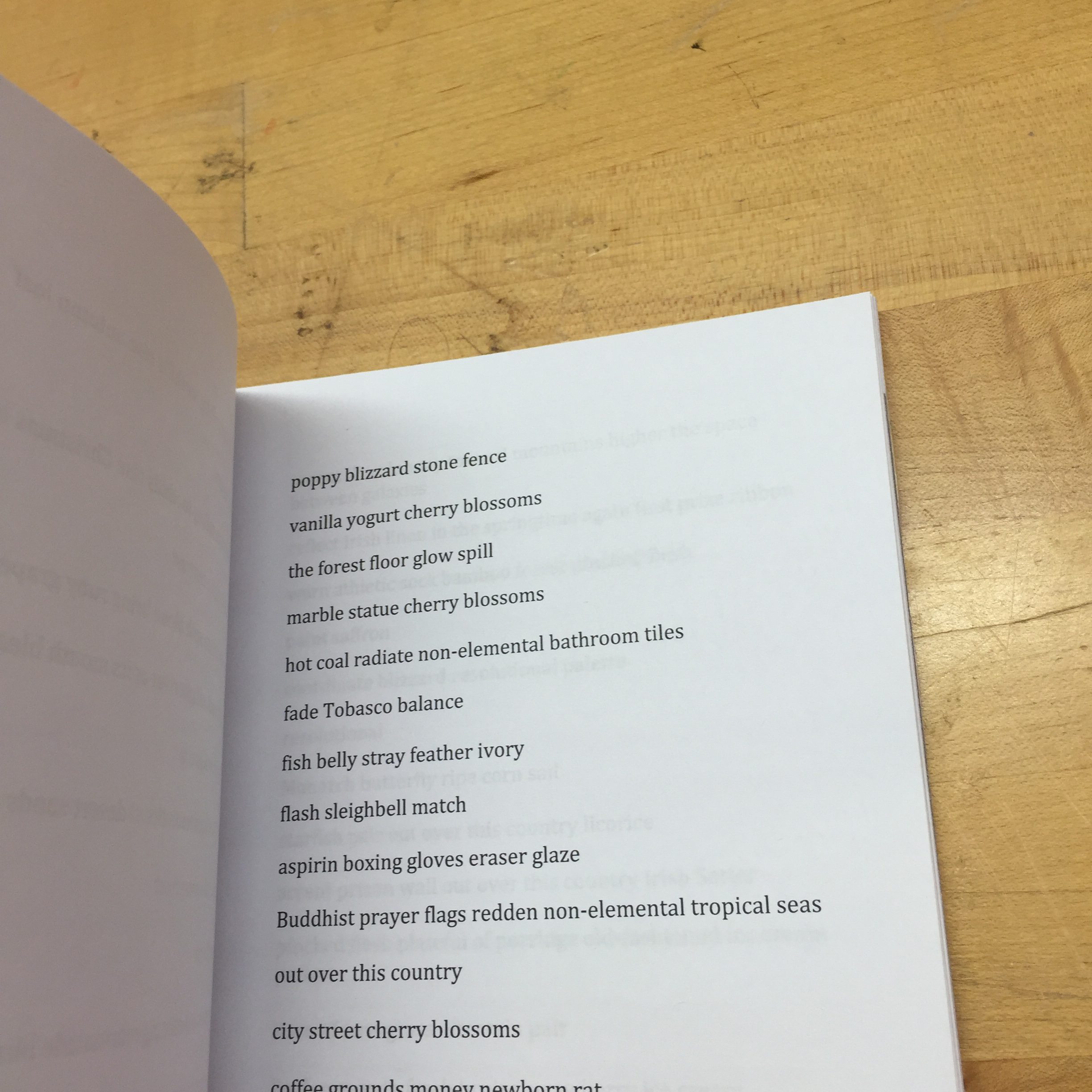
My book is called Stripes. It contains a stripe of colors on each page.
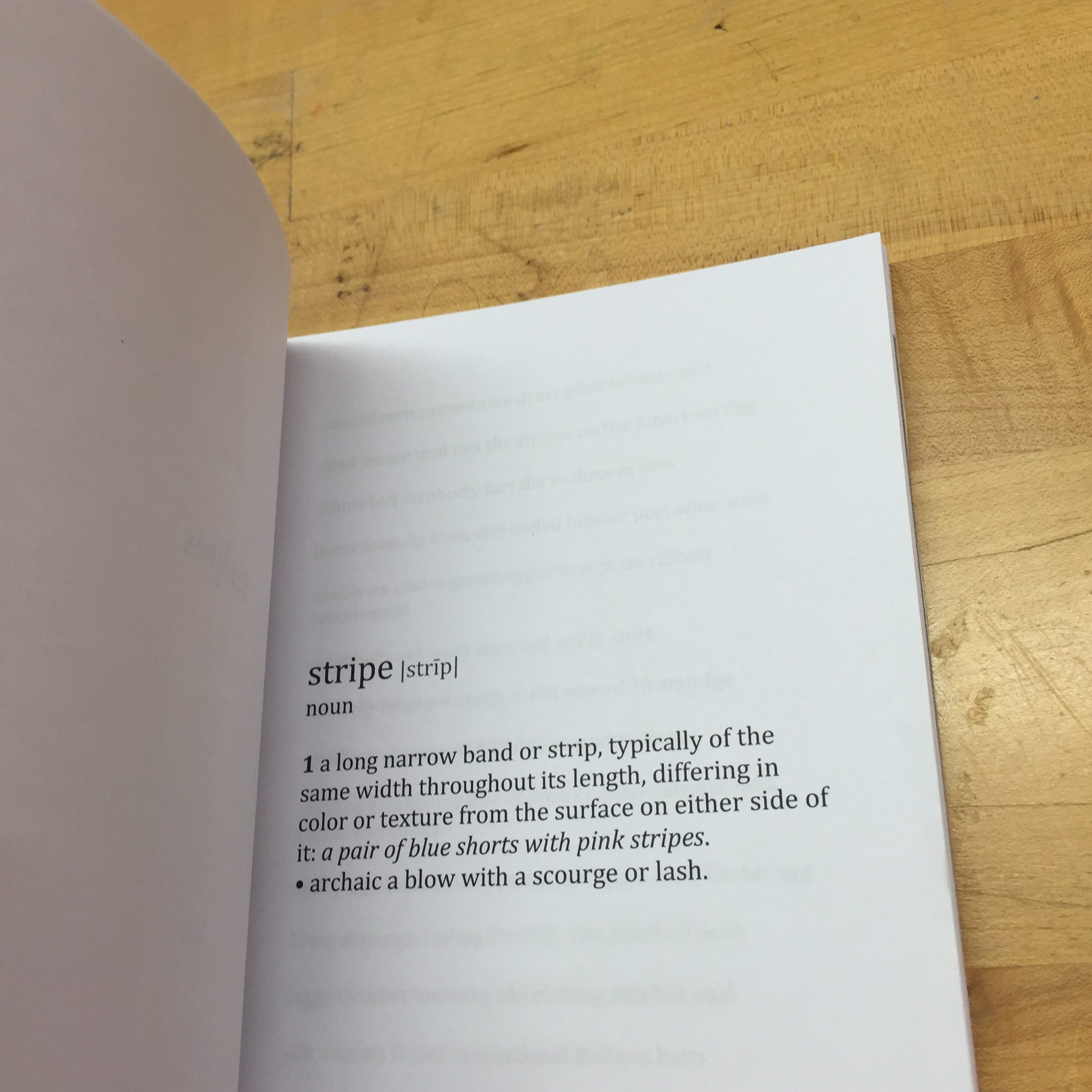
I was fascinated by this perception study: Colour is in the eye of the beholder. I realize that colors are not only just shades or hues or RGB values; they have very strong relationships to feeling, smell, taste and memory. So I wanted to represent the concept of color by evoking them with words, so that the reader would “see” the colors by imagining them. They can be completely personal and generic, different from person to person, depending on their experience or understanding of the descriptions. Just imagine seeing the stripe that contains the colors of “cornflour sparkle“, “spider web weave“, “old Oriental rug burn“, “glisten shimmer pretzel“, “glow field of clover” and “iceberg peanut butter Arctic landscape“. You see what I mean.
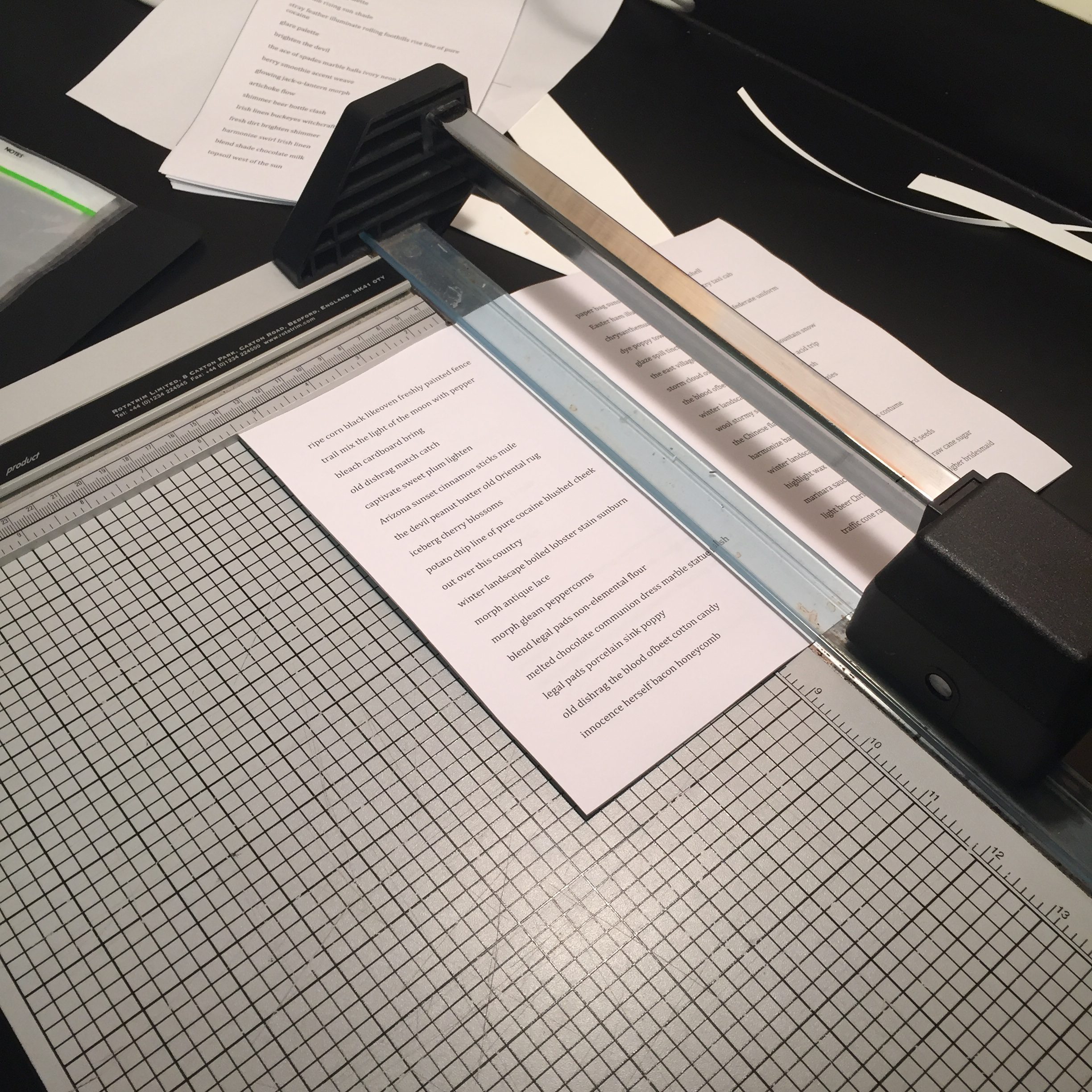
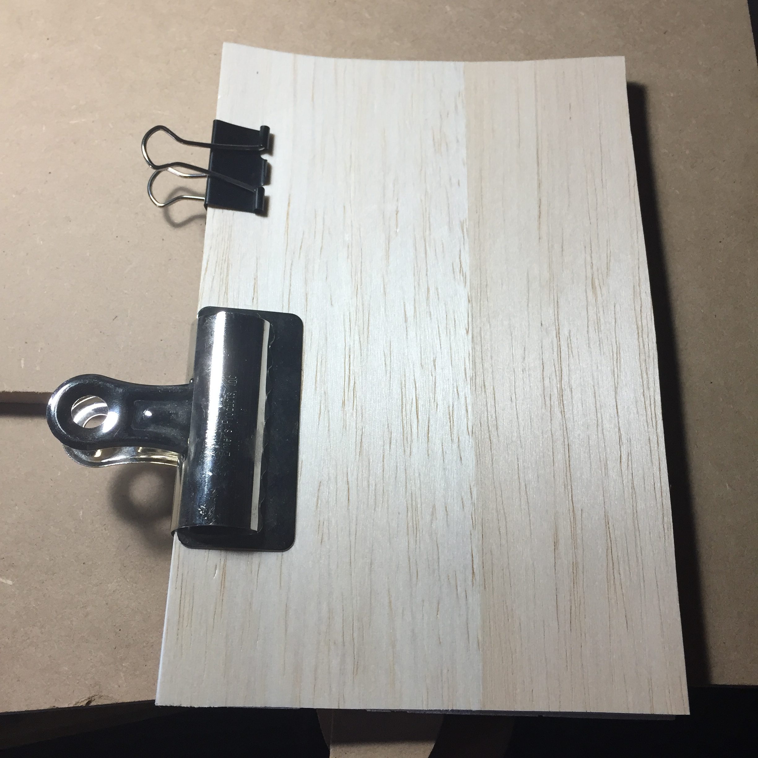
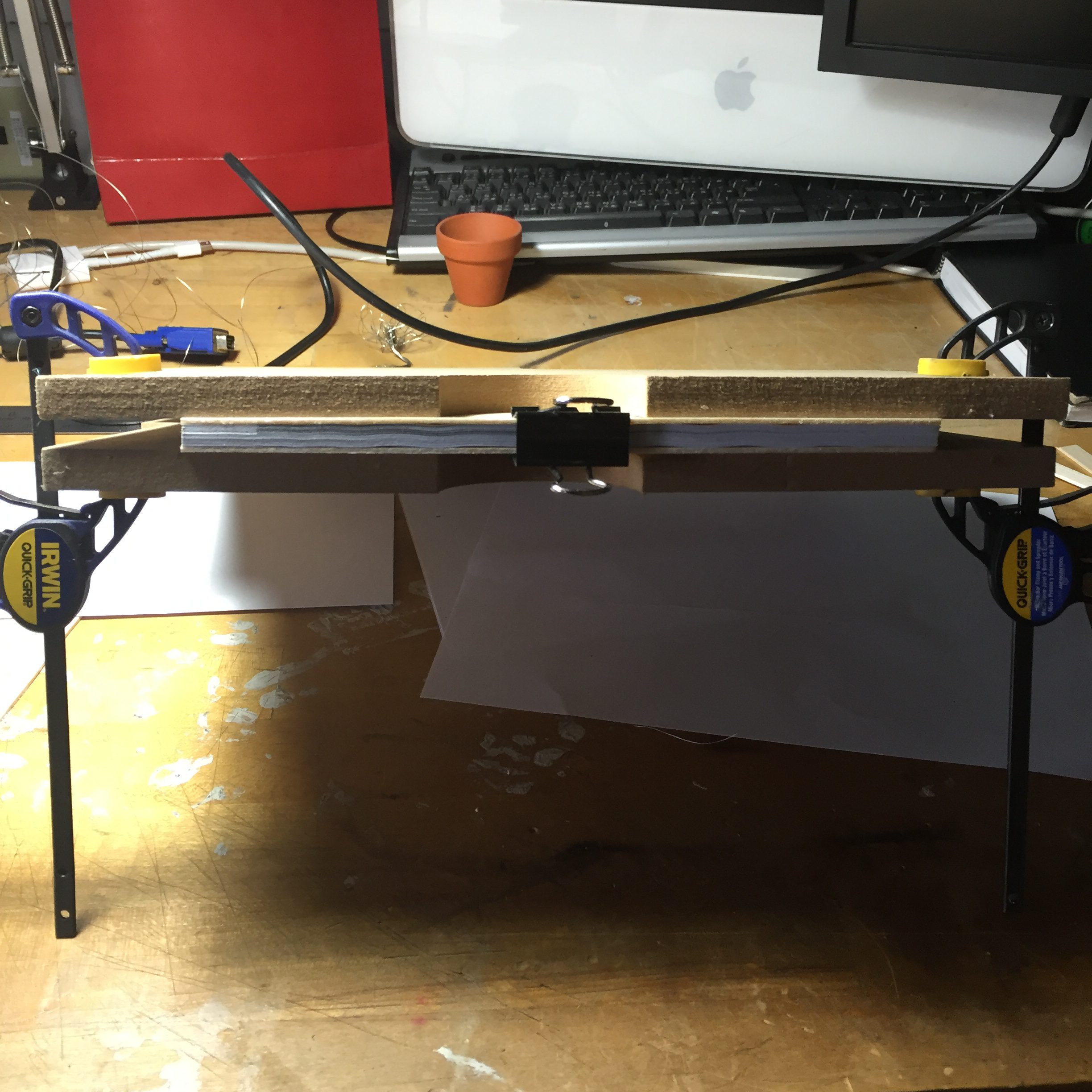
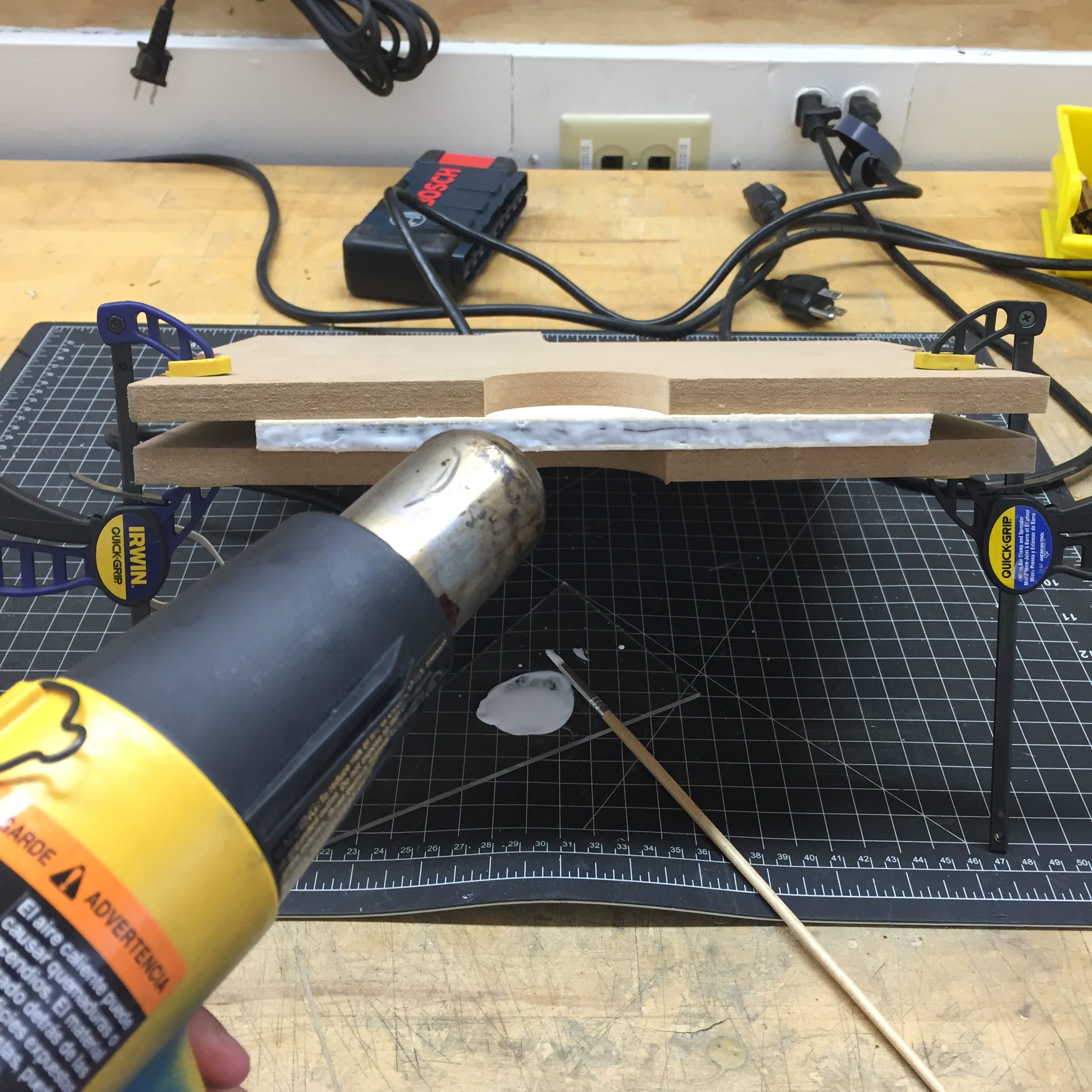
A closer look at my bookbinding process:
Print and cut with an edge cutter:
Organize and press between two pieces of wood blocks:
Brush PVA glue into the spine of the book. Shorten the drying time by blowing hot air on the surface until the glue is dry. Repeat three times:
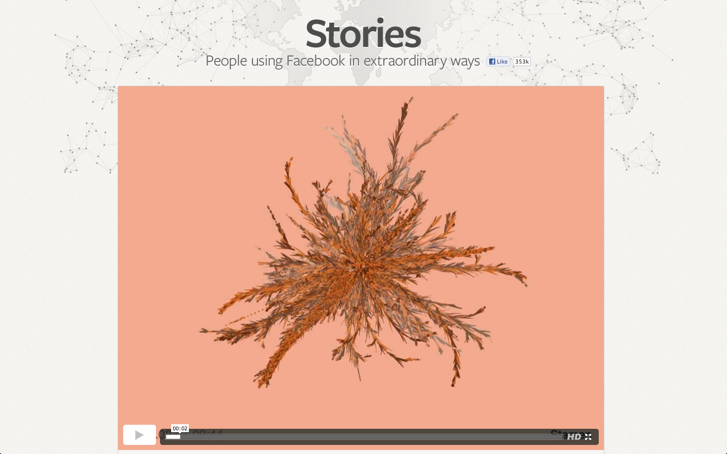
After struggling to create even a scatterplot in D3, I’m mesmerized by pretty much any data visualization. But even without that sidenote, Rachel Binx’s representation of viral Facebook stories is really beautiful. The color choices are well thought out (and it’s nice that the different colors actually reflect the data, in this case gender).
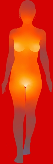
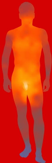
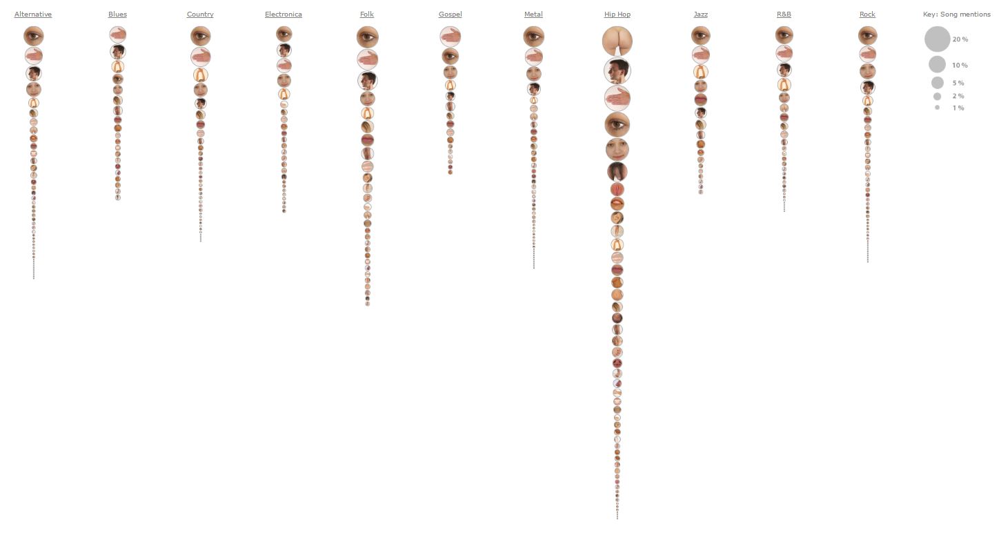
Fleshmap (2008) – Martin Wattenberg collaborating with Fernanda Viegas and Dolores Lab
I found the Fleshmap project very interesting because of the nature of the investigation. Sex and desire are subjects that are so embedded in our culture right now, but at the same time they’re still treated with a heavy taboo in regards to talking about sex in daily conversation and with the treatment of sexual education in the school system. Visually I find the first graphic of the most desirable places to be touched (man and woman) to be very engaging, and although the data (from Mechanical Turk) isn’t surprising, it does help the viewer more palpably understand the erotic nature of the data. The other part of the project I found really interesting was their analysis of the mention of different body parts in different genres of music. The information you can draw from this visualization (2nd image), gives surprising insight into the way sex factors into cultural and musical trends. It’s interesting to consider the popularity of hip hop right now combined with the visualization that it’s one of three genres that do not list the eyes as the most mentioned, and instead most mentions the ass, as opposed to the other two that mention hands most. This is fascinating when thinking about how the eyes are called “the window into the soul” and are often associated with love and emotion, while asses are most often are an object of desire. I think Fleshmap is a meaningful project that shows the pervasive and popular nature of sex in the current cultural environment.
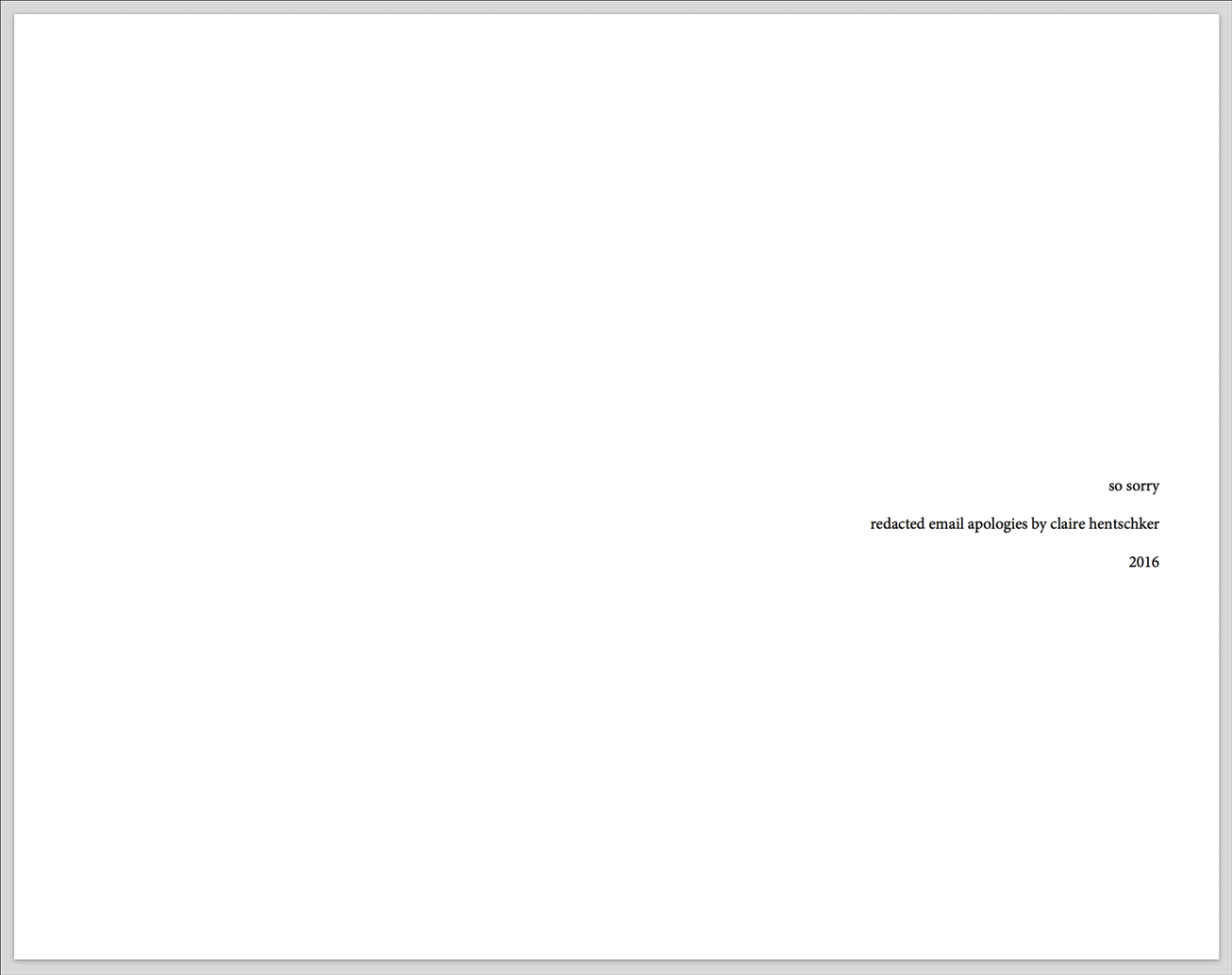
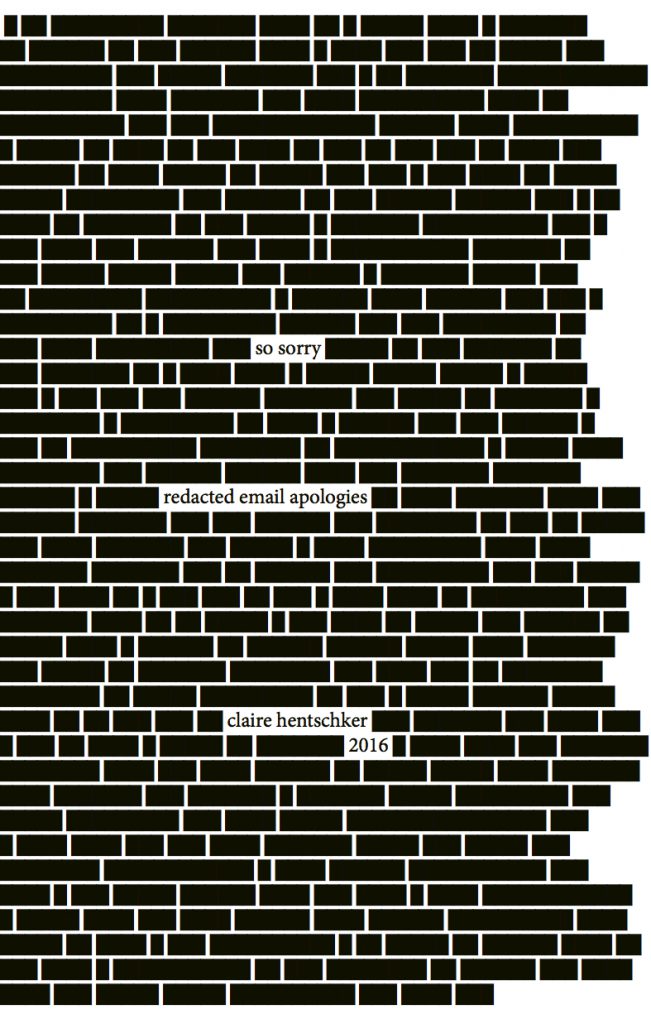
The book ‘so sorry’ compiles all of the emails I sent from 2011-2016 in which the word ‘sorry’ appears at least once, in reverse chronological order. There were 214 emails that met this criterion, from two different Gmail accounts of mine. Each page of this book contains a redacted version of one of these emails, in which only the sentence that contains the apology is left visible, without its context. Each page also includes the time and date each email was sent. After I included an email in the book, I permanently deleted it from my email account.
The emails were retrieved ‘by hand’ in order to ensure that no sensitive information was copied over. The date, time and full content of the emails were stored in a JSON file. Using p5.js I redacted all sentences that did not include the word “sorry” in them. The book was then laid out computationally in Adobe InDesign using Basil.js.
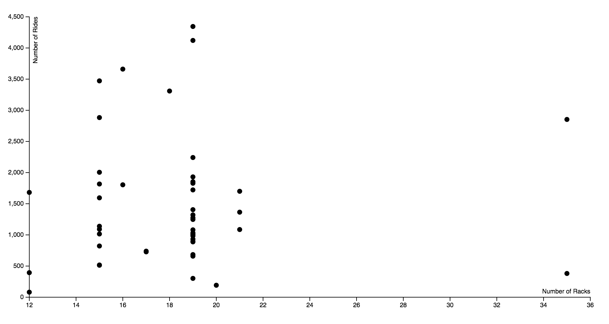
I used the bike data to visualize the number of racks against the number of rides each station had. I wanted to see if there was a correlation between the number of racks and the popularity of the station. It turns out this is not the case, as the popularity of the 19 rack ranged from over 4000 and under 500. The number of racks seems rather arbitrary, so it questions how much thought went into the installation of the bike racks. Ideally I would have like there to be an interactive component to this data, where you’d be able to hover over each dot and see the station name it represents.
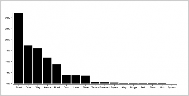
I first looked at the data of healthyridespgh but wasn’t really interesting in other people’s biking habits. The only thing that did intrigue me was that I had all this information about street names, and I began to get curious abut that data. If you look at a city like NYC, which is mostly streets and avenues, its data would appear very different from a city like Pittsburgh. I then decided to swap out the healthyridepgh data for the actual list of every street in Pittsburgh. With over 7000 streets, I was able to sort the data into this d3 graph.
Procedure:
Copy all the street names from this list into a txt file
pittsburgh.txt
Create a python file to convert the txt to a csv
txtToCsv.py
pittsburgh.csv
Create a python file that has a dictionary of all possible street types, then sorts through the csv and counts how many of each type there are, then sort through the dictionary and determine the corresponding percentage value for each street type, then export the dictionary with percentage values as a JSON file
streetNames.py
pittsburghData.json
Substitute a bar graph block with my json data
index.html
The most beautiful bar graph I’ve ever made. I say this because I spent a very, very long time trying to make this force cluster visualization work. I thought I had lowered my bar enough in terms of what I was asking of from d3. Currently the colour category of the clusters are evenly distributed. After attempting to understand d3 enough to just change even distribution to uneven distribution.
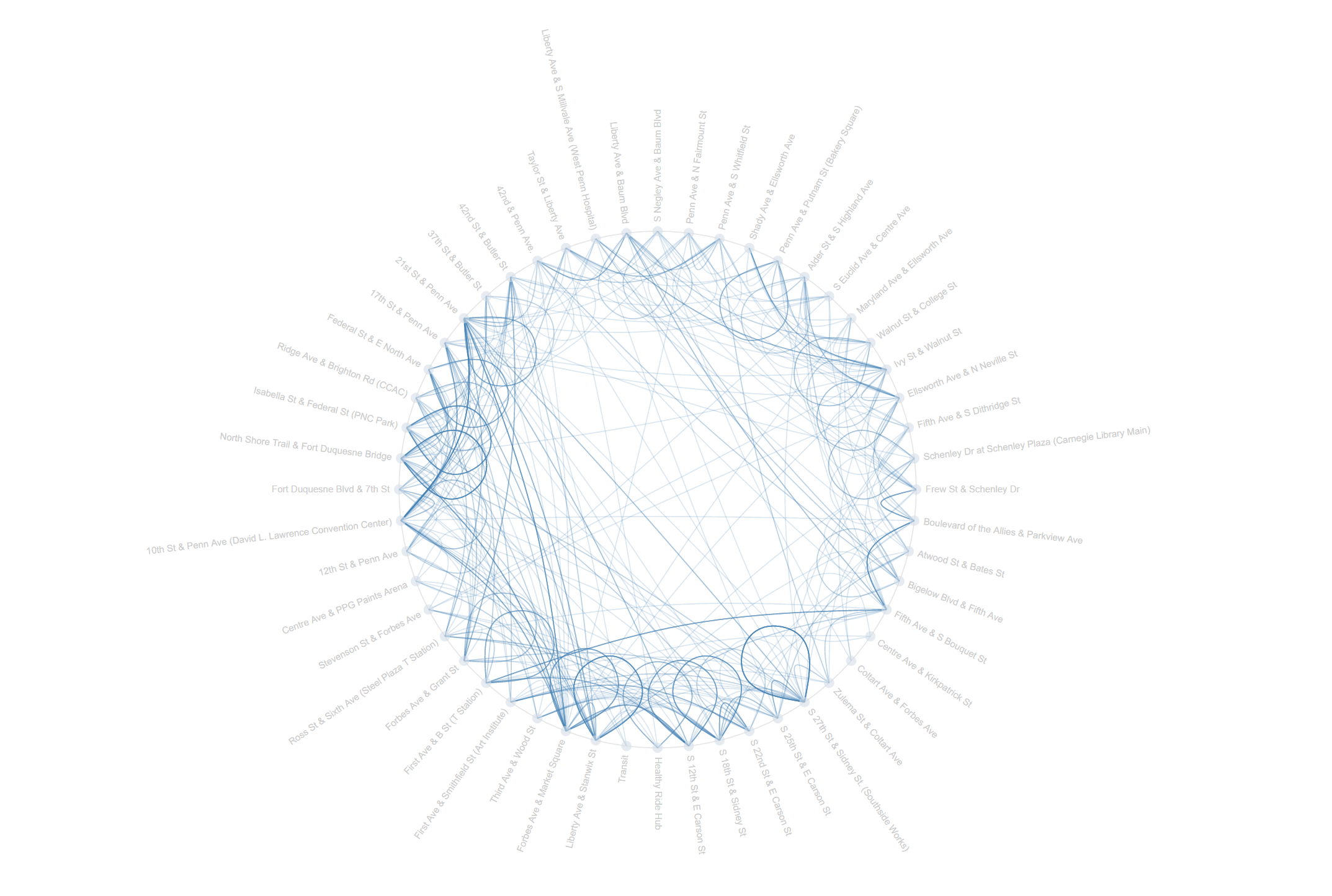
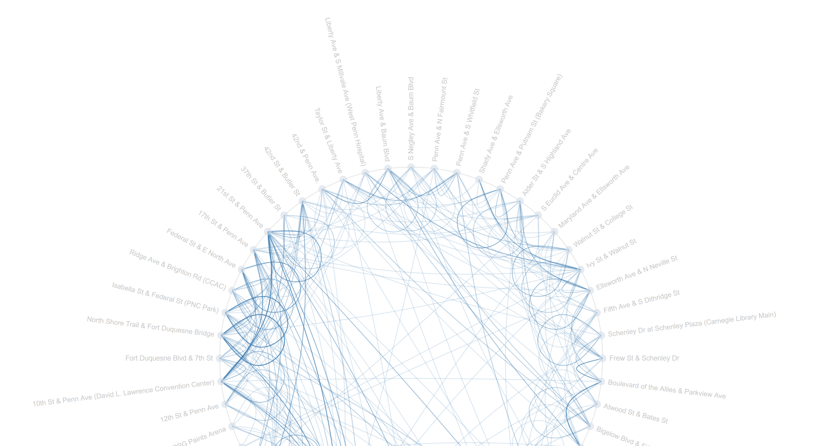
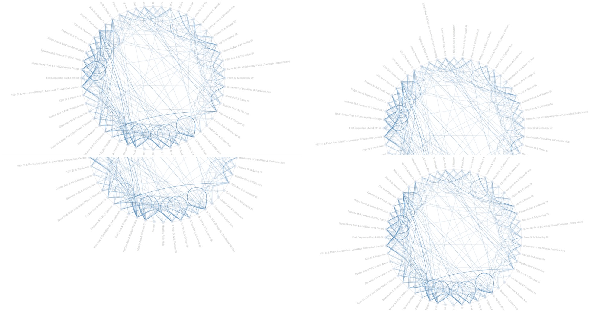
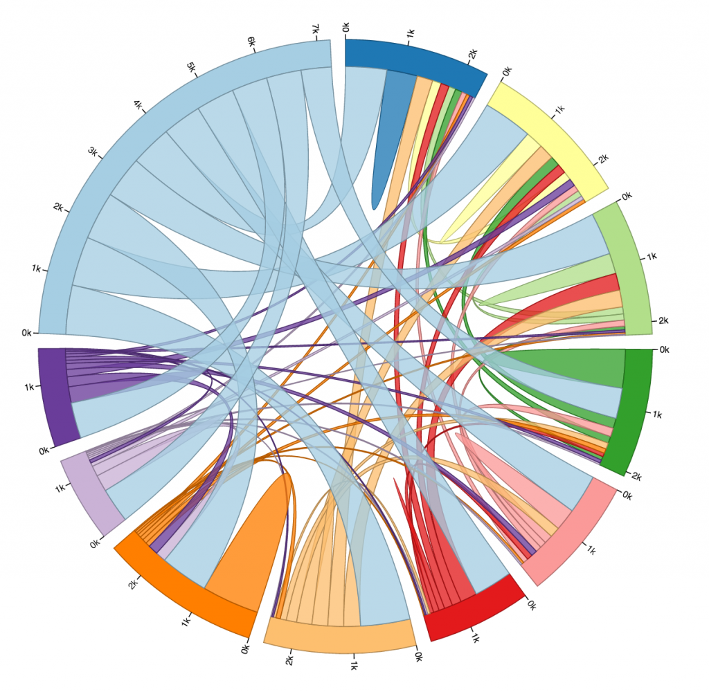
My visualization displayed the data arranged in a circle of all the stations recorded in the spreadsheet– and then connected the corresponding start stations with their end stations of each bike rented; as such each line represents the journey of one bike from one station to another, or from one station back to itself. (Otherwise seen as a loop in the visualization.) The customization of the lines being at a lower opacity allows for the concept of frequency in the diagram, so the darker, more often-overlapped, and more opaque lines imply that more instances of bikes traveling some path with those two stations as the destination endpoints.
I initially found this block appealing because I felt it balanced uniqueness in style as well as practicality and readability (at least, in general, not specifically picking out every single line…) I instinctively thought the only way to reasonably implement relevant data was to have the stations connect to one another, and I stayed on track to this idea. I originally practiced with a simple network graph example, and the results were barely readable because of the plethora of overlapping messes of lines; I then combined two other references to reformat the data as json with Python, mirroring the structure of the example’s json data by labeling nodes and links accordingly (I also originally placed dummy data at the nodes to figure out exactly how the code worked). I then dug through the code to find out exactly how much could be customized, and refined the node colors, opacities, edge colors, link widths, etc. to my liking. Frankly, I had the lowest expectations for this project as D3 was incredibly overwhelming, as well as even dealing with the data itself before I could even get into D3, so I am quite thankful for the results and just immensely relieved that I outputted something because I wanted to cry multiple times throughout the work process.
This week’s looking outwards, I’ve chosen to write about Stefanie Prosavec, someone whom I’d heard of before, but really changed the way I thought about visualization and introduced me to code.
I first stumbled across her work about two years ago, and was immediately drawn in by the intricacy and artistry of her visualizations, that treated the product as a piece that was meant to be equally beautiful as it was informative. Specifically, her projects: writing without words, which looked at quantifying and visualizing text in a way I’d never seen before.
The visualizations she created were not so much exact and measured as they were textural and interpretive, providing comparisons that could be felt between texts, which created a sort of visual persona for different pieces of literature, and even recognizable visual styles for different authors.
Ironically, her work was created ‘by hand’ in illustrator rather than being coded, and after seeing how powerful this form of visualization could be, it only underscored the importance of programming as a design tool for exploring and communicating information.
Sob! D3 is……strangle worthy. So much respect. I’ve always loved Amanda Cox’s work. I love it even more now.
(she’s been shown in class – the NY times designer)
Here’s another of her compatriots – SARAH SLOBIN, a data visualist for Wall Street Journal who calls herself a ‘visual journalist’. She calls herself a visual journalist because at the Times graphics editors do their own reporting, so these are many pieces she herself pitched and produced. Over the course of her profligic career, she has done everything from “infographics that span two pages of newsprint, to long-form multimedia stories to deep data-dives to designing front-ends and coding back-ends, from breaking news to new products.”
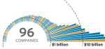
the billion dollar startup club is an interactive, immediately dramatic visualization of the biggest (monetarily) baddest startups around.
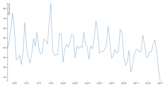
For my visualization, I made a line chart that tracks the number of bike rentals each day over the course of the ~12 week 3rd quarter. You can see there are 13 spikes, which I hypothesize correspond to weekends, when bike rentals for recreational purposes would rise. The second largest spike occurs on the 4th of July.
To do this project, I first pared down the Healthy Ride Data downloaded form the website using Excel, and then created an array of the sum of all the trips made in each day using Processing. I then returned to Excel to edit the dates (it turned out that the d3 block I was using required a different format) and create the tsv. Finally, I plugged my data into the d3 block and uploaded it on my server.
I think it was really easy to get carried away with this assignment, because it’s a lot of fun to come up with things to ask the data — I really wanted to figure out the fastest bike, and then categorize them by if they were “sprinters” or “distance runners”. I also thought it would be cool to track the cardinal directions in which the bikes move, or figure out which bike gets used most in the wee hours of the morning. But the technical challenges of this assignment made it so that we had to keep ourselves grounded. New respect for data scientists/artists.
All right, all right. This is not my best work. However, it was really interesting to get to work with D3 for the first time, and I’m glad I know a bit more about it now.
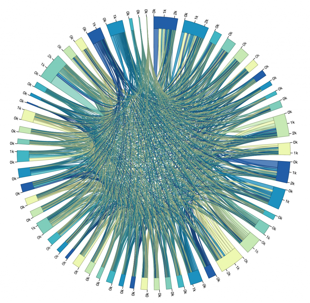
My plan was to map trips from every bike stop to every other bike stop in a chord diagram. I chose a chord diagram because I thought it reminded me of a wheel, and I thought “Hey, maybe I can make it spin, or decorate it to look like a wheel!” That all went out the window very soon.
I used a chord diagram from the D3 blocks website to achieve this, and honestly changed very little about it except for the colors, the scale of the little marks around the circle, and of course the data. The main code that I wrote was the Processing file that turned the data in the .csv file we had into data I could work with. It created a two dimensional array, then incremented elements (A, B) and (B, A) by one for every trip from station A to B, or station B to A. I chose to make the matrix symmetrical, and treat trips from A to B as equivalent to trips from B to A. Perhaps the other way may have been a bit more precise, but it also made the diagram even less readable. When the chords were thicker at one end than another, I didn’t really know what that meant, so I wanted to just keep the matrix symmetrical.
The Processing file generated a .txt file containing the matrix that I needed. After I generated it, I pasted it into the D3 in my HTML file, and then I displayed it as a graphic. It all went according to plan (I guess), but I hadn’t really thought about just how unrealistic it was to make a chord diagram of over fifty bike stops. As you can see in the image below, it was pretty much totally unreadable and unhelpful.
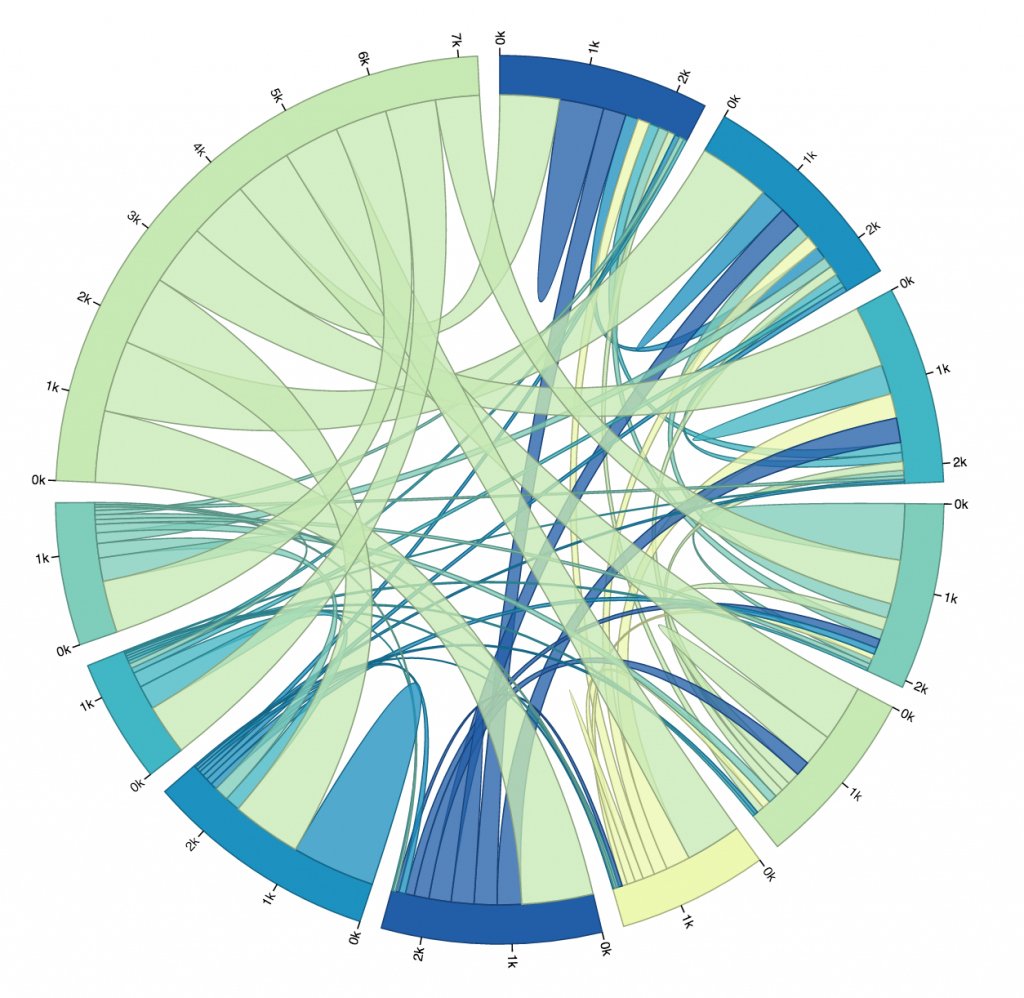
So, I looked at that first trial, picked out the ten busiest stops (I did this manually, not by writing code, just for time’s sake), and altered my code so that I could get a new matrix that only dealt with the ride data for the top ten busiest stops. You can see that iteration below. The eleventh, largest section of the circle in the upper left is the “other” section, representing rides from one of the ten busiest stations to or from one of the less busy stations. I chose to not display rides from “other” to “other,” because it wasn’t relevant to the ten busiest stops, and it dominated the circle when it was included.
Here is another diagram representing the same data, just with a different color scheme. I don’t find this one as pretty, but it gives every stop its own unique color, which makes it slightly more readable. As you can see, every stop’s connectors are ordered from largest to smallest (going clockwise).
One thing I found quite interesting is how none of the ten busiest stops’ largest connector was to another one of the ten busiest stops. Most of them had the most rides to or from “other,” which is to be expected, I supposed, considering just how many other stations there are. Still, several of the stops have more rides to themselves than any other stop, more even than to all of the “other” stops! And a lot of the stops whose largest connector was to “other” still had more rides to themselves than to any of the other ten busiest stops.
I was surprised to see how common that was. I guess it isn’t all that weird to check out a bike for a while, ride it around for fun or for errands, and then bring it back where you found it without putting it away in between. Still, if I were to visualize more data I would like to look exclusively at rides that start and end in the same place, and see if there is any pattern there regarding the type of user that does this, or the time of day it is done.
All in all, this is a very very minimum viable product. I spent most of the week just struggling with D3, and while time constraints are no real excuse for poor work, I would like the record to reflect that I am very aware that this project is flawed. My biggest frustration is that the names of the stops in question are not displayed by the portion of the circle that represents them. I could’t figure out how to do that, but if I were to work more on this visualization, that would be my next priority.
Here is my Processing code for the version that only cares about the ten busiest stops:
int[][] matrix;
Table allRidesTable;

PrintWriter output;

void makeMatrix(){
  matrix = new int[11][11];
  for (int i=0; i<11; i++){
    for (int j=0; j<11; j++){
      matrix[i][j] = 0;
    }
  }
  //Now our matrix is set up, but it's all zero. Now we need to fill it with values.
  allRidesTable = loadTable("HealthyRide Rentals 2016 Q3.csv", "header");
  //Trip iD,Starttime,Stoptime,Bikeid,Tipduration,From station id, From station name,To station id,To station name, Usertype
  int totalRides = allRidesTable.getRowCount();
  for (int row=0; row < totalRides; row++){
    TableRow thisRow = allRidesTable.getRow(row);
    int startStationID = thisRow.getInt("From station id");
    int endStationID = thisRow.getInt("To station id");
    println("Start ID = " + startStationID + ", End ID = " + endStationID);
    //We only want to map the 10 busiest stations, which are:
    //1000, 1001, 1010, 1012, 1013, 1016, 1017, 1045, 1048, 1049
    int startStationNumber= 10;
    int endStationNumber = 10;
    if (startStationID==1000) startStationNumber = 0;
    if (startStationID==1001) startStationNumber = 1;
    if (startStationID==1010) startStationNumber = 2;
    if (startStationID==1012) startStationNumber = 3;
    if (startStationID==1013) startStationNumber = 4;
    if (startStationID==1016) startStationNumber = 5;
    if (startStationID==1017) startStationNumber = 6;
    if (startStationID==1045) startStationNumber = 7;
    if (startStationID==1048) startStationNumber = 8;
    if (startStationID==1049) startStationNumber = 9;
    if (endStationID==1000) endStationNumber = 0;
    if (endStationID==1001) endStationNumber = 1;
    if (endStationID==1010) endStationNumber = 2;
    if (endStationID==1012) endStationNumber = 3;
    if (endStationID==1013) endStationNumber = 4;
    if (endStationID==1016) endStationNumber = 5;
    if (endStationID==1017) endStationNumber = 6;
    if (endStationID==1045) endStationNumber = 7;
    if (endStationID==1048) endStationNumber = 8;
    if (endStationID==1049) endStationNumber = 9;
    //println("Start Number = " + startStationNumber + ", End Number = " + endStationNumber);
    if (startStationNumber == endStationNumber){
      matrix[startStationNumber][endStationNumber] += 1;
    } else {
      //I will treat trips from station A->B and B->A as the same.
      //Direction does not matter for this data visualization.
      //So, the matrix will be symmetric.
      matrix[startStationNumber][endStationNumber] += 1;
      matrix[endStationNumber][startStationNumber] += 1;
    }
  }
  //Now the matrix is full of the number of rides from place to place.
}

void setup() {
  makeMatrix();
  output = createWriter("myMatrix.txt");
  int nRows = matrix.length;
  int nCols = nRows;

  output.println("[");
  for (int row = 0; row < nRows; row++) {
    String aRowString = "[";
    for (int col = 0; col< nCols; col++) {
      aRowString += matrix[row][col];
      if (col != (nCols -1)){
        aRowString += ", ";
      }
    }
    aRowString += "]";
    if (row != (nRows -1)) {
      aRowString += ", ";
    }
    output.println(aRowString);
  }
  output.println("];");


  output.flush();  // Writes the remaining data to the file
  output.close();  // Finishes the file
  exit();  // Stops the program
}
And here is my Processing Code for the version that maps all stops:
int[][] matrix;
Table allRidesTable;

PrintWriter output;

void makeMatrix(){
  matrix = new int[53][53];
  for (int i=0; i<53; i++){
    for (int j=0; j<53; j++){
      matrix[i][j] = 0;
    }
  }
  //Now our matrix is set up, but it's all zero. Now we need to fill it with values.
  allRidesTable = loadTable("HealthyRide Rentals 2016 Q3.csv", "header");
  //Trip iD,Starttime,Stoptime,Bikeid,Tipduration,From station id, From station name,To station id,To station name, Usertype
  int totalRides = allRidesTable.getRowCount();
  for (int row=0; row < totalRides; row++){
    TableRow thisRow = allRidesTable.getRow(row);
    int startStationID = thisRow.getInt("From station id");
    int endStationID = thisRow.getInt("To station id");
    println("Start ID = " + startStationID + ", End ID = " + endStationID);
    //Note that the station IDs range from 1000 to 1051, inclusive
    int startStationNumber = startStationID - 1000;
    int endStationNumber = endStationID - 1000;
    if (startStationNumber < 0 || startStationNumber > 51){
      //The Start Station number was invalid, and all invalid Stations will be called 52.
      startStationNumber = 52;
    }
    if (endStationNumber < 0 || endStationNumber > 51){
      //The End Station number was invalid, and all invalid Stations will be called 52.
      endStationNumber = 52;
    }
    println("Start Number = " + startStationNumber + ", End Number = " + endStationNumber);
    if (startStationNumber == endStationNumber){
      matrix[startStationNumber][endStationNumber] += 1;
    } else {
      //I will treat trips from station A->B and B->A as the same.
      //Direction does not matter for this data visualization.
      //So, the matrix will be symmetric.
      matrix[startStationNumber][endStationNumber] += 1;
      matrix[endStationNumber][startStationNumber] += 1;
    }
  }
  //Now the matrix is full of the number of rides from place to place.
}

void setup() {
  makeMatrix();
  output = createWriter("myMatrix.txt");
  int nRows = matrix.length;
  int nCols = nRows;

  output.println("[");
  for (int row = 0; row < nRows; row++) {
    String aRowString = "[";
    for (int col = 0; col< nCols; col++) {
      aRowString += matrix[row][col];
      if (col != (nCols -1)){
        aRowString += ", ";
      }
    }
    aRowString += "]";
    if (row != (nRows -1)) {
      aRowString += ", ";
    }
    output.println(aRowString);
  }
  output.println("];");


  output.flush();  // Writes the remaining data to the file
  output.close();  // Finishes the file
  exit();  // Stops the program
}
I totaled the amount of time spent on a bike that launched from a certain station and sorted them from least to most. This could happen because people from that station need to get to a far-away place, or because there is just a large quantity of bikes launched from that station.
The station IDs are scrunched on the X axis and the Y axis makes no sense. We love you D3.
Ok, I would have posted a link to github but it seems like I did not save the processing code part. All I did was add into a dictionary the station number key if it was not already in the dict, but if it was, I added the duration that that bike had to that key. Then I sorted them by least to most and println()ed.
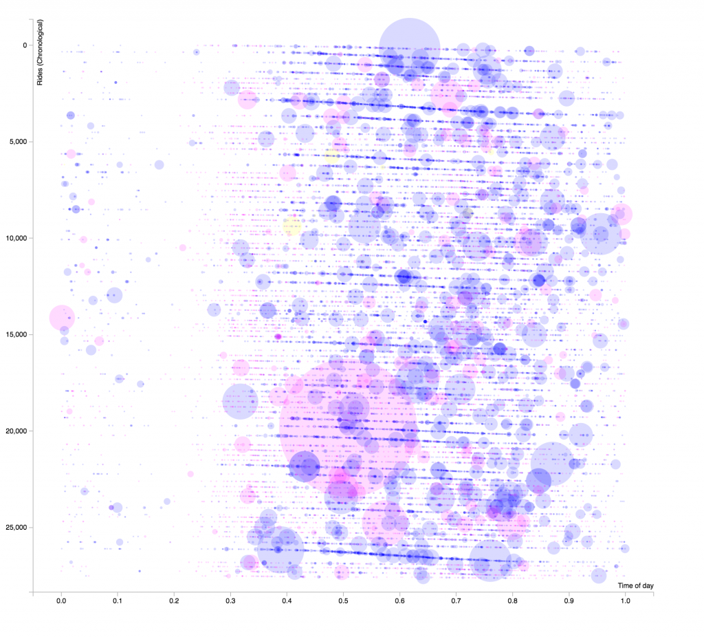
This is a graph of all the rides in their most recent quarter. The Y axis is rides chronologically, the first ride at the top and the last at the bottom.
The X axis is the time of day, from early in the morning to late at night.
The size of the circles indicates the duration of the ride, and color corresponds to the type of rider. Pink is subscriber, Blue is customer, and Yellow (very rare) is daily pass.
The number labels are misrepresentitive, as I had to do some hacky conversions to make this work. 😉
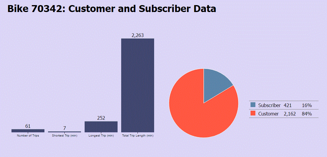
For the data visualization of Healthy Ride Pittsburgh, I wanted to figure out the specifics of the bikes used. I wanted to figure out, “What’s the most popular bike used?”
Given the data for Quarter 1 of 2016, I used Excel and D3 to solve this question. Using Excel, and its formulas, I was able to deduce what bike was taken for the most rides. I then divided the data between the two user types: Subscribers and Customers. After creating these two separate files, I totaled the data for each user type and then concatenated it into a final file. Using this final information, I then used the bl.ocks example for Pie Charts and Bar Graphs (http://bl.ocks.org/NPashaP/96447623ef4d342ee09b) to represent the information.
After observing the data, I found that the majority of 61 rides, using the most popular bike (Bike ID: 70342), were initiated by customers (36:25 for customer:subscriber). This ratio seems to be applicable to the entire Healthy Ride Pittsburgh system. Additionally, I found that the bike had a lot of minutes on it compared to most bikes. This is primarily because it is the most popular bike. However, this bike also had one of the longest trips accounted for in the entire system (initial Healthy Ride Pittsburgh Q1 2016 Data).
From this quantitative data, I then began to question more about the bike:
Does it have the most comfortable seat out of the surrounding bikes? Does it ride the smoothest? Are there certain aesthetic qualities that make it more appealing to most bikes? Is it just by chance that this bike has become the most popular bike and is it actually identical in quality to others?
Only further research of the bike’s physicality can help me answer this question. I hope that one day, if I do find myself using Healthy Ride Pittsburgh, that I’ll come across Bike 70324 and determine for myself if its popularity is based on chance or fact.
A project that I’m particularly interested in is Lev Manovich’s “SelfieSaoPaulo” (2014). In this project, Manovich collects thousands of selfies taken from individuals living in Sao Paulo, Brazil and displays them on a building within the city. Although his collection of mass data is intriguing, I’m particularly interested in how he is able to further his audience by involving people of the city. Additionally, the topic of facial recognition still interests me, as his program is able to recognize thousands of selfies (with varying quality of photos).
Another project of his that seems connected to “SelfieSaoPaulo” is his most recent piece, “Inequiligram”. In his project, he collects social media data from New York City, New York and finds patterns of inequality. How he is able to recognize these patterns in such a large concentration of data is astonishing and sets the current bar for mass data collection.


 I like his other work too, aesthetically, but 9-Questions is the sort of stuff that gets me going.