Feedback on Plots
Feedback on Plotter Artworks
Two leading computational artists, Nick Hardeman and Marius Watz, provided their critiques of the students’ Plotter projects, as assigned in Deliverables-04.
Nick Hardeman is a new media artist, designer, and experimenter. He works as Minister of Interactive Art at Design I/O, where he utilizes technology to create immersive environments that invite people to explore. Nick’s work includes interactive installations, mobile and online applications that investigate new modes of creative expression.
Marius Watz is an artist working with visual abstraction through generative software processes. His work focuses on the synthesis of form as the product of parametric behaviors. He is known for hard-edged geometrical forms and vivid colors, with outputs ranging from pure software works to public projections and physical objects produced with digital fabrication technology.
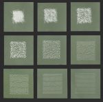
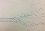
Nick Hardeman: Clear depiction of chaotic to orderly lines accentuated by appropriate placement of 9 pieces. Textured paper compliments silver lines.
Marius Watz: Nice progression from order to disorder, though the 4 most chaotic steps lose subtlety.
Nick Hardeman: Simple concept that could use more diversity or controlled order, patterns. Artist enjoyed plotting process but did’t provide documentation of it.
Marius Watz: Meets the assignment criteria, but not much more. When in doubt, try something wilder. (And never mention time constraints.)
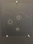
Nick Hardeman: Irregular shapes, two colors, multiple line widths and varying line styles result in pleasing composition. Final plotted piece documented image is lacking.
Marius Watz: Charming (if ambiguous) forms, well suited for the medium. The plots shown have less “hair” and fatter lines than vector preview, visually a middle point might work better.
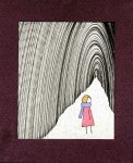
Nick Hardeman: Cropping of tunnel lines helps guide the eye across the entire image. Negative space and color balance the dense lines. Pleasant composition. Is the character code generated? Why or why not?
Marius Watz: Basic form made more interesting by exploration of mechanical imperfections.
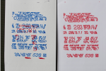
Nick Hardeman: Technically driven concept. Good documentation of process. Interesting composition. Two colors adds visual complexity. Needs more compelling reason for choice of numbers.
Marius Watz: Nice exploration of type as both glyphs and raster, exploiting the visual qualities of glitch and overprint to good effect.
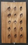
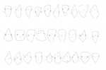
Nick Hardeman: Faces are similar but unique. Leads to cohesiveness while prompting scrutiny of each face. Laser etching on wood adds to character.
Marius Watz: The idea is interesting, but execution feels too simple. The randomization of the face is too “regular”. Having features that are interchangeable or optional for each face would give a better effect.
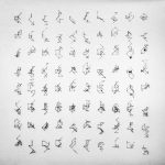
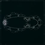
Nick Hardeman: Line angles at 45 degree increments implies order, while still being random. The fills add variation and help focus. The close-ups in your documentation help appreciate the design on a micro level.
Marius Watz: The line drawings are elegant, if occasionally a little cluttered. The grid constellations work well.
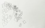
Nick Hardeman: Animation portrays “waterfall” of cubes well, but plotter output does not. The negative space on the right feels unnecessary.
Marius Watz: The composition shows promise, but the plot shown does not take the idea far enough. Consider balance and what is “enough”.
Nick Hardeman: Linear composition of increasing density provides balance and movement. Burn marks from laser create subtle gradients.
Marius Watz: The drawing is satisfactory, if not exciting. Whether you use a plotter or laser as a drawing tool, attention must be paid to the material qualities (paper, pen, burn).
Nick Hardeman: From a previous project, glad to see thorough exploration of possible outputs. Animated GIF illustrates process for generating the images. Orientation of small dots creates delicate paths.
Marius Watz: Good use of a classic algorithm, modified to produce a subtly unique style. Drawing dots with the plotter makes excellent use of its capabilities, and the result is charming.
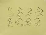
Nick Hardeman: Brush and ink adds to character of the lines. Interesting approach to represent the number 3 as a binary tree that appears to be organic lines.
Marius Watz: The process is more convincing than the result, although the use of a brush adds to the finished product. The abstraction of binary tree forms is not obvious, looking too random.
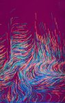
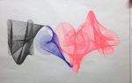
Nick Hardeman: Attractive vibrant colors. Lines convey movement across the entire piece. Fluid forms are made by the dense juxtaposition of lines. Good use of negative space.
Marius Watz: Beautiful execution, even if the signature of a noise function is immediately obvious. The flow lines and multiple colors make great use of the plotter’s materiality.
Nick Hardeman: Dynamic composition. Eye follows spirals from off the page to the center of each spiral. Delicate plotter lines are hard to appreciate in provided image. Could use a stronger explanation / discussion.
Marius Watz: Elegant curves, well suited for plotter output, but composition feels too rigid. (Note on documentation: If the work has details not shown, find a way to show it.)
Nick Hardeman: Conveys notion of order to chaos. Rather abrupt transition. Nice subtle variation of colors and widths. Offset drawing of same line helps provide movement.
Marius Watz: An efficient interpretation of the topic, with elegant output. Consider greater complexity / density.
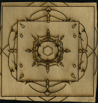
Nick Hardeman: Great sense of depth in 2D form through use of geometric patterns and scale. Uneven edges on wood distract from symmetry.
Marius Watz: Mandalas are an excellent subject for plotter drawings. Execution is an intriguing starting point, but feels unfinished.
Nick Hardeman: Impressive breadth of studies. Good representation of 3D form in 2D loose style. Pen execution better serves lines vs. bleeding ink approach.
Marius Watz: Process sketches are impressive, showing a great number of variations on the basic form.
Nick Hardeman: (looking at black, blue and pink plotted version). Colors feel disjointed and unintentional. Good use of organized lines to make forms that still represent letters.
Marius Watz: The typographic transformation balances nicely between clean and complex. Makes good use of the plotter, with overlapping lines giving a subtle extra effect.
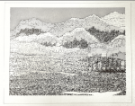
Nick Hardeman: Excellent explanation of process and Influences. Well executed. Generative landscape that resembles one that might be found in nature.
Marius Watz: An exquisite piece, both in terms of a surprising algorithm and output that pushes the limits of the plotter’s capability. The final drawings are lovely, and makes me wonder what they would look like at a greater scale.
Nick Hardeman: Is the top piece the finished, plotted piece? Some of the faces display emotion. But some appear dismembered; this might benefit from slightly more control over randomness.
Marius Watz: These faces, while somewhat simple, win through with their quirky forms. The thin stroke works well with the fragile-feeling head shapes.
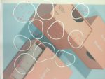
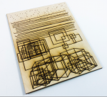
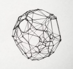
Nick Hardeman: Layering add points of focus and interesting texture variety. The shape in the top left feels haphazard. The other designs work better aesthetically.
Marius Watz: Due to their complexity, these forms appear to be more texture than drawing. While there is an interesting geometry, the process feels obscured by a little too chaotic final output.
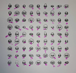
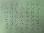
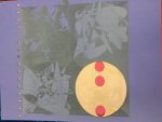
Nick Hardeman: Nice variation in eyes and mouths, would like more in head shape. Pink circles help break up uniform grid.
Marius Watz: The abstraction of what constitutes a face, while relying only on the single shape of the ellipse, works well. In a grid, the variations consistently feel differentiated.
![]()
Nick Hardeman: Strong concept. Repeating story doesn’t celebrate individual because it’s not necessarily relevant to that individual. Serves more like a textured bar graph after realization that story is the same.
Marius Watz: As concrete poetry, the piece is convincing, but could do with even more deconstruction. The sensitivity of the ambitious theme might prove a little overwhelming; accepting non-completeness for an already fractured visual narrative might provide artistic license. That said, there is an obvious need for legible parts so as not to obscure the message.