kander – Visualization
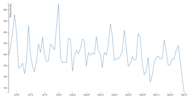
For my visualization, I made a line chart that tracks the number of bike rentals each day over the course of the ~12 week 3rd quarter. You can see there are 13 spikes, which I hypothesize correspond to weekends, when bike rentals for recreational purposes would rise. The second largest spike occurs on the 4th of July.
To do this project, I first pared down the Healthy Ride Data downloaded form the website using Excel, and then created an array of the sum of all the trips made in each day using Processing. I then returned to Excel to edit the dates (it turned out that the d3 block I was using required a different format) and create the tsv. Finally, I plugged my data into the d3 block and uploaded it on my server.
I think it was really easy to get carried away with this assignment, because it’s a lot of fun to come up with things to ask the data — I really wanted to figure out the fastest bike, and then categorize them by if they were “sprinters” or “distance runners”. I also thought it would be cool to track the cardinal directions in which the bikes move, or figure out which bike gets used most in the wee hours of the morning. But the technical challenges of this assignment made it so that we had to keep ourselves grounded. New respect for data scientists/artists.
Code on GitHub: