tigop-clock
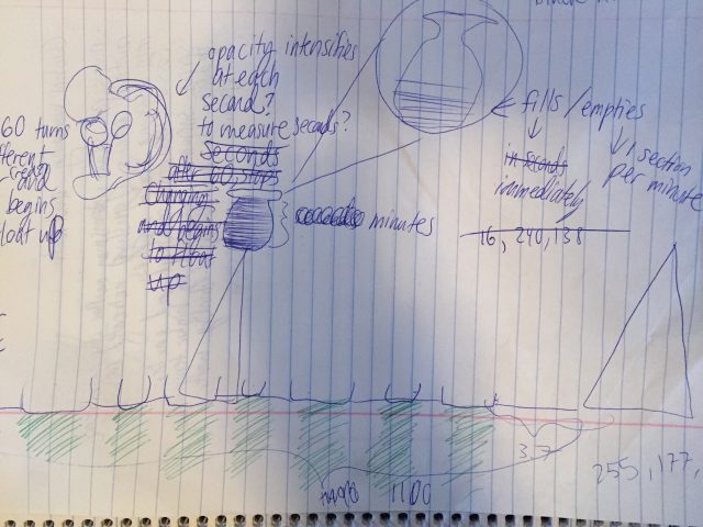
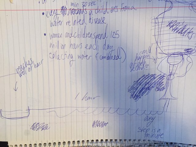
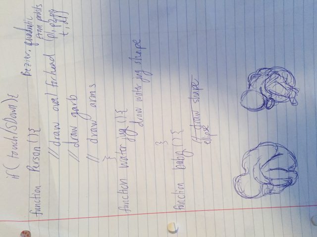
In this project, I was inspired by the idea of data visualization. I thought it was interesting to have a parametric form of data visualization, and I wanted to make a clock which represented something I found to be a serious issue. That issue is lack of access to water throughout the world. I have a large circle to represent a woman or a mother, and a small circle rises from within the larger circle and floats upwards with each second. The large circle moves sideways, representing hours and minutes. Its representation of minutes is a bit more straightforward, as with each passing minute, it moves one step sideways. It moves between elongated lines which stretch across the canvas to represent areas where there are wells for the mother to access water. The lines are three hours apart (with respect to the mother, as it takes three hours from her to get from one well to the next-when in reality it takes some individuals 3 hours and 42 minutes.) The child circle disappears after it reaches the top of the canvas, and it does so with each 90 seconds that pass to represent the fact that every 90 seconds, a child dies of a water related illness due to lack of access of clean and safe drinking water. Each time a child circle disappears, the red value of the background increases by a certain increment.