Lumar-DataViz
Onboarding experience as a rushed customer for healthyride:
See the actual footage here:

1.Short on time

2. Oh look! Bike share!

3.What a confusing Kiosk

4. IT WON’T COME OOOOOFFF

5.SO ANGRY. STORMS OFF LATE.

If I wanted to figure out how to improve this onboarding experience I would need to know the kind of users that are more likely to use HealthyRide and in which ways. Determining for whom I’m designing for is vital!
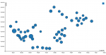
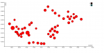
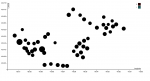
With this in mind, I took the data for each station in 2016, and extracted the latitude, longitude, and distribution between subscriber vs. customer. This would’ve been my filthy hack method of getting the map assignment done as well. The size of the circles plotted is proportional to the number of users (and extrapolated from there, possibly the type of audience that is more likely to become users and thus the kind of people we want to ensure the onboarding process is smooth for. The reasoning isn’t perfect because one can also argue that the smaller circles represent an area with an audience we should be designing even more for because
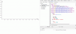
Once it’s finished the svg file generated can ripped and edited to have a map slipped under it in illustrator.
The size of the circles plotted is proportional to the number of users (and extrapolated from there, possibly the type of audience that is more likely to become users and thus the kind of people we want to ensure the onboarding process is smooth for. The reasoning isn’t perfect because one can also argue that the smaller circles represent an area with an audience we should be designing even more for because clearly they aren’t using Healthy Ride enough….so my scenario doesn’t quite as easily work application wise in the research process….that’s ok)
The color…well….it was supposed to be an interpolation between yellow and blue correlated to the proportion of subscribers vs. customers from each station, but apparently the d3.interpolateCool/Warm/Plasma/all those cool color scales come in a seperate d3 library.
![]()
whhhhhhhyyyyyyy is this blurrrrry?!?!
D3 HealthyRide Visualization