kander – LookingOutwards07
For this Looking Outwards assignment, I looked at the work of Ingrid Burrington (who, it should be noted, has”lifewinning.com” as her web domain name). She doesn’t focus exclusively on visualizations, but she has a really interesting map-based visualization that seeks to measure the impact of a hike in the public transit fare in New York City. There are a few issues with the visualization, and I think it could be synthesized a little further, but I enjoy the nature of the data that she chose to analyze.
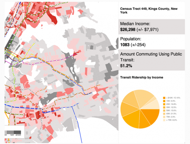
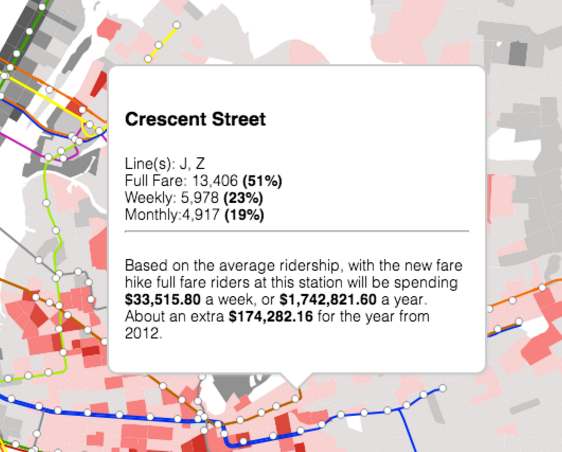
Burrington’s map allows you to zoom in and out of different areas of NYC, which is broken up into it’s different census tracts. Mousing over a tract brings up on the side information about the median income (the map is also color coded based on this data), percent of public transit uses, income of those riding public transit, and population. Clicking on a station brings up a little pop up that tells you the type of pass bought at each location, the total increase in spending by full-far riders that would result from the pay hike.
I think there are a lot of parts of the visualization that could be less confusing. First, it might be a good idea to break it up into several visualizations — perhaps one about ridership and types of passes and one about the pay hike — or otherwise have a way to pare down the data that is shown. Additionally, I don’t feel it was necessary to color code the subway lines (maybe if I was a New Yorker, I’d feel differently). I think it adds confusion.
I also think that this high number of types of of data muddies the message, and drowns out perhaps some more interesting facts that could be drawn from the visualization. For example, it might be far more revealing to have a visualization that shows the ratio of average cost increase per public-transport rider to median income of the area. Or perhaps a comparison between the amount that an area would pay and the percentage of the pop. that actually took public transport. It felt like a lot of simpler visualizations crammed into one, but without a larger synthesis.
Still, there are some very redeeming aspects of the visualization. Each of the individual elements is done well and clearly, and the overall aesthetic is pleasing. Public transport fare increases, and which areas would pay the most, is a very interesting data set, because it’s hard to conceptualize how much money actually stands to be made from a small fare increase on each rider. Furthermore, all of this data existing in the same text-based document or spreadsheet would be absolutely impossible to interpret, so this visualization is definitely a step-up.
Additionally, I perused other parts of the website, and I love the informal, ever-so-slightly flippant style in which she writes and speaks (the use of the word “hella” in a description of one of her projects really sealed the deal for me). Her Seven on Seven talk with Meredith Whittaker, which includes a discussion of magic, is pretty cool as well.