hizlik-lookingoutward07
138 Years of Popular Science Jeb Thorp
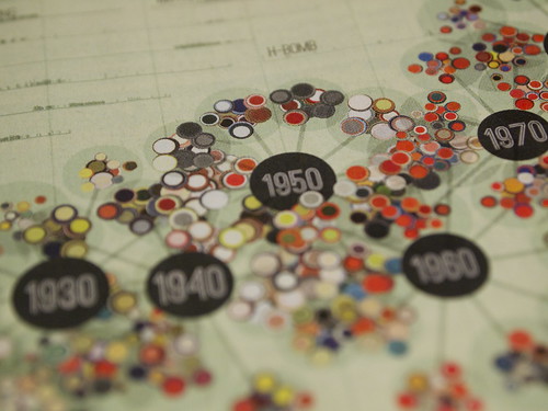
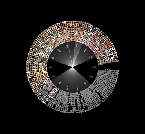
This was a project that caught my eye as I searched through the works of the several data-vis artists and designers listed on the lecture page. I personally have read many pop-sci magazine articles in the past and, along with Wired magazine, value their views, opinions and news regarding the technological and scientific world, past, present and future. Therefore I was interested in what parameters Jeb was considering as the data for his visuals (there are so many things you can compare with 140 years of magazine data). He decided to create a visualization based on terms used throughout the years (“Radio-Television” for example). Although I personally think this is an ok but not best choice, I can’t think of anything cooler. However, I really enjoyed his method of visualizing this massive amount of data. According to his detailed documentation, he wanted a DNA-structure for the decades, with clusters of years surrounding each decade, and within each year is a circle that represents a separate magazine article (and the circle color is dependent on the dominant color on the article cover).
I personally love the final structure, but am unsure about the colors still. Although it is a culmination of all the dominant cover colors over the decades, the overall pop-sci page feels very dull/muted. Perhaps a pure-white background would help pop the cover colors more, or using color in the metadata/term text surrounding the structure? Not sure. I do love his many forms of designing the final structure, including this one “diversion” as he calls it.
You can view more of this project at his blog post. I have been looking more at his other works too and really enjoy his visualizations. I could love to actually pick up and read this page from the Pop-Sci magazine though.