hizlik-visualization
You can view the project live here. IT TAKES 20-30 SECONDS TO LOAD
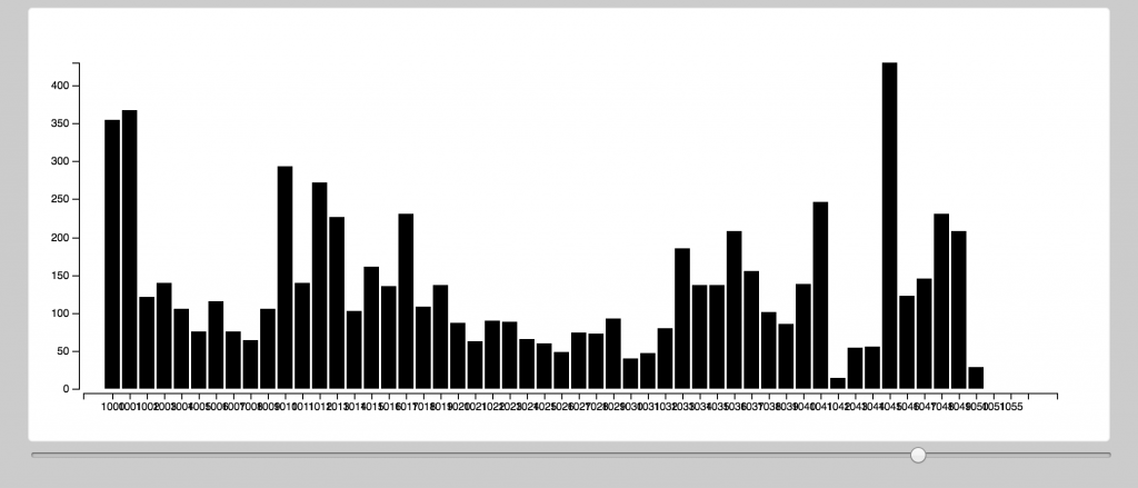
Chart: It shows the amount of departures from stations per hour. Using this, you can kind of see how some stations have more people taking bikes in the mornings and some have more people taking them at nights (possibly to/from work?). Y axis = number of departures, X axis = station.
Making of: It was remarkably hard using d3, just like we were warned (that it takes a different kind of thinking). That said, I’m fairly happy with how it turned out, for a simple chart. I could not fix the x-axis names (I wanted them to be vertical) and could not get animations working. I also would have preferred to have a max-height that is consistent across all hours, rather than changing the scale of the chart. But I couldn’t figure that out either. I couldn’t get the axis titles to show up either, so I ended up not using them.