Drewch – LookingOutwards07
When I think of the power of information visualization, I think about how it can be used as a way to show data in a convincing way to force people to rethink what they thought they knew. I’m not really interested in seeing the latest stock projections, or pro-baseball player stats updates, or Citi-bike riding statistics. These sorts of visualization have their own merits and uses, but I’m interested in seeing information about infrastructures, politics, philosophy, and everything that people take for granted. Choosing an artist/designer to talk about here is a little bit challenging for a couple reasons.
I’m not sure if I should be looking for aesthetically and compositionally impressive charts or for meaningful (that’s subjective ofc) information. Maral Pourkazemi does both well … I think … probably…
http://monoment.io/9-questions/
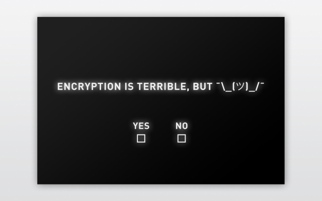
In his piece, 9-Questions, Maral Pourkazemi created 9 statements, all of which really got me thinking. What answer would I pick? What answer did others pick? Does that data even matter? It is very interesting to me how he is able to accomplish what I said earlier about “forcing people to rethink what they thought they knew” without visualizing any data at all.
 I like his other work too, aesthetically, but 9-Questions is the sort of stuff that gets me going.