Category: Visualization

tigop-visualization

this was just awful

Table allRidesTable;
int stationRideCounts[]; 
String stations[] = {
"Centre Ave & PPG Paints Arena",
"North Shore Trail & Fort Duquesne Bridge",
"Ross St & Sixth Ave (Steel Plaza T Station)",
"37th St & Butler St",
"Bigelow Blvd & Fifth Ave",
"Frew St & Schenley Dr",
"Forbes Ave & Market Square",
"Forbes Ave & Grant St",
"Stevenson St & Forbes Ave",
"12th St & Penn Ave",
"Ridge Ave & Brighton Rd (CCAC)",
"17th St & Penn Ave",
"Taylor St & Liberty Ave",
"Liberty Ave & Baum Blvd",
"Shady Ave & Ellsworth Ave",
"Penn Ave & Putnam St (Bakery Square)",
"Alder St & S Highland Ave",
"Maryland Ave & Ellsworth Ave",
"Ivy St & Walnut St",
"Fifth Ave & S Dithridge St",
"Schenley Dr at Schenley Plaza (Carnegie Library Main)",
"Boulevard of the Allies & Parkview Ave",
"Atwood St & Bates",
"Fifth Ave & S Bouquet St",
"Zulema St & Coltart Ave",
"S 27th St & Sidney St. (Southside Works)",
"S 25th St & E Carson St",
"S 22nd St & E Carson St",
"S 12th St & E Carson St",
"21st St & Penn Ave",
"42nd St & Butler St",
"S Negley Ave & Baum Blvd",
"Liberty Ave & Stanwix St",
"S 18th St & Sidney St",
"Third Ave & Wood St",
"First Ave & Smithfield St (Art Institute)",
"First Ave & B St (T Station)",
"10th St & Penn Ave (David L. Lawrence Convention Center)",
"Fort Duquesne Blvd & 7th",
"Isabella St & Federal St (PNC Park)",
"42nd & Penn Ave.",
"Liberty Ave & S Millvale Ave (West Penn Hospital)",
"Penn Ave & N Fairmount St",
"Ellsworth Ave & N Neville St",
"Coltart Ave & Forbes Ave",
"Walnut St & College St",
"Penn Ave & S Whitfield St",
"Federal St & E North Ave",
"S Euclid Ave & Centre Ave",
"Centre Ave & Kirkpatrick St"
};
void setup() {

  int nStations = stations.length;
  stationRideCounts = new int[nStations];
  for (int s=0; s

.

anson-Visualization

screen-shot-2016-11-07-at-4-23-35-pm

So, this was interesting, and an important lesson for me about parsing strings and creating tsv’s. I adapted (admittedly minimally) a Mike Bostock bar graph, and plotted the number of rides at each of the 24 hours in a day. I think with a lot more practice, I could come to like Javascript quite a lot. When you hover over the individual bars, the bar changes color – here shown in the web color “rebecca purple” which is a fun name for a color. I’d like to keep working with Javascript in future projects.

Table allRidesTable;

int ridesPerHour[];
  
void setup() {

  ridesPerHour = new int[24]; 
  for (int s=0; s<24; s++) {
    ridesPerHour[s] = 0; // initialized to zero yo
  }


  allRidesTable = loadTable("HealthyRideRentals2015Q4.csv", "header"); 
  // Trip id,Starttime,Stoptime,Bikeid,Tripduration,From station id,From station name,To station id,To station name,Usertype

  int nRows = allRidesTable.getRowCount(); 
  for (int i=0; i


Healthy Ride

A Day of Pittsburgh Bike Rides

cambu-visualization

click (on image) for interactive version

For this project, I decided to analyze the number of concurrent bicyclists using the EasyRide system at any one moment in time. To visualize this, I used Tom May’s Day/Hour Heatmap.

processing

Table allTimes;
IntDict grid; //thanks to gautam for the idea of an intdict
String gridKey;

//"this is about you having a car crash with D3" ~Golan 

void setup() {
  // change this if you add a new file 
  int dayOfMonthStarting = 7; 
  grid = new IntDict();

  //allTimes = loadTable("startStopTimes_sep19to25.csv", "header");
  allTimes = loadTable("startStopTimes_aug10to16.csv", "header");
  
  //header is Starttime, Stoptime

  int numRows = allTimes.getRowCount();
  for (int i = 0; i < numRows; i++) { TableRow curRow = allTimes.getRow(i); //M/D/YEAR 24HR:60MIN //PARAM ON START HOUR String startTime = curRow.getString("Starttime"); String Str = startTime; int startChar = Str.lastIndexOf( ' ' ); int endChar = Str.lastIndexOf( ':' ); int startHourInt = Integer.parseInt(startTime.substring(startChar+1, endChar)); //PARAM ON END HOUR String stopTime = curRow.getString("Stoptime"); //9/19/2015 0:01 String StrR = stopTime; int startCharR = StrR.lastIndexOf( ' ' ); int endCharR = StrR.lastIndexOf( ':' ); int stopHourInt = Integer.parseInt(stopTime.substring(startCharR+1, endCharR)); //PARAM ON DAY int curDay = Integer.parseInt(startTime.substring(2, 4)) - (dayOfMonthStarting - 1); //1-7 println("-->> " + startTime + " to " + stopTime);
    //println("Place this in day: " + curDay + ", with an hour range of: "); 
    //println("start hour: " + startHourInt);
    //println("stop hour: " + stopHourInt);

    int rideDur;

    if (startHourInt - stopHourInt == 0) {
      //place one hour of usage at the startHourInt location
      rideDur = 1;
      //println(rideDur);
    } else {
      rideDur = stopHourInt - startHourInt + 1;
      //println(rideDur);
      //d3_export(i);
    }
    startHourInt = startHourInt + 1;
    gridKey = "D" + curDay + "H" + startHourInt;
    println(gridKey + " -> " + rideDur);

    if (rideDur == 1) { //only incrementing or making a single hour change
      keyCreate(gridKey);
    } else { //ranged creation
      println(rideDur + " @ " + startHourInt);
      for (int n = startHourInt; n <= startHourInt + rideDur; n++) { gridKey = "D" + curDay + "H" + n; if (n > 24) {
          println("warning");
          //do nothing
        } else {
          keyCreate(gridKey);
        }
        
        println(n + " -> " + gridKey);
      }
    }
  }
  println(grid);
  d3_export();
}

void keyCreate(String gridKey) {
  if (grid.hasKey(gridKey) == true) {
    grid.increment(gridKey);
  } else {
    grid.set(gridKey, 1);
  }
}

void d3_export() {
  Table d3_data;
  d3_data = new Table();
  d3_data.addColumn("day");
  d3_data.addColumn("hour");
  d3_data.addColumn("value");

  for (int days = 1; days <= 7; days++) {
    for (int hours = 1; hours <= 24; hours++) {
      String keyComb ="D" + days + "H" + hours; 
      //println(keyComb);
      TableRow newRow = d3_data.addRow();    
      newRow.setInt("day", days);        
      newRow.setInt("hour", hours);
      if (grid.hasKey(keyComb) == false) {
        newRow.setInt("value", 0);
      } else {
        newRow.setInt("value", grid.get(keyComb));
      }
    }
  }
  saveTable(d3_data, "data/sep7-13.tsv", "tsv");
}

kadoin-visualization

Data vis can be cool and isolating data isn’t so bad, but d3 is a punk and I’d need a bit more practice with it before I think I’d make anything nice with it.  I tried to see if any of the bikes went to all the stations and sadly the answer is no. The most worldly of the bikes have only been to 36 stations while some have stayed in one place the entire time.

This graph is pretty meh but it gets the point across I think. A continuation of this project might be a graph that shows a bell curve for the average number of stations visited by a bike.

Overall, data vis ain’t my favorite.

capture

link to the full graph here

Catlu – Visualization

datavisualization

On this project, I was initially curious about how many times each bike returned “home,” based on the station they were parked at the beginning of the year. Later, I realized I wouldn’t be able to do this because the Healthy Ride data did not come with dates. I then focused on the idea of bike “diversity.” I wondered how many different bikes had been to each station. This information I thought would be best shown in a bar graph for clear comparison. More than information, I guess I was trying to draw out a story. First, I pulled the Healthy Ride file into Processing and used Processing to calculate and turn out the “diversity” per station. This I then saved as a TSV file. As for the making of the visualization, D3 proved a bit confusing. I tried to load the TSV into my code, but just couldn’t get it to show up. In the end, since my data that I wanted to use D3 on wasn’t that long, I ended up just hard-coding it into the code as 2 arrays. I changed and tested a lot of things from the code (taken from the D3 Workergnome bar graph example), and ended up with my graph.

The screenshot is a little blurry for some reason. Here is a link to a clearer version you can zoom in on:

localhost

Here is the Processing code for the bike diversity calculations (github):

bike calculations

Here is the D3 code used to make my bar graph (github):

bike D3 code

takos-visualization

vizz
Concept:
For my visualization, I wanted to see if the holiday season, and specific holidays (thanksgiving( 1-26 ), Christmas (12 -25) , Hanukka(12-6 / 12-13), New Years (day and eve), had an effect on bike riding.


Process:
I cleaned up the data through processing and excel so that I’d only have data on the start dates of the rides, then I made an array of how many rides occurred on each day.
Then I used code from the D3 examples to make a bar code by plugging my data in, and playing around with the colors and the text
Conclusion:
My findings were largely inconclusive. For Thanksgiving and Christmas, there seems to be an increase the day after, for New Years, there is an increase on the eve, and a decrease for New Years Day and for Hanukka it seemed relatively steady. December 12th is weird, though, because it has about three times as many rides as the next highest data, but I think that’s an error on the side of whoever put together the healthy rides data (there were a lot of errors in the data set).


I couldn’t get the number of rides to display, so I just got rid of the left axis labeling, but the highest number is about 600


https://github.com/tatyanade/viz

Zarard-Visualization

This is a visualization of the spatial locations of faces in the Teenie Harris archive. Teenie Harris photos are generally taken in a 4:3 ratio which means I only had to plot 2 arrangements: the vertical case and the horizontal case. Since all of the photos were resized to have a max side-length of 1600, I just plotted where the faces would land on a 1600×1600 pixel grid assuming the photos were placed closest to the upper left hand corner.

Each box represents a 40×40 pixel grid and the color is representative of how many faces overlap with that 40 x 40 pixel grid.

I used R to create a matrix of where the faces were, exported it as a tsv and then imported it into javascript. Although I think the visualization is effective, one thing I don’t like is how the gradient of colors don’t really reflect the gradient of values. It makes some rings look like they contain more faces than what are actually located there.

The First Button is for Horizontal Pictures


The Second Button is for Vertical Pictures


Guodu-Visualization

Data Visualization for Pittsburgh Healthy Ride

Initially I was interested in how do customers or subscribers choose their bikes? Do they examine the newness / wear and tear of the bikes? Of course our data set did not have a rating of the bike’s physical condition but maybe a trend in the bike ids would show something?

top10bike

In the end I compared the top 10 bike trip durations and their bike id’s between customers and subscribers. While I was able to achieve the simple interactive component of toggling between customers and subscribers, I could not manage to get the text working like the following where I was exploring static d3 bl.ocks.

screen-shot-2016-11-04-at-10-18-11-pm

screen-shot-2016-11-04-at-10-21-39-pm

Overall a bar graph would have been more effective for understanding what the information where the trip duration is numerically visualized instead of just proportional section, or another bl.ock where I could include more information like start and end stations. While it’s interesting to see that subscribers logged a lot of hours in  bike #70145, if this bike was placed in the customer pie chart, it would have been more than half of the pie chart.

Hope I can one day ride the legendary #70145 bike.

__________

Just for some fun because I was thinking how I could get other people interested in data visualization about bikes…

bikeforfun

It’s impossible to read the text though… 😛


arialy-Visualization

screen-shot-2016-11-04-at-1-19-00-pm

I used the bike data to visualize the number of racks against the number of rides each station had. I wanted to see if there was a correlation between the number of racks and the popularity of the station. It turns out this is not the case, as the popularity of the 19 rack ranged from over 4000 and under 500. The number of racks seems rather arbitrary, so it questions how much thought went into the installation of the bike racks. Ideally I would have like there to be an interactive component to this data, where you’d be able to hover over each dot and see the station name it represents.

Antar-DataViz

screen-shot-2016-11-03-at-11-52-27-pm

github

I first looked at the data of healthyridespgh but wasn’t really interesting in other people’s biking habits. The only thing that did intrigue me was that I had all this information about street names, and I began to get curious abut that data. If you look at a city like NYC, which is mostly streets and avenues, its data would appear very different from a city like Pittsburgh. I then decided to swap out the healthyridepgh data for the actual list of every street in Pittsburgh. With over 7000 streets, I was able to sort the data into this d3 graph.

Procedure:

  1. Copy all the street names from this list into a txt file
    1. pittsburgh.txt
  2. Create a python file to convert the txt to a csv
    1. txtToCsv.py
    2. pittsburgh.csv
  3. Create a python file that has a dictionary of all possible street types, then sorts through the csv and counts how many of each type there are, then sort through the dictionary and determine the corresponding percentage value for each street type, then export the dictionary with percentage values as a JSON file
    1. streetNames.py
    2. pittsburghData.json
  4. Substitute a bar graph block with my json data
    1. index.html

The most beautiful bar graph I’ve ever made. I say this because I spent a very, very long time trying to make this force cluster visualization work. I thought I had lowered my bar enough in terms of what I was asking of from d3. Currently the colour category of the clusters are evenly distributed. After attempting to understand d3 enough to just change even distribution to uneven distribution. screen-shot-2016-11-04-at-9-21-10-am


Keali-Visualization

screenshot-2016-11-04-08-38-56
screenshot-2016-11-04-08-33-58

My visualization displayed the data arranged in a circle of all the stations recorded in the spreadsheet– and then connected the corresponding start stations with their end stations of each bike rented; as such each line represents the journey of one bike from one station to another, or from one station back to itself. (Otherwise seen as a loop in the visualization.) The customization of the lines being at a lower opacity allows for the concept of frequency in the diagram, so the darker, more often-overlapped, and more opaque lines imply that more instances of bikes traveling some path with those two stations as the destination endpoints.

Reference 1 | Reference 2 | Reference 3

I initially found this block appealing because I felt it balanced uniqueness in style as well as practicality and readability (at least, in general, not specifically picking out every single line…) I instinctively thought the only way to reasonably implement relevant data was to have the stations connect to one another, and I stayed on track to this idea. I originally practiced with a simple network graph example, and the results were barely readable because of the plethora of overlapping messes of lines; I then combined two other references to reformat the data as json with Python, mirroring the structure of the example’s json data by labeling nodes and links accordingly (I also originally placed dummy data at the nodes to figure out exactly how the code worked). I then dug through the code to find out exactly how much could be customized, and refined the node colors, opacities, edge colors, link widths, etc. to my liking. Frankly, I had the lowest expectations for this project as D3 was incredibly overwhelming, as well as even dealing with the data itself before I could even get into D3, so I am quite thankful for the results and just immensely relieved that I outputted something because I wanted to cry multiple times throughout the work process.

viz4

//GitHub_repository


import csv
import json

bikeIDs = open('bikeids.txt', 'r').read()
ignore = 1
with open('data/HealthyRide Rentals 2016 Q3.csv', 'r') as csvfile:

    rentalReader = csv.reader(csvfile)
    output = []
    rawNodes = set()
    rawLinks = []
    stationNameDict = dict()
    useEvery = 50
    counter = 0
    for row in rentalReader:
        counter += 1
        if (counter % useEvery != 0):
            continue
        ignore -= 1;
        if (ignore >= 0):
            continue
        try:
            start = int(row[5])
            startName = row[6]
            end = int(row[7])
            endName = row[8]
            stationNameDict[start] = startName
            stationNameDict[end] = endName
            rawNodes.add(start)
            rawNodes.add(end)
            rawLinks.append((start,end))
        except:
            pass
    nodes = []
    links = []
    rawNodes = list(rawNodes)
    indices = dict()
    for rawNode in rawNodes:
        name = stationNameDict[rawNode]
        group = rawNode
        nodes.append({"name":name, "group": rawNode})
    for i in range(len(rawNodes)):
       stationId = rawNodes[i]
       indices[stationId] = i
    for (startId, endId) in rawLinks:
        source = indices[startId]
        target = indices[endId]
        sourceName = stationNameDict[startId]
        endName = stationNameDict[endId]
        weight = 1
        links.append({"source":sourceName, "target":endName, "weight":weight})
    output = {"nodes": nodes, "links":links}

    with open("graphFile.json","w") as outfile:
        outfile.write(json.dumps(output))

def getStations():
    pass

kander – Visualization

For my visualization, I made a line chart that tracks the number of bike rentals each day over the course of the ~12 week 3rd quarter. You can see there are 13 spikes, which I hypothesize correspond to weekends, when bike rentals for recreational purposes would rise. The second largest spike occurs on the 4th of July.

kander viz

To do this project, I first pared down the Healthy Ride Data downloaded form the website using Excel, and then created an array of the sum of all the trips made in each day using Processing. I then returned to Excel to edit the dates (it turned out that the d3 block I was using required a different format) and create the tsv. Finally, I plugged my data into the d3 block and uploaded it on my server.

I think it was really easy to get carried away with this assignment, because it’s a lot of fun to come up with things to ask the data — I really wanted to figure out the fastest bike, and then categorize them by if they were “sprinters” or “distance runners”. I also thought it would be cool to track the cardinal directions in which the bikes move, or figure out which bike gets used most in the wee hours of the morning. But the technical challenges of this assignment made it so that we had to keep ourselves grounded. New respect for data scientists/artists.

Code on GitHub:

Processing

data file

d3


Jaqaur – Visualization

All right, all right. This is not my best work. However, it was really interesting to get to work with D3 for the first time, and I’m glad I know a bit more about it now.

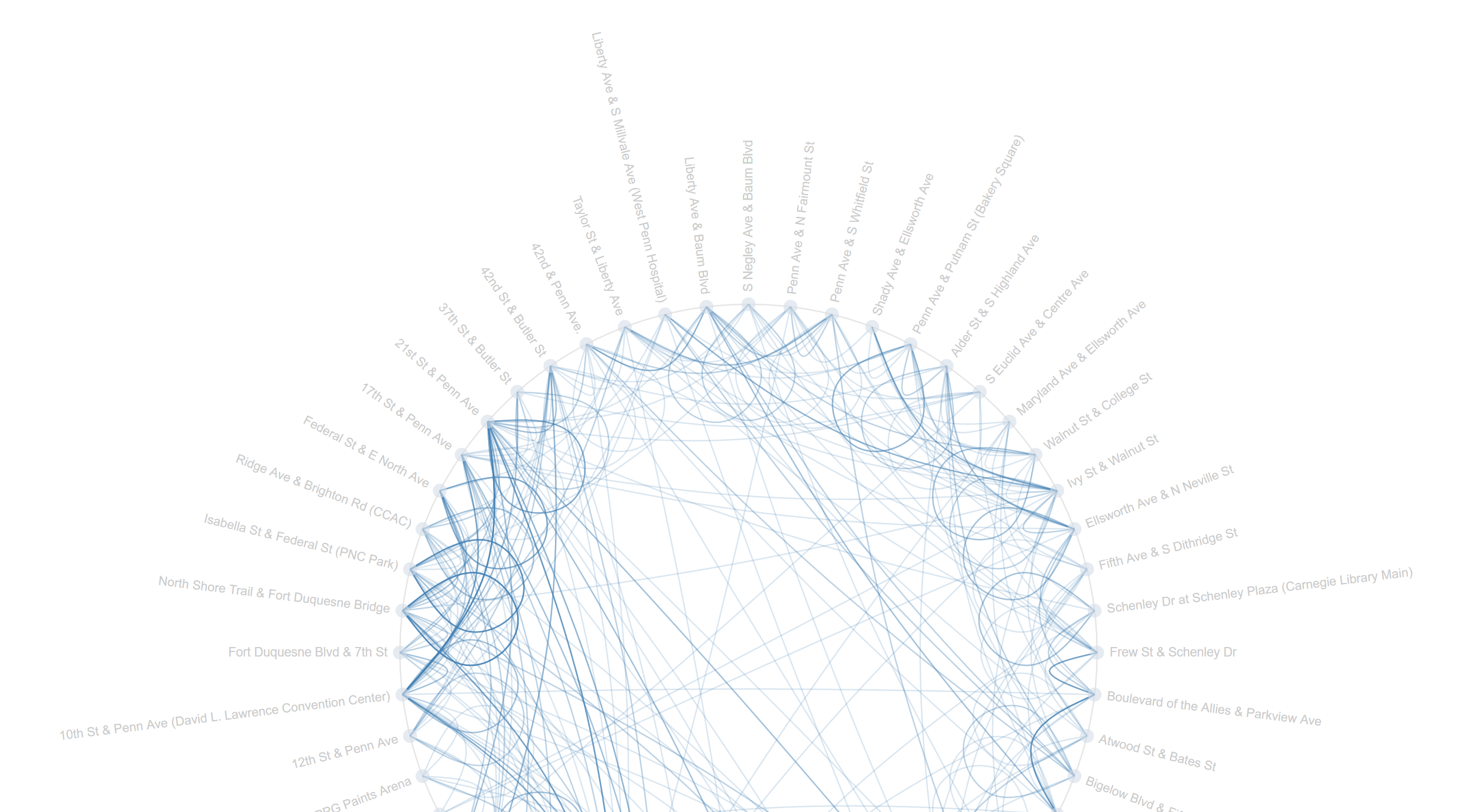
My plan was to map trips from every bike stop to every other bike stop in a chord diagram. I chose a chord diagram because I thought it reminded me of a wheel, and I thought “Hey, maybe I can make it spin, or decorate it to look like a wheel!” That all went out the window very soon.

I used a chord diagram from the D3 blocks website to achieve this, and honestly changed very little about it except for the colors, the scale of the little marks around the circle, and of course the data. The main code that I wrote was the Processing file that turned the data in the .csv file we had into data I could work with. It created a two dimensional array, then incremented elements (A, B) and (B, A) by one for every trip from station A to B, or station B to A. I chose to make the matrix symmetrical, and treat trips from A to B as equivalent to trips from B to A. Perhaps the other way may have been a bit more precise, but it also made the diagram even less readable. When the chords were thicker at one end than another, I didn’t really know what that meant, so I wanted to just keep the matrix symmetrical.

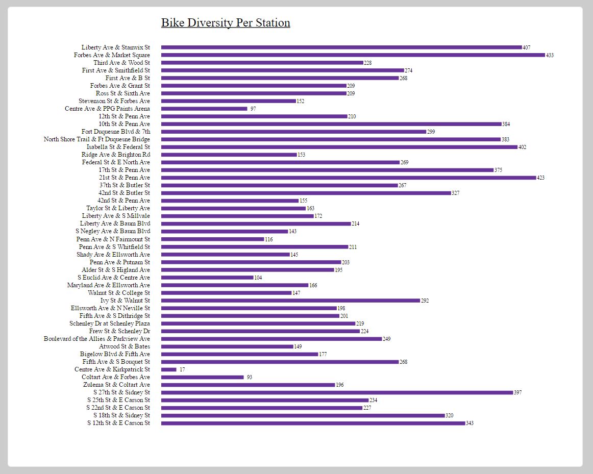
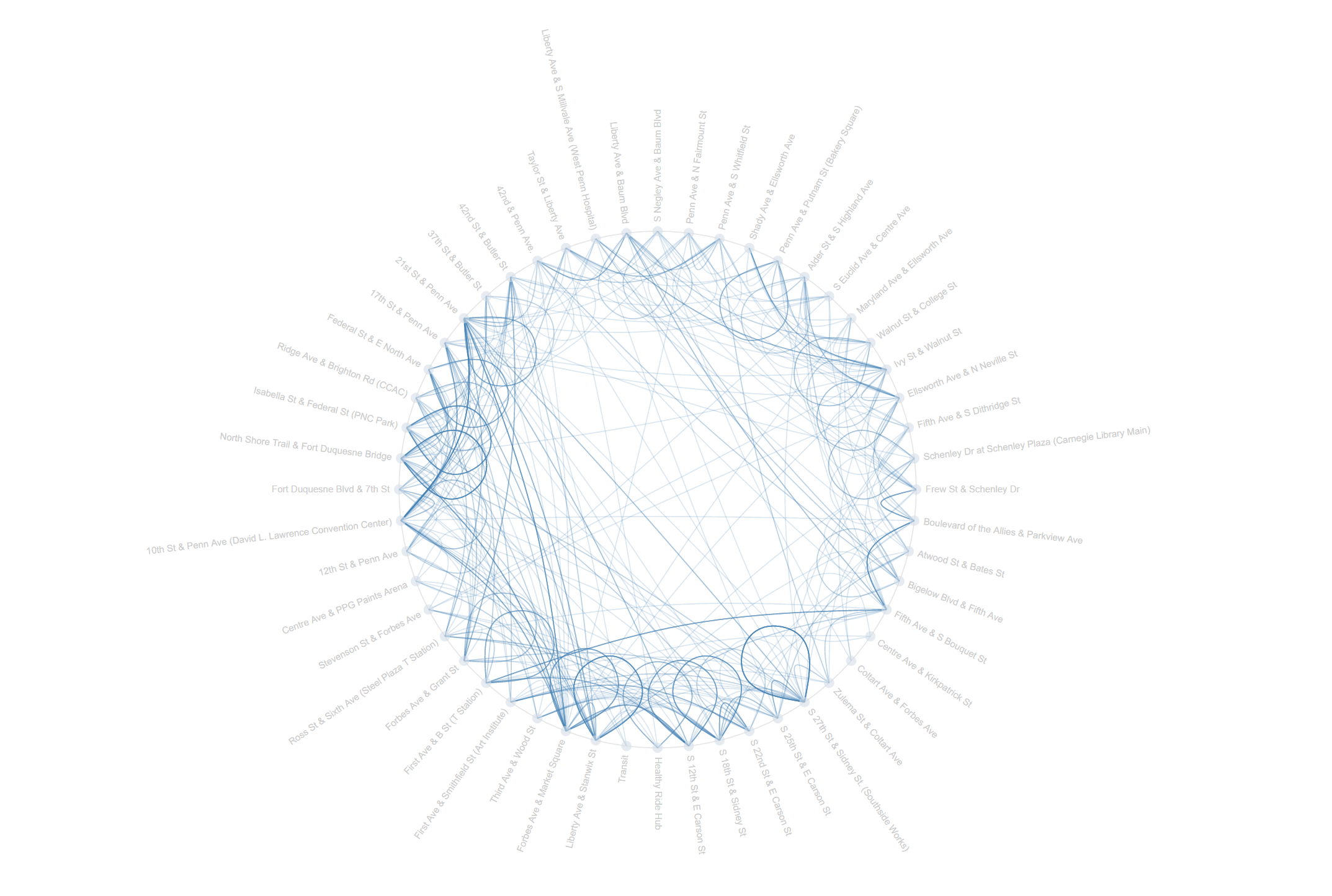
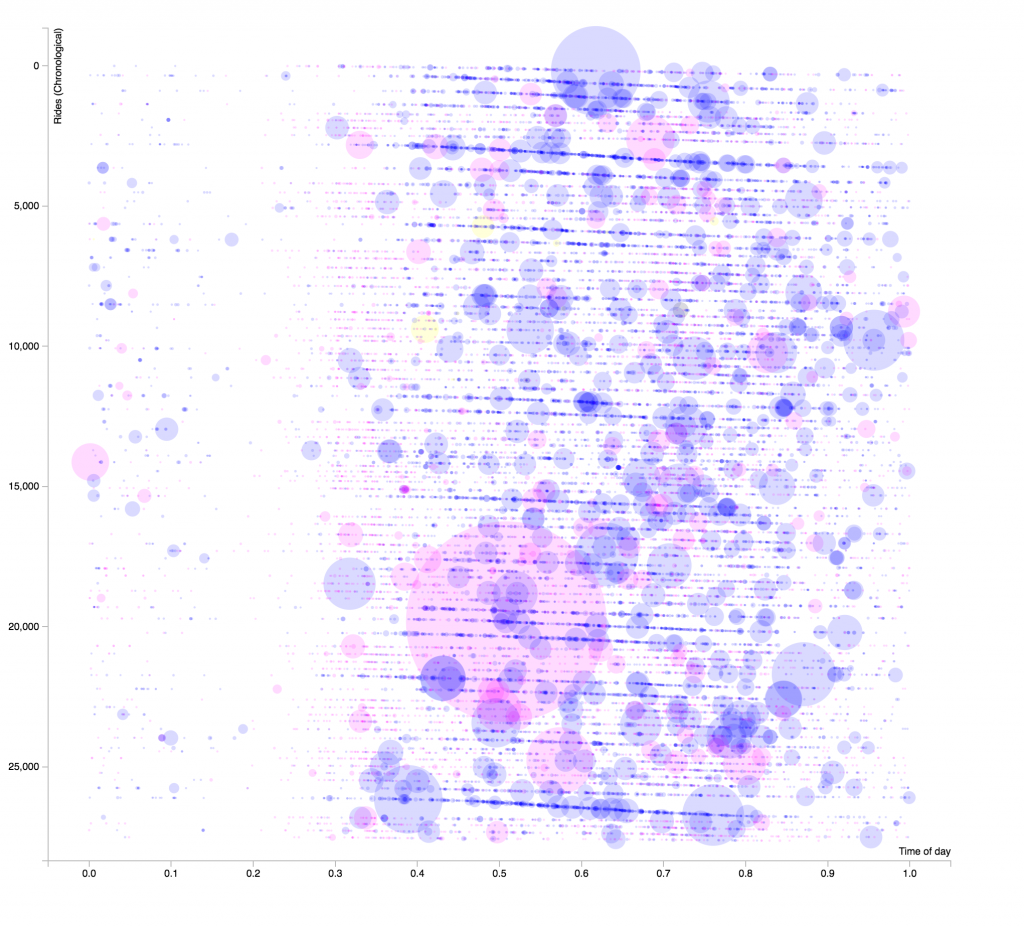
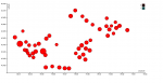
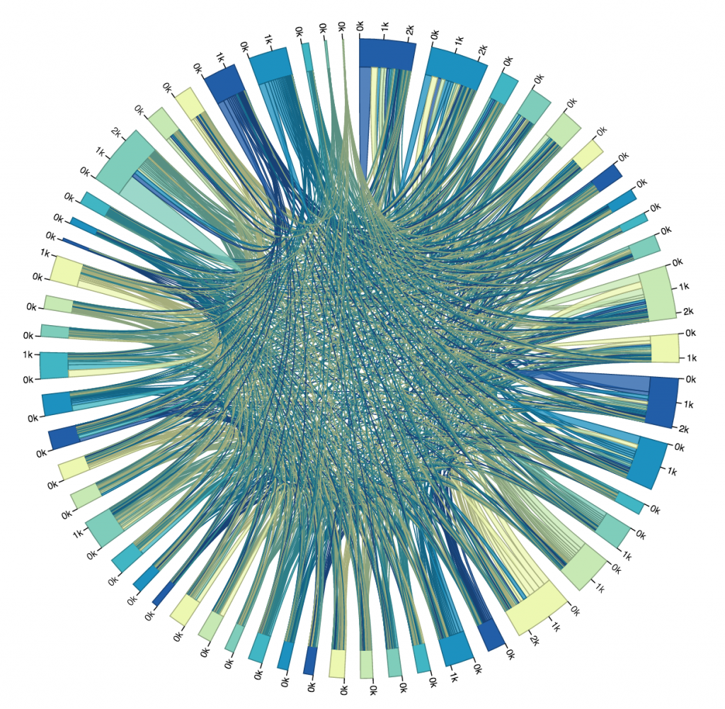
The Processing file generated a .txt file containing the matrix that I needed. After I generated it, I pasted it into the D3 in my HTML file, and then I displayed it as a graphic. It all went according to plan (I guess), but I hadn’t really thought about just how unrealistic it was to make a chord diagram of over fifty bike stops. As you can see in the image below, it was pretty much totally unreadable and unhelpful.

all-data-graph

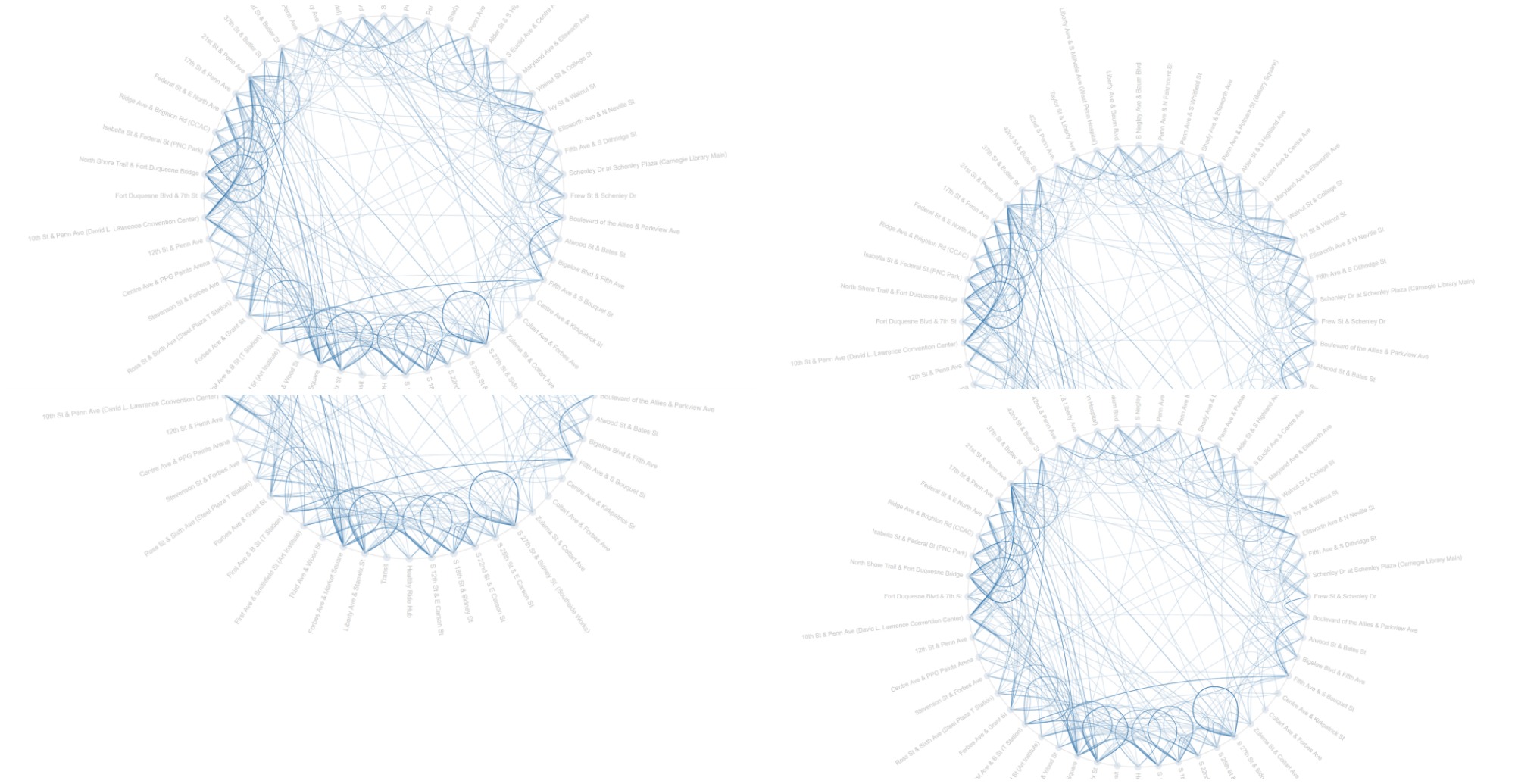
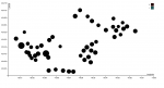
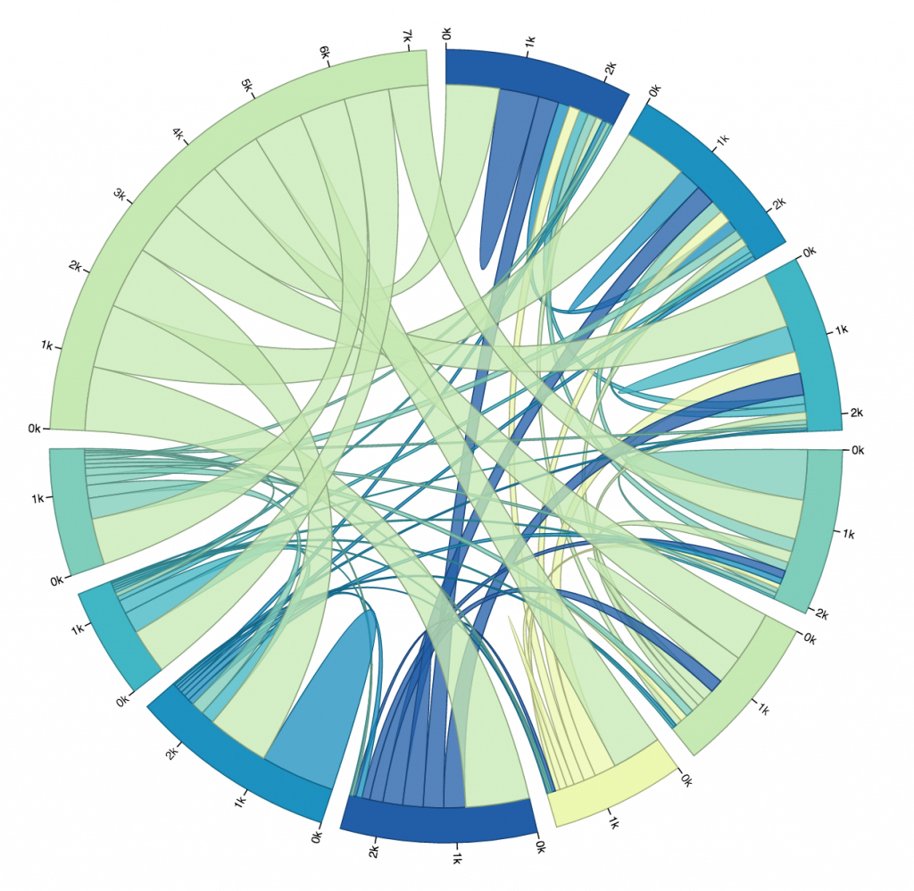
So, I looked at that first trial, picked out the ten busiest stops (I did this manually, not by writing code, just for time’s sake), and altered my code so that I could get a new matrix that only dealt with the ride data for the top ten busiest stops. You can see that iteration below. The eleventh, largest section of the circle in the upper left is the “other” section, representing rides from one of the ten busiest stations to or from one of the less busy stations. I chose to not display rides from “other” to “other,” because it wasn’t relevant to the ten busiest stops, and it dominated the circle when it was included.

green-top-10-graph

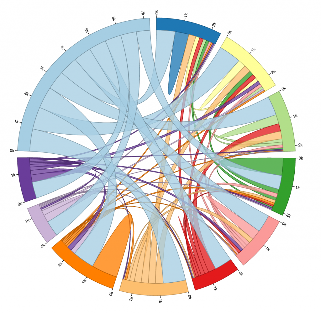
Here is another diagram representing the same data, just with a different color scheme. I don’t find this one as pretty, but it gives every stop its own unique color, which makes it slightly more readable. As you can see, every stop’s connectors are ordered from largest to smallest (going clockwise).

One thing I found quite interesting is how none of the ten busiest stops’ largest connector was to another one of the ten busiest stops. Most of them had the most rides to or from “other,” which is to be expected, I supposed, considering just how many other stations there are. Still, several of the stops have more rides to themselves than any other stop, more even than to all of the “other” stops! And a lot of the stops whose largest connector was to “other” still had more rides to themselves than to any of the other ten busiest stops.
I was surprised to see how common that was. I guess it isn’t all that weird to check out a bike for a while, ride it around for fun or for errands, and then bring it back where you found it without putting it away in between. Still, if I were to visualize more data I would like to look exclusively at rides that start and end in the same place, and see if there is any pattern there regarding the type of user that does this, or the time of day it is done.

colored-top-10-graph

All in all, this is a very very minimum viable product. I spent most of the week just struggling with D3, and while time constraints are no real excuse for poor work, I would like the record to reflect that I am very aware that this project is flawed. My biggest frustration is that the names of the stops in question are not displayed by the portion of the circle that represents them. I could’t figure out how to do that, but if I were to work more on this visualization, that would be my next priority.

Here’s a link to my code on github: https://github.com/JacquiwithaQ/60212/tree/master/Bike%20Data%20Visualization

Here is my Processing code for the version that only cares about the ten busiest stops:

int[][] matrix;
Table allRidesTable;

PrintWriter output; 

void makeMatrix(){
  matrix = new int[11][11];
  for (int i=0; i<11; i++){
    for (int j=0; j<11; j++){
      matrix[i][j] = 0;
    }
  }
  //Now our matrix is set up, but it's all zero. Now we need to fill it with values.
  allRidesTable = loadTable("HealthyRide Rentals 2016 Q3.csv", "header");
  //Trip iD,Starttime,Stoptime,Bikeid,Tipduration,From station id, From station name,To station id,To station name, Usertype
  int totalRides = allRidesTable.getRowCount();
  for (int row=0; row < totalRides; row++){
    TableRow thisRow = allRidesTable.getRow(row);
    int startStationID = thisRow.getInt("From station id");
    int endStationID = thisRow.getInt("To station id");
    println("Start ID = " + startStationID + ", End ID = " + endStationID);
    //We only want to map the 10 busiest stations, which are:
    //1000, 1001, 1010, 1012, 1013, 1016, 1017, 1045, 1048, 1049
    int startStationNumber= 10;
    int endStationNumber = 10;
    if (startStationID==1000) startStationNumber = 0;
    if (startStationID==1001) startStationNumber = 1;
    if (startStationID==1010) startStationNumber = 2;
    if (startStationID==1012) startStationNumber = 3;
    if (startStationID==1013) startStationNumber = 4;
    if (startStationID==1016) startStationNumber = 5;
    if (startStationID==1017) startStationNumber = 6;
    if (startStationID==1045) startStationNumber = 7;
    if (startStationID==1048) startStationNumber = 8;
    if (startStationID==1049) startStationNumber = 9;
    if (endStationID==1000) endStationNumber = 0;
    if (endStationID==1001) endStationNumber = 1;
    if (endStationID==1010) endStationNumber = 2;
    if (endStationID==1012) endStationNumber = 3;
    if (endStationID==1013) endStationNumber = 4;
    if (endStationID==1016) endStationNumber = 5;
    if (endStationID==1017) endStationNumber = 6;
    if (endStationID==1045) endStationNumber = 7;
    if (endStationID==1048) endStationNumber = 8;
    if (endStationID==1049) endStationNumber = 9;
    //println("Start Number = " + startStationNumber + ", End Number = " + endStationNumber);
    if (startStationNumber == endStationNumber){
      matrix[startStationNumber][endStationNumber] += 1;
    } else {
      //I will treat trips from station A->B and B->A as the same.
      //Direction does not matter for this data visualization.
      //So, the matrix will be symmetric.
      matrix[startStationNumber][endStationNumber] += 1;
      matrix[endStationNumber][startStationNumber] += 1;
    }
  }
  //Now the matrix is full of the number of rides from place to place.
}

void setup() {
  makeMatrix();
  output = createWriter("myMatrix.txt"); 
  int nRows = matrix.length; 
  int nCols = nRows;

  output.println("["); 
  for (int row = 0; row < nRows; row++) {
    String aRowString = "[";
    for (int col = 0; col< nCols; col++) {
      aRowString += matrix[row][col];
      if (col != (nCols -1)){
        aRowString += ", ";
      }
    }
    aRowString += "]";
    if (row != (nRows -1)) {
      aRowString += ", ";
    }
    output.println(aRowString); 
  }
  output.println("];"); 
  

  output.flush();  // Writes the remaining data to the file
  output.close();  // Finishes the file
  exit();  // Stops the program
}

And here is my Processing Code for the version that maps all stops:

int[][] matrix;
Table allRidesTable;

PrintWriter output; 

void makeMatrix(){
  matrix = new int[53][53];
  for (int i=0; i<53; i++){
    for (int j=0; j<53; j++){
      matrix[i][j] = 0;
    }
  }
  //Now our matrix is set up, but it's all zero. Now we need to fill it with values.
  allRidesTable = loadTable("HealthyRide Rentals 2016 Q3.csv", "header");
  //Trip iD,Starttime,Stoptime,Bikeid,Tipduration,From station id, From station name,To station id,To station name, Usertype
  int totalRides = allRidesTable.getRowCount();
  for (int row=0; row < totalRides; row++){
    TableRow thisRow = allRidesTable.getRow(row);
    int startStationID = thisRow.getInt("From station id");
    int endStationID = thisRow.getInt("To station id");
    println("Start ID = " + startStationID + ", End ID = " + endStationID);
    //Note that the station IDs range from 1000 to 1051, inclusive
    int startStationNumber = startStationID - 1000;
    int endStationNumber = endStationID - 1000;
    if (startStationNumber < 0 || startStationNumber > 51){
      //The Start Station number was invalid, and all invalid Stations will be called 52.
      startStationNumber = 52;
    }
    if (endStationNumber < 0 || endStationNumber > 51){
      //The End Station number was invalid, and all invalid Stations will be called 52.
      endStationNumber = 52;
    }
    println("Start Number = " + startStationNumber + ", End Number = " + endStationNumber);
    if (startStationNumber == endStationNumber){
      matrix[startStationNumber][endStationNumber] += 1;
    } else {
      //I will treat trips from station A->B and B->A as the same.
      //Direction does not matter for this data visualization.
      //So, the matrix will be symmetric.
      matrix[startStationNumber][endStationNumber] += 1;
      matrix[endStationNumber][startStationNumber] += 1;
    }
  }
  //Now the matrix is full of the number of rides from place to place.
}

void setup() {
  makeMatrix();
  output = createWriter("myMatrix.txt"); 
  int nRows = matrix.length; 
  int nCols = nRows;

  output.println("["); 
  for (int row = 0; row < nRows; row++) {
    String aRowString = "[";
    for (int col = 0; col< nCols; col++) {
      aRowString += matrix[row][col];
      if (col != (nCols -1)){
        aRowString += ", ";
      }
    }
    aRowString += "]";
    if (row != (nRows -1)) {
      aRowString += ", ";
    }
    output.println(aRowString); 
  }
  output.println("];"); 
  

  output.flush();  // Writes the remaining data to the file
  output.close();  // Finishes the file
  exit();  // Stops the program
}

And here is my HTMl/D3:


Drewch – Visualization

Hahahaaylmao

I totaled the amount of time spent on a bike that launched from a certain station and sorted them from least to most. This could happen because people from that station need to get to a far-away place, or because there is just a large quantity of bikes launched from that station.

The station IDs are scrunched on the X axis and the Y axis makes no sense. We love you D3.

Ok, I would have posted a link to github but it seems like I did not save the processing code part. All I did was add into a dictionary the station number key if it was not already in the dict, but if it was, I added the duration that that bike had to that key. Then I sorted them by least to most and println()ed.

Krawleb-Vizualization

screen-shot-2016-11-04-at-2-14-14-am

This is a graph of all the rides in their most recent quarter. The Y axis is rides chronologically, the first ride at the top and the last at the bottom.

The X axis is the time of day, from early in the morning to late at night.

The size of the circles indicates the duration of the ride, and color corresponds to the type of rider. Pink is subscriber, Blue is customer, and Yellow (very rare) is daily pass.

The number labels are misrepresentitive, as I had to do some hacky conversions to make this work. 😉

Github

(more documentation coming soon!)

Xastol – Visualization

bar_pie_bike_xastolgif

For the data visualization of Healthy Ride Pittsburgh, I wanted to figure out the specifics of the bikes used. I wanted to figure out, “What’s the most popular bike used?”


Given the data for Quarter 1 of 2016, I used Excel and D3 to solve this question. Using Excel, and its formulas, I was able to deduce what bike was taken for the most rides. I then divided the data between the two user types: Subscribers and Customers. After creating these two separate files, I totaled the data for each user type and then concatenated it into a final file. Using this final information, I then used the bl.ocks example for Pie Charts and Bar Graphs (http://bl.ocks.org/NPashaP/96447623ef4d342ee09b) to represent the information.


After observing the data, I found that the majority of 61 rides, using the most popular bike (Bike ID: 70342), were initiated by customers (36:25 for customer:subscriber). This ratio seems to be applicable to the entire Healthy Ride Pittsburgh system. Additionally, I found that the bike had a lot of minutes on it compared to most bikes. This is primarily because it is the most popular bike. However, this bike also had one of the longest trips accounted for in the entire system (initial Healthy Ride Pittsburgh Q1 2016 Data).


From this quantitative data, I then began to question more about the bike:

Does it have the most comfortable seat out of the surrounding bikes? Does it ride the smoothest? Are there certain aesthetic qualities that make it more appealing to most bikes? Is it just by chance that this bike has become the most popular bike and is it actually identical in quality to others?

Only further research of the bike’s physicality can help me answer this question. I hope that one day, if I do find myself using Healthy Ride Pittsburgh, that I’ll come across Bike 70324 and determine for myself if its popularity is based on chance or fact.

 
github link: https://github.com/xapostol/60-212/tree/master/70342%20BIKE%20DATA%20-%20xastol

hizlik-visualization

screen-shot-2016-11-03-at-6-21-05-pm

You can view the project live here. IT TAKES 20-30 SECONDS TO LOAD

Chart: It shows the amount of departures from stations per hour. Using this, you can kind of see how some stations have more people taking bikes in the mornings and some have more people taking them at nights (possibly to/from work?). Y axis = number of departures, X axis = station.

Making of: It was remarkably hard using d3, just like we were warned (that it takes a different kind of thinking). That said, I’m fairly happy with how it turned out, for a simple chart. I could not fix the x-axis names (I wanted them to be vertical) and could not get animations working. I also would have preferred to have a max-height that is consistent across all hours, rather than changing the scale of the chart. But I couldn’t figure that out either. I couldn’t get the axis titles to show up either, so I ended up not using them.

Ngdon-Visualization

Number of Rents and Returns during Weekdays and Weekends

snip20161102_1

Interesting observations:

  • There are two peaks (8 am and 5 pm) during week days, probably people going to work and going back from work.
  • Bikes are used more to go home than to go to work.
  • People wake up late during weekends.
  • Nobody try to rent bikes when its 3-4 am. There are only returns.

Top Ten Most Ridden Bikes

snip20161102_3

The most popular bike of the quarter is Bike #70145, which has been ridden for almost 300 hours! The least popular bike is Bike #70008, which has been ridden only for about 10 minutes during the quarter.


Rents and Returns at Stations

snip20161104_10

Interesting observations:

  • There’s more traffic near city center.
  • People tend to rent their bikes at small stations and return them at larger ones.


I really enjoyed making this assignment. There seemed to be so much interesting information that I can extract from the data, and I kept thinking of possible visualizations I can do.

d3 felt strange at first, but soon I got used to it and started to admire its beauty. However for some of the features (for example one bar on top of another in the first chart) I couldn’t figure out how to make them using the idiomatic d3 way, so I used some hackish processing-like method to achieve them.


/*    HIDDEN INITIALIZATION BLOCK    */

// Select the DOM element
var parent = d3.select("#visualization");

// Set up the margins
var bbox   = parent.node().getBoundingClientRect();
var margin = {top: 50, right: 50, bottom: 50, left: 50};
var width  = +bbox.width - margin.left - margin.right;
var height = +bbox.height - margin.top - margin.bottom;

// Define svg as a group within the base SVG.
var svg = parent.select("svg").append("g")
    .attr("transform", "translate(" + margin.left + "," + margin.top + ")");

/*  END HIDDEN INITIALIZATION BLOCK  */
var data1 = []
var data2 = []

for (var i = 0; i < 49; i++){
  data1.push(0)
  data2.push(0)
}

var datat = []
var mapdata = null;
var stations = null;
var rentals = null;

function isweekday(t){
  var dt = t.split(" ")[0].split("/")
  var date = new Date(dt[2],dt[0]-1,dt[1])
  var fmt = d3.timeFormat("%a")
  
  return ["Mon","Tue","Wed","Thur","Fri"].indexOf(fmt(date)) != -1
}


d3.json('http://d3.workergnome.com/examples/basic_map/data.geojson', function(loaded_data1) {
  d3.csv('db/HealthyRideStations2016.csv', function(loaded_data2) {
    d3.csv('db/HealthyRideRentals2016Q3.csv', function(loaded_data3) {
      mapdata = loaded_data1;
      stations = loaded_data2;
      rentals = loaded_data3;

      var s1 = 1
      var s2 = 1
      for (var i = 0; i < rentals.length; i++){
        var shr = +rentals[i]["Starttime"].split(" ")[1].split(":")[0]
        var ehr = +rentals[i]["Stoptime"].split(" ")[1].split(":")[0]
        if (isweekday(rentals[i]["Starttime"])){
          data1[shr]+=1
          data2[ehr]+=1
          //s1++
        }else{
          data1[shr+25]+=1
          data2[ehr+25]+=1
          //s2++
        }
      }
      console.log([s1,s2])
      for (var i = 0; i < 24; i++){
        datat.push((data1[i]+data2[i])/s1)
      }
      for (var i = 24; i < data1.length; i++){
        datat.push((data1[i]+data2[i])/s2)
      }
      var x = d3.scaleLinear().domain([0, d3.max(datat)]).range([0, height]);
      var x2 = d3.scaleLinear().domain([0, d3.max(datat)]).range([height, 0]);
      var d1s = []
      var d2s = []

      for (var i = 0; i < 24; i++){
        d1s.push(x(data1[i]/s1));
        d2s.push(x(data2[i]/s1));
      }
      for (var i = 24; i < data1.length; i++){
        d1s.push(x(data1[i]/s2));
        d2s.push(x(data2[i]/s2));
      }

      // define the bar width
      var barWidth = width/data1.length;

      // set up the x scale
      var col1 = d3.rgb(190,195,195)
      var col2 = d3.rgb(200,190,190)
      var col3 = d3.rgb(170,175,175)
      var col4 = d3.rgb(180,170,170)
      
      console.log(data1)
      console.log(data2)
      // Create each bar, select the enter selection, and append a svg group.

      svg.append("g")
        .attr("transform", "translate(-4,-2)")
        .call(d3.axisLeft(x2).ticks(10))
        .attr("font-family", "sans-serif")
        .attr("font-size", 8)
        .attr("opacity",.3)

      svg.selectAll("rect.i")
        .data(d1s).enter()
        .append("rect")
        .attr("class", "i")
        .attr("x",function(d,i){return i*barWidth})
        .attr("y",function(d,i){return height-d-d2s[i]})
        .attr("width",barWidth*0.9)
        .attr("height",function(d){return d})
        .attr("fill", function(d,i){if (i < 25){return col1}else{return col2}})

      svg.selectAll("rect.ii")
        .data(d2s).enter()
        .append("rect")
        .attr("class", "ii")
        .attr("x",function(d,i){return i*barWidth})
        .attr("y",function(d,i){return height-d-1})
        .attr("width",barWidth*0.9)
        .attr("height",function(d){return d})
        .attr("fill", function(d,i){if (i < 25){return col3}else{return col4}})

      var ts = 8
      svg.selectAll("text.i")
        .data(d2s).enter()
        .append("text")
        .attr("class", "i")
        .attr("x",function(d,i){return (i+0.45)*barWidth-ts/2})
        .attr("y",function(d,i){return height+8})
        .attr("fill", function(d,i){if (i < 25){return d3.rgb(170,175,175)}else{return d3.rgb(180,170,170)}})

        .attr("font-family", "sans-serif")
        .attr("font-size", ts)
        .text(function(d,i){if ((i%25)%2 == 1 && (i%25) != 24){return i%25}else{return ""}})

      var ww = ["Weekdays","Weekends"]
      svg.selectAll("text.ii")
        .data(ww).enter()
        .append("text")
        .attr("class", "ii")
        .attr("x",function(d,i){return (i*barWidth*25+10)})
        .attr("y",function(d,i){return 10})
        .attr("fill", function(d,i){if (i < 1){return d3.rgb(170,175,175)}else{return d3.rgb(180,170,170)}})

        .attr("font-family", "sans-serif")
        .attr("font-size", 10)
        .text(function(d,i){return d})


      //drawing the legend
      var t1 = svg.append("text").attr("x", barWidth*data1.length+8).attr("y", height+8)
        .attr("font-family", "sans-serif").attr("fill","silver").attr("font-size", 8).text("O'Clock");        

      var bx = svg.append("rect").attr("x", width-20).attr("y", 50)
        .attr("width", 50).attr("height",50).attr("fill","none").attr("stroke","Gainsboro") 

      var l1 = svg.append("rect").attr("x", width-15).attr("y", 60).attr("width", 10).attr("height",10).attr("fill",col1) 
      var l2 = svg.append("rect").attr("x", width-15).attr("y", 80).attr("width", 10).attr("height",10).attr("fill",col3) 

      var lt1 = svg.append("text").attr("x", width-2).attr("y", 67)
        .attr("font-family", "sans-serif").attr("fill","silver").attr("font-size", 7).text("Rents"); 

      var lt2 = svg.append("text").attr("x", width-2).attr("y", 87)
      .attr("font-family", "sans-serif").attr("fill","silver").attr("font-size", 7).text("Returns"); 

    });
  });


});


Lumar-DataViz

Onboarding experience as a rushed customer for healthyride:

See the actual footage here:

screen-shot-2016-10-28-at-5-31-18-pm

1.Short on time

timing

2. Oh look! Bike share!

ooo

3.What a confusing Kiosk

so-angry_2

4. IT WON’T COME OOOOOFFF

it-wont-come-off

5.SO ANGRY. STORMS OFF LATE.

stormsoff


If I wanted to figure out how to improve this onboarding experience I would need to know the kind of users that are more likely to use HealthyRide and in which ways. Determining for whom I’m designing for is vital!

With this in mind, I took the data for each station in 2016, and extracted the latitude, longitude, and distribution between subscriber vs. customer. This would’ve been my filthy hack method of getting the map assignment done as well. The size of the circles plotted is proportional to the number of users (and extrapolated from there, possibly the type of audience that is more likely to become users and thus the kind of people we want to ensure the onboarding process is smooth for. The reasoning isn’t perfect because one can also argue that the smaller circles represent an area with an audience we should be designing even more for because

Once it’s finished the svg file generated can ripped and edited to have a map slipped under it in illustrator.

The size of the circles plotted is proportional to the number of users (and extrapolated from there, possibly the type of audience that is more likely to become users and thus the kind of people we want to ensure the onboarding process is smooth for. The reasoning isn’t perfect because one can also argue that the smaller circles represent an area with an audience we should be designing even more for because clearly they aren’t using Healthy Ride enough….so my scenario doesn’t quite as easily work application wise in the research process….that’s ok)

The color…well….it was supposed to be an interpolation between yellow and blue correlated to the proportion of subscribers vs. customers from each station, but apparently the d3.interpolateCool/Warm/Plasma/all those cool color scales come in a seperate d3 library.

screen-shot-2016-11-04-at-2-49-10-am

screen-shot-2016-11-04-at-3-04-24-amscreen-shot-2016-11-04-at-3-14-23-amscreen-shot-2016-11-04-at-3-25-20-am

whywontitwork

whhhhhhhyyyyyyy is this blurrrrry?!?!


  D3 HealthyRide Visualization