Eyeo 2015 – Zach Lieberman, From Point A to Point B
Zach Lieberman is an American new media artist and programmer who has “a simple goal: he wants you surprised”. He describes the core of his work to be “augmenting the body’s ability to communicate”. He is the co-creator of openFrameworks and currently teaches at Parsons School of Design, where he received his MFA in Design and Technology.
Immediately upon speaking, Zach seems like such a down-to-earth, fun, and approachable guy, asking if the audience, “felt like family”. We all went on a “journey” because his talk was so humorous, engaging, deep, and human, and this latter point is want I was to discuss about Lieberman.
Zach stated he’s been to Eyeo 4 times and it’s been an emotional ride, where the first time he was really happy because it was his first time, the second time he was heartbroken for some reason, the third time he was happy again because he had just opened a new school (School for Poetic Computation), but in this fourth talk, his father had just died three weeks ago. I was really moved because Zach still came to Eyeo to give his talk, making it a tribute to his Father’s belief that “The world needs stories. We are drowning in data, and we need people to weave stories.”
What struck me was how genuinely passionate he was about his work, you can just hear it by his enthusiastic tone and the number of times he said he was “obsessed” with things like how a line (he talked A LOT about this, it was so cool) can be used to separate or disconnect people, how the “world is all around us, we just need a way to see or hear it”, and how everything is about connections. To me, his work doesn’t come off as computational or cold, which is what I associate with most programmers (but then again, I haven’t had much exposure to a lot of creative computing projects yet so more to come in Looking Outwards :^) ).
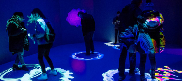
I really admire this because I think some of Lieberman’s work can be considered human-centered design, which is what I’ve been learning in the School of Design. I think the way that he talks about his thought process for his Play the World piano radio is inspirational for me as a designer. I saw it as another way to think about creating products that are engaging, emotional, memorable, and understanding of natural human behavior. Basically he created a program that makes the keys on a piano have the same pitch as a random song from around the world, so people can see and hear what African music might sound like and then suddenly from Rio de Janiero (go to 27:19 in the video to see how excited kids and adults got when they played this piano). One guy who played it said to Zach, “I need this in my life”. The current, sad stereotype with technology is that we’d rather be spending time on our smart phone screen than with close family and friends. I think Zach’s attitude and work shows that technology can touch upon topics that get people to see other people’s world views and stories, making it seems like the technology that we interact with now (mostly phones, tablets, and computers) is just the beginning and we will be having more intricate and thought provoking experiences.
Other cool projects that I didn’t touch upon:
- Last year, I designed a font with a friend, but Zach created a program to visualize a car’s movement into a font :O
- Zach, my instructor Golan (!!!!!!!), and others worked together to create an abstract, playful speech performance
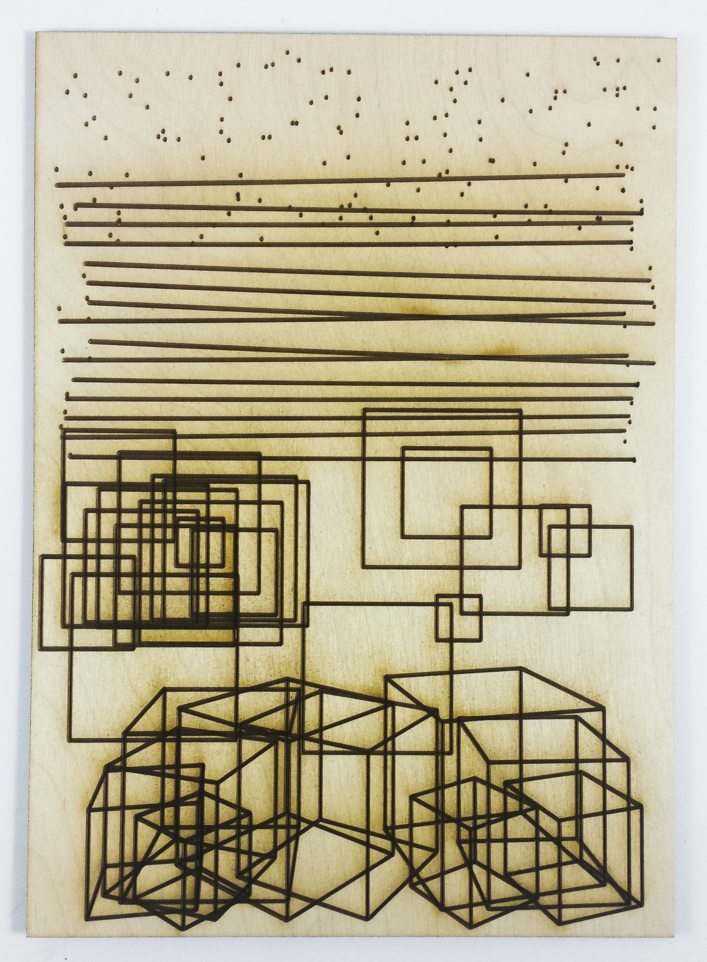
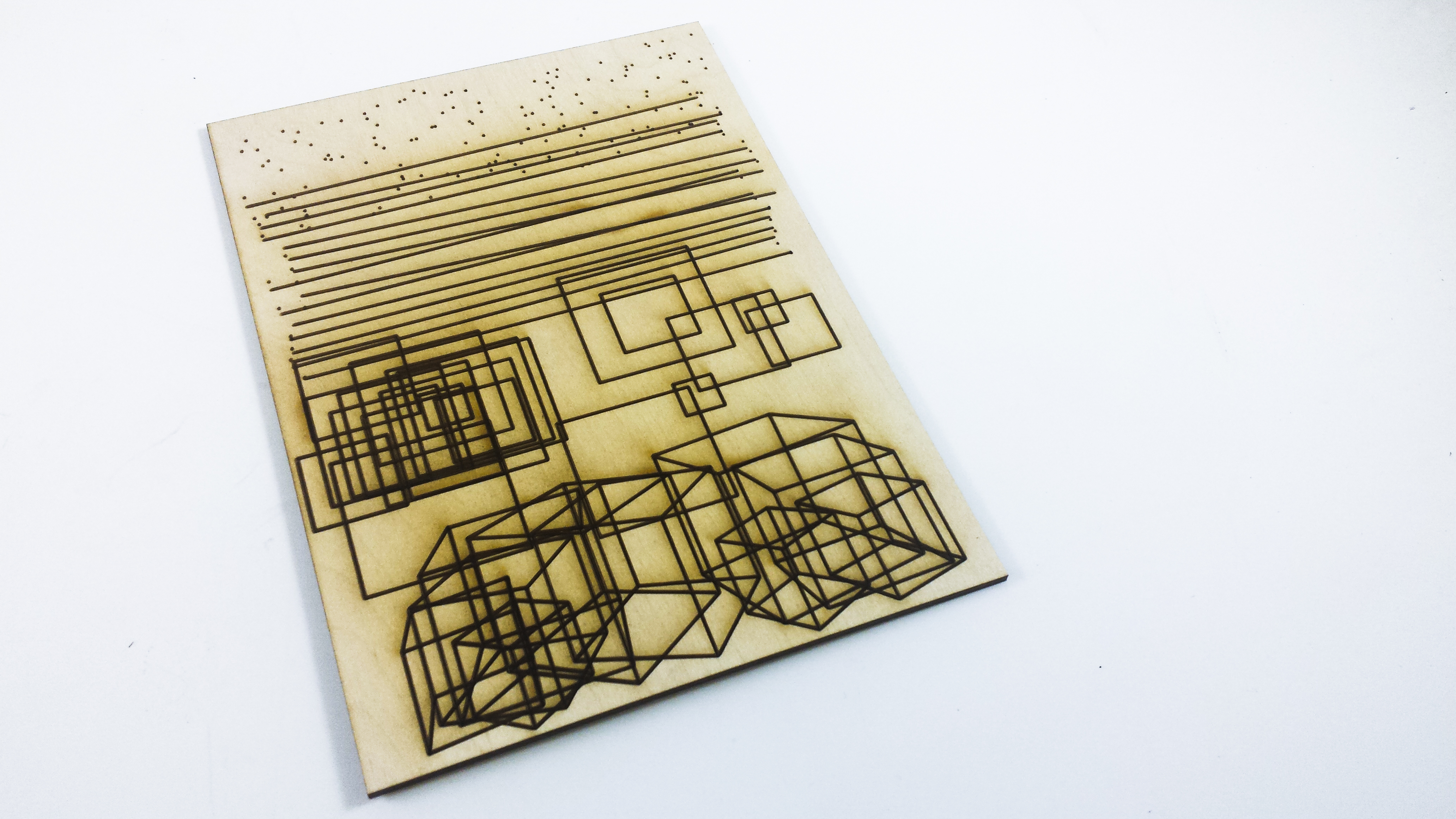
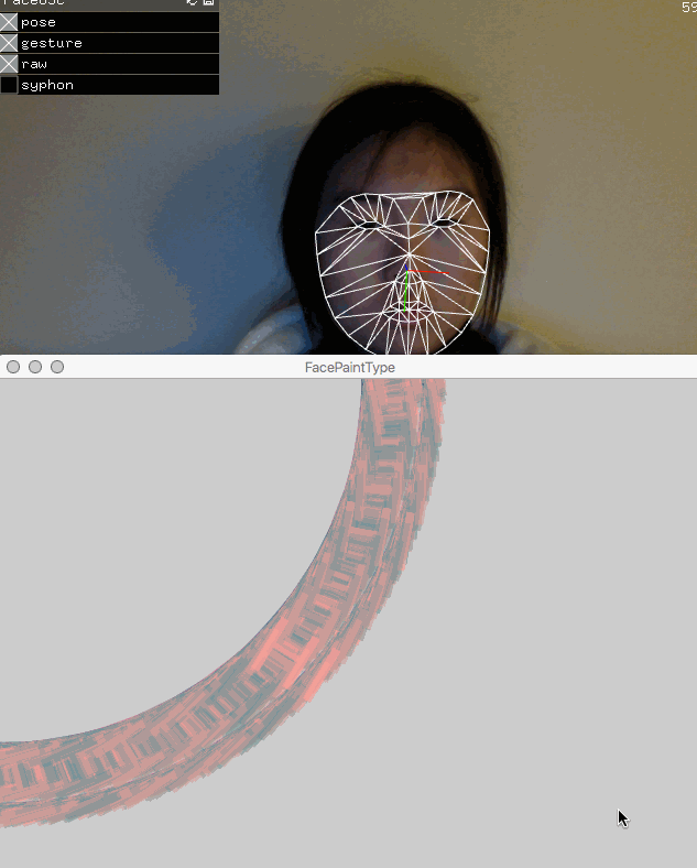
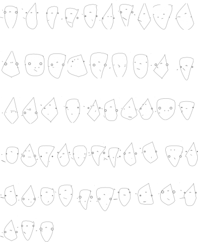
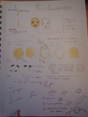
 Type as a path
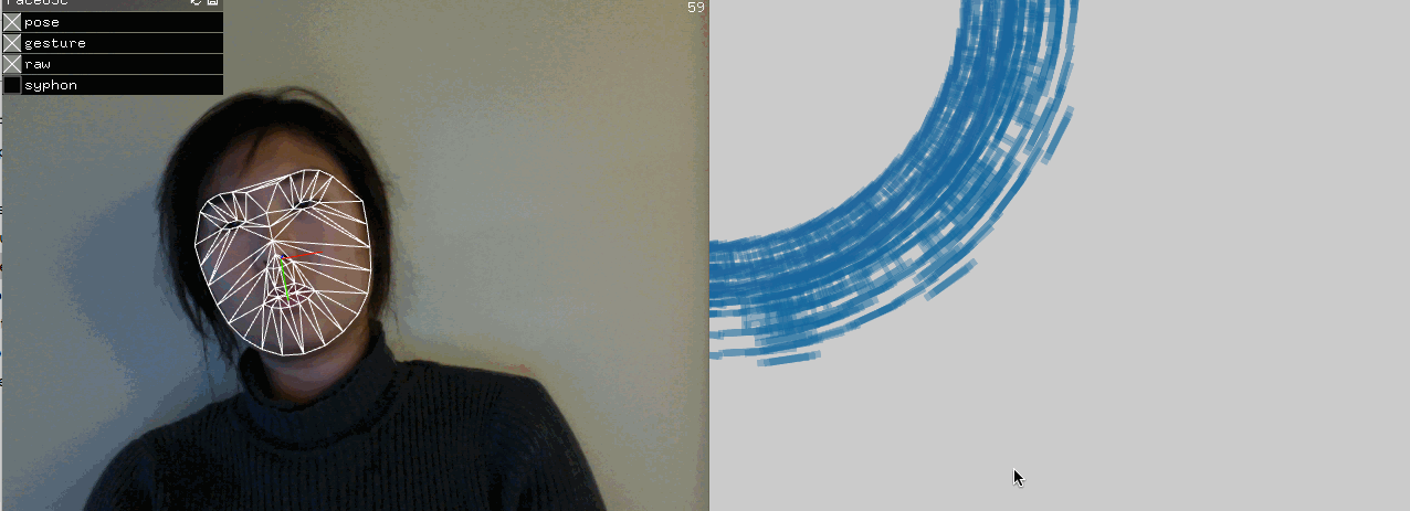
 Got into rotating type
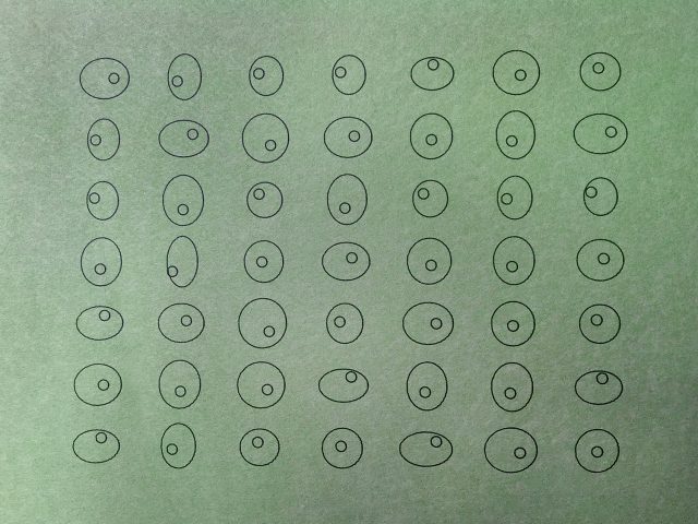
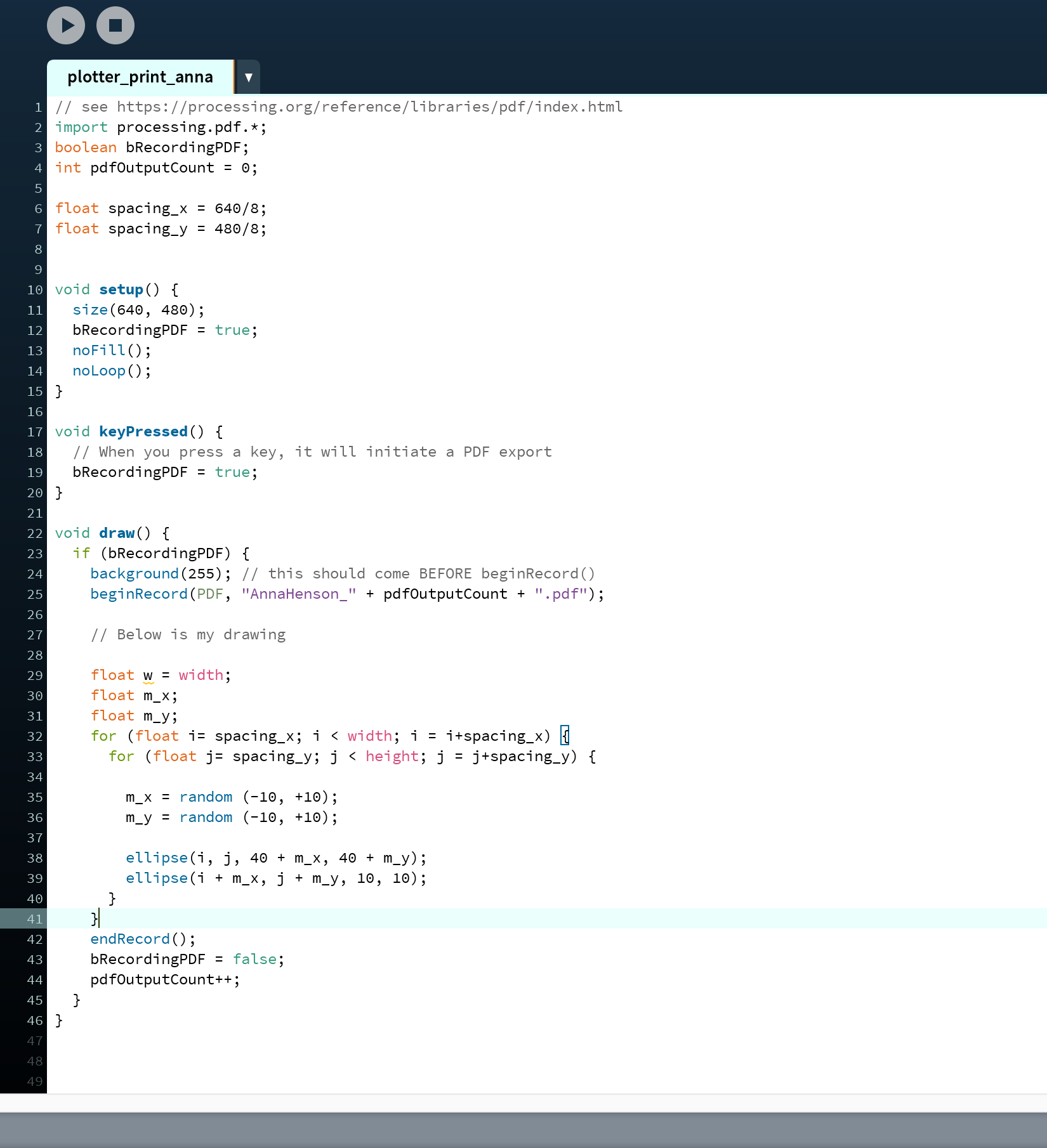

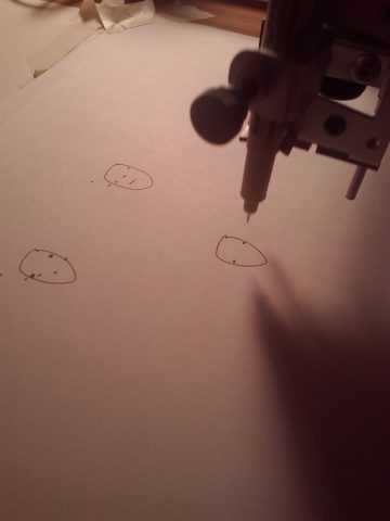
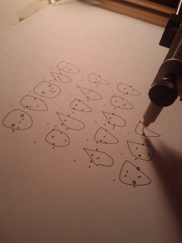
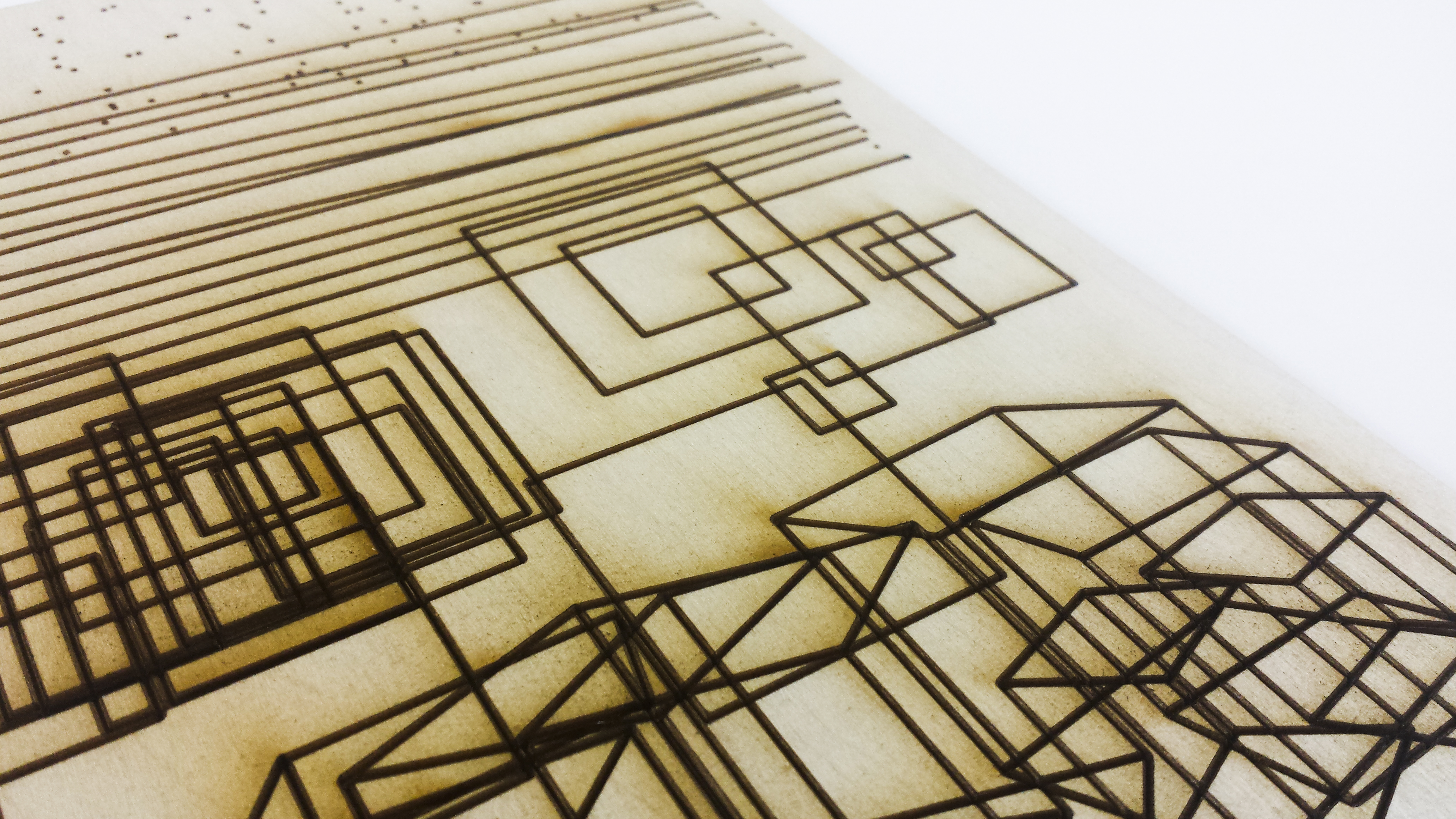
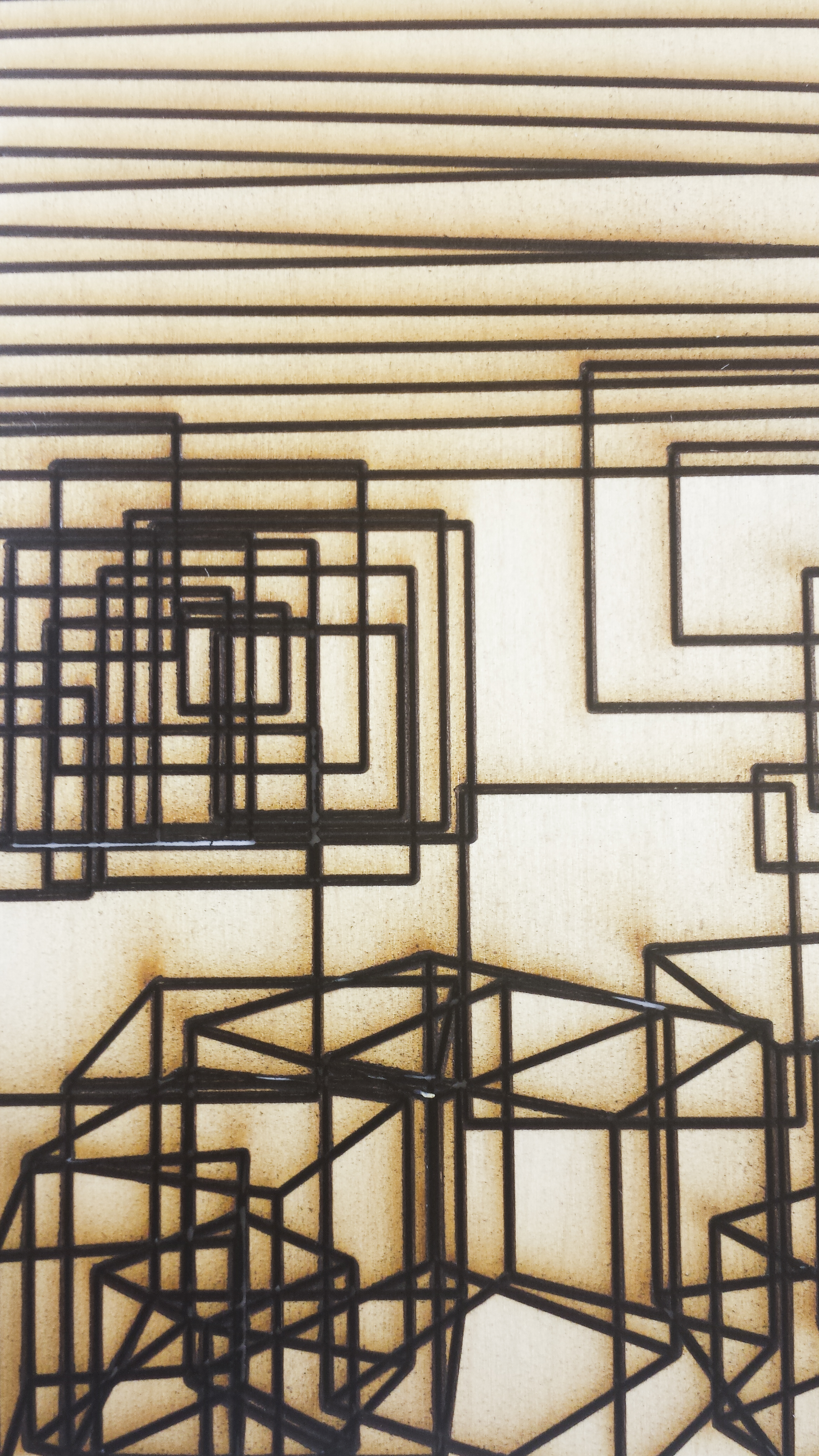
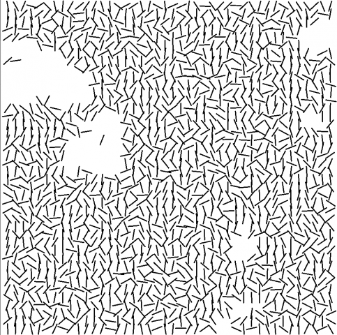
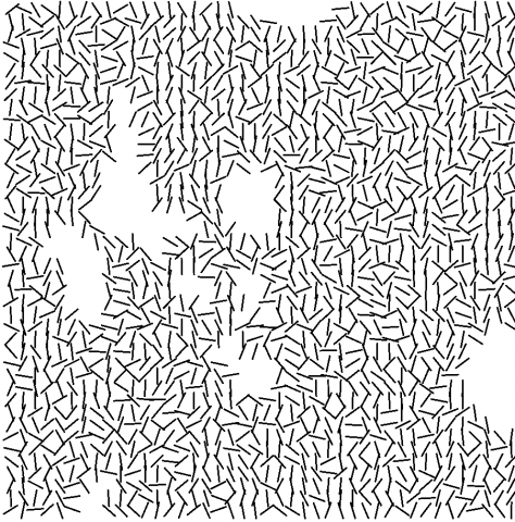
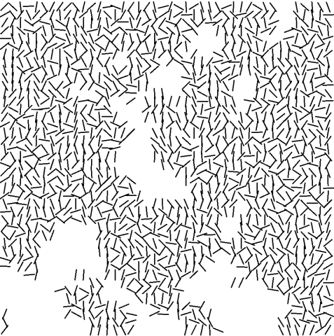
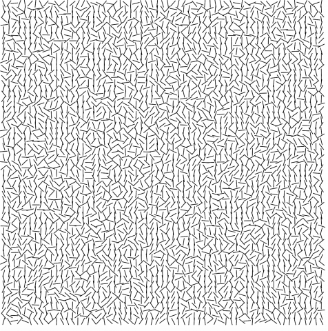
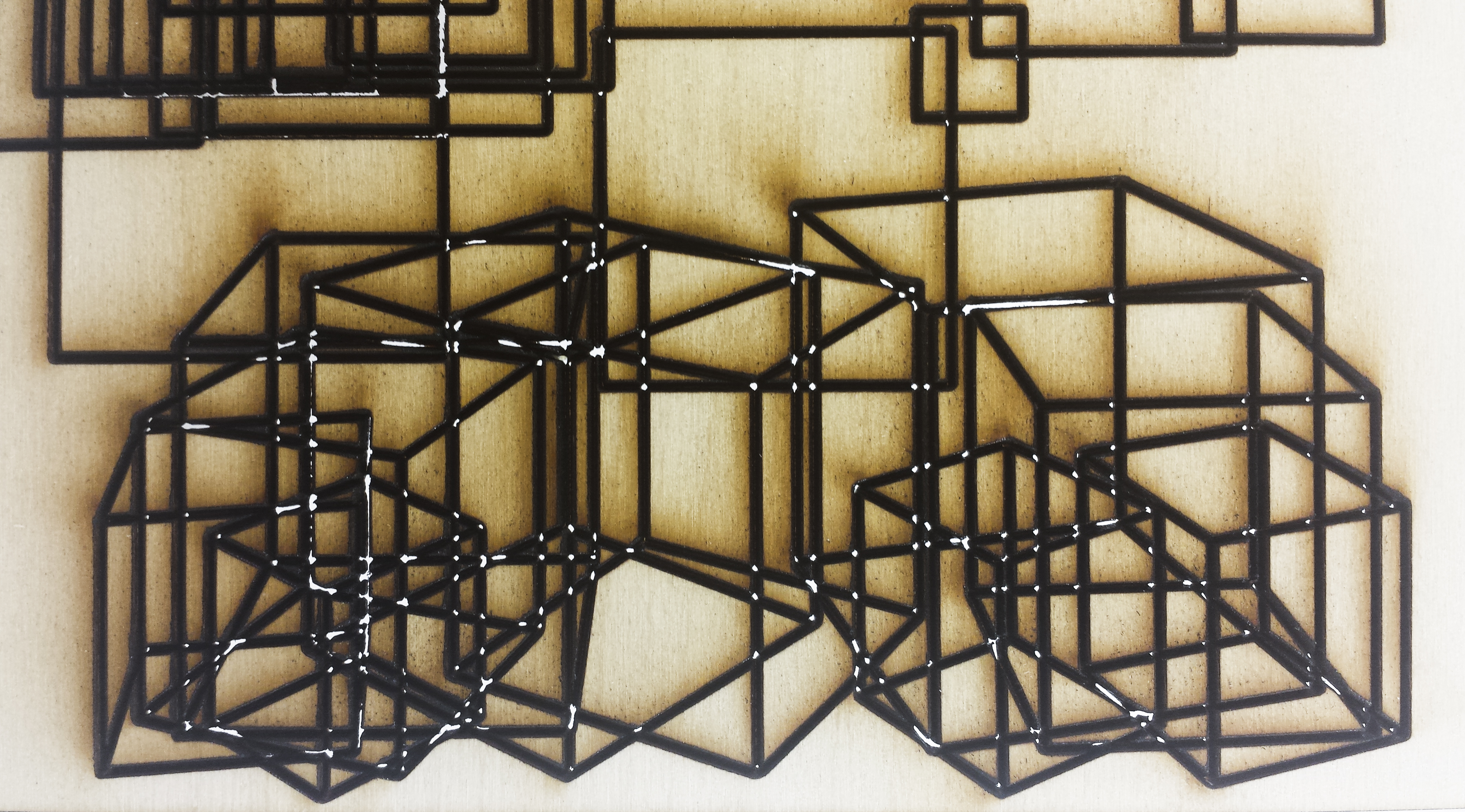 Power was a little too high for my first laser cut, but it was interesting to see certain parts poking through.