The Beginner’s Guide was a PC game I played on my classmate drewch’s Steam account (funny enough we both decided to create Unity games for our final projects).
The game uses narration and a series of another (likely fictional) game designer’s works to construct a sense of this unknown artist’s character. The game is really powerful not because of intensely beautiful visuals, story (in the traditional sense), or fun gameplay. It’s really about the way the viewer projects their own memories onto the works this unknown game designer seemingly created about his own problems.
The use of games as really an art medium made me want to explore games as part of my own practice. I’m also very interested in the use of lights within artworks. The simulation of lights within the Unity game space is something I wanted to play with. This led me to make something in Unity for the final project.
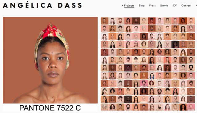
For my final Looking Outwards I decided to look at Angélica Dass; although she is not a tech artist she inspired much of my work for my game and my last project for this class.
Angélica Dass is a Brazilian photographer based in Madrid, Spain. She is most known for her exhibit Humanae which aims to explore the true variation between skin tones and challenges just what exactly makes us the classified race that we are– as she stated in her TEDTalk, “does it have to do with our origin, nationality or bank account?” She speaks on growing up in Brazil, which, like many Latin American countries and countries in general, culturally contains many implicit and explicit biases against people of darker complexions. Dass recalls being treated like a nanny or a prostitute many times because of her complexion, a story eerily similar to one I heard while interviewing a few Brazilian women for my project. This issue has improved tenfold since the times they are speaking of, however it has not been quite eradicated anywhere in the world.
Dass’ other pieces include Vecinas, a collaboration with the Mallan Council of Spain which aimed to reshape the perception of migrants and refugees of Mall through archived pictures and Dass’ photography, and De Pies A Cabeza, a series of photographs of people’s faces and their shoes. Her work challenges existing notions in a subtle and objective but very powerful way. Conceptually she is “goals” so to say; in my game and in a lot of my work I aim to achieve the same sense of subtlety she does with same amount of intellectual impact.
For part of my last project I was doing generative text, so I looked into ways neural networks can be used to do so. Golan pointed me to a couple of resources, and one of them seems particularly interesting and effective: http://karpathy.github.io/2015/05/21/rnn-effectiveness/
This author applied recurrent neural networks to wikipedia articles, Shakespeare, code, and even research papers, and the result is very realistic.
The model learned how to start and end quotation marks and brackets, which I think is one of the more difficult problems in text generation.
Generative paper.
Generative code.
I’m particularly fascinated by the way neural networks magically learn. Unfortunately I never got them to work so well in my final project.
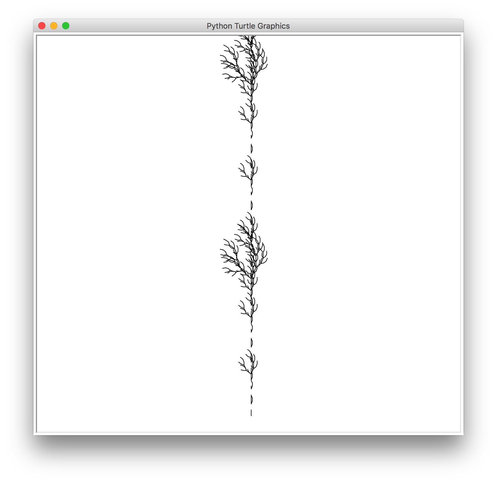
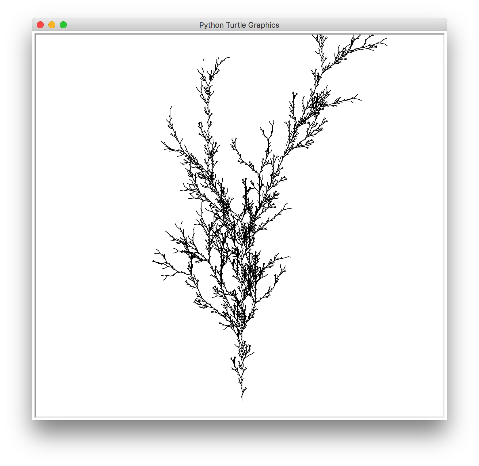
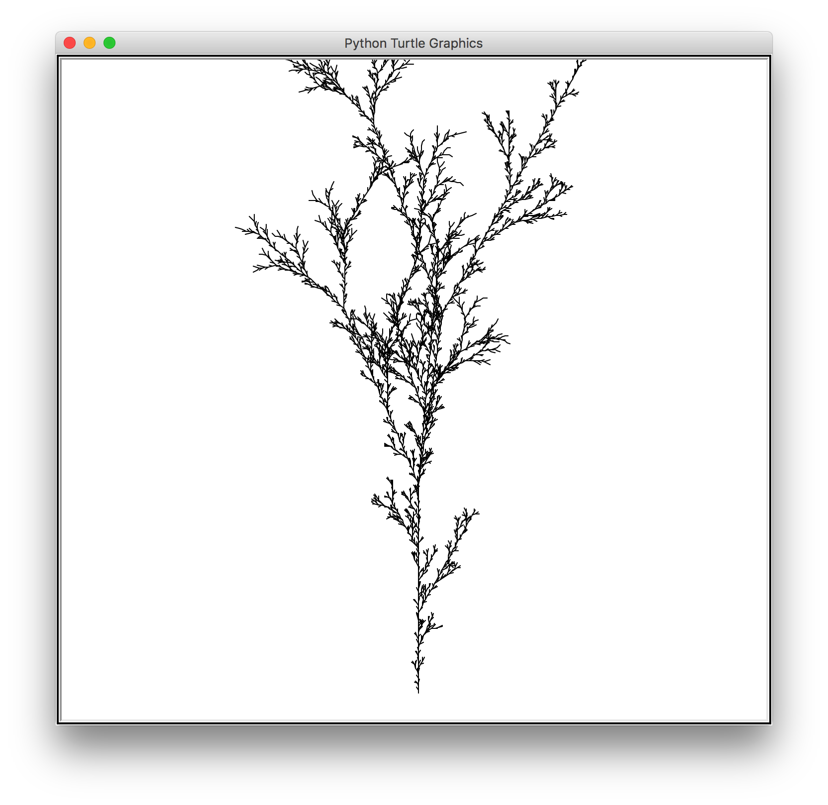
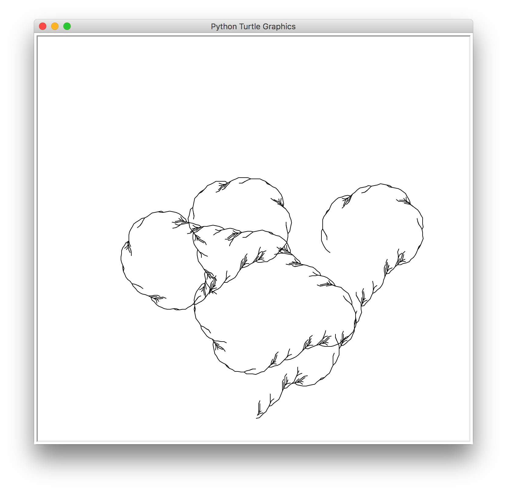
I was also planing to generate plants alongside my imaginary animals, so I also researched about L-system, which is a type of grammar that can be used to describe the shape of a plant.
I’m very interested in this system because it condenses a complicated graphic such a that of a tree into a plain line of text. And simply changing the order of a few symbols can result in a vast variety of different tree shapes.
For example, the above image can be simply described by the rule
(X → F−[[X]+X]+F[+FX]−X), (F → FF)
As I’m also doing text generation, I thought about the interesting possibilities of applying text generation methods onto the rules. So the shapes of the trees will not be limited by the number of rules that I can find, and exotic and alien-looking trees can be easily churned out.
Below are a couple of outputs I was able to get by applying Markov chain to existing l-system rules using python.
However more often the program generates something that resembles a messy ball of string. Therefore I’m still working on it.
For this project I decided to look at something related to my Teenie Harris Research.
The Loop Suite
Kids with Santa
Jason Salavon focuses his artistic practice around visual averages and overlays. Because he chooses datasets with high similarity, by layering all the images together you can pull out key insights about the situations depicted in the photographs. In the top image, you can get a sense of the shapes that come through in Chicago’s inner loop, very tall and long buildings. In the Santa photo, you notice that many of the children sit on the same leg and are very small, probably all less than 6 years old. I might end up trying this in my visual annotations of the Teenie Harris archive.
I’ve talked about Bound and Journey already in another LookingOutwards, and although the final project that I created is inspired by it in spades, I’ll take this moment to talk about a few other games that really influenced me and my decisions.
First is AntiChamber. I think the above video was purposely designed to confuse you, which is fitting, because the game was designed to confuse you anyways. There is a mastery of the psychological meaning of the game’s mechanics, and with it, an incredible revelation that most players go through at some point: the greatest obstacle you’ll ever face in this game is yourself.
Next up are Stanley Parable, and The Beginner’s Guide.
The big difference about these two games compared to the previous ones I mentioned is that dialogue (monologue?) is the biggest thing that drives player progression. The games/levels are designed to catch the player off-guard, and the narrators try to make players think over what they’re seeing/doing.
My goal for this project (but hopefully better accomplished in future projects) is to tap into the power of surprise and introspection, things that all of the aforementioned games do masterfully.
Theo, Emily, and Nick’s works, and in particular Connected Worlds, have captivated me since the day I came across them; seriously, I was such a fanboy of Connected Worlds. By chance I came across their Eyeo talk to write about for my past LookingOutwards and I could not have been more grateful for that discovery.
It is December 2 and they just finished their presentation and I’m so giddy inside and I also lowkey want a picture with them but it’s okay.
Anyhow my last project will be an attempt to also make some virtual environment; personally I’ve never been as into VR or 3D, so I want the output to be purely run on the computer, reminiscent of a videogame/computer game environment. However the user manipulation and interaction persists, so ideally it would be some inferior Connected Worlds… I personally admire the aesthetics and graphics of Design I/O’s works, and would personally like to achieve my own style and effects with a similarly sleek, endearing, and effective designs. I also aim to execute a calm, serene environment–an innocent nature-scape.
Designers traditionally use grids to help their design of type. Type, even humanist type is still/can still be broken down systematically with math and geometry. How might I use computation to aid in design? Or to manipulate current types?
Other than that, the details of serif, stroke weight, relative x heights, ligatures, time period, etc all contribute towards a personality that each type holds. Great communications designers should be able to use them as they would aesthetic and communicative forms not merely words. When would you use one over the other?
What would I like to analyze/explore in computational type?
Create a new display type? Explore the anatomy of type? It’s history and cultural weight?
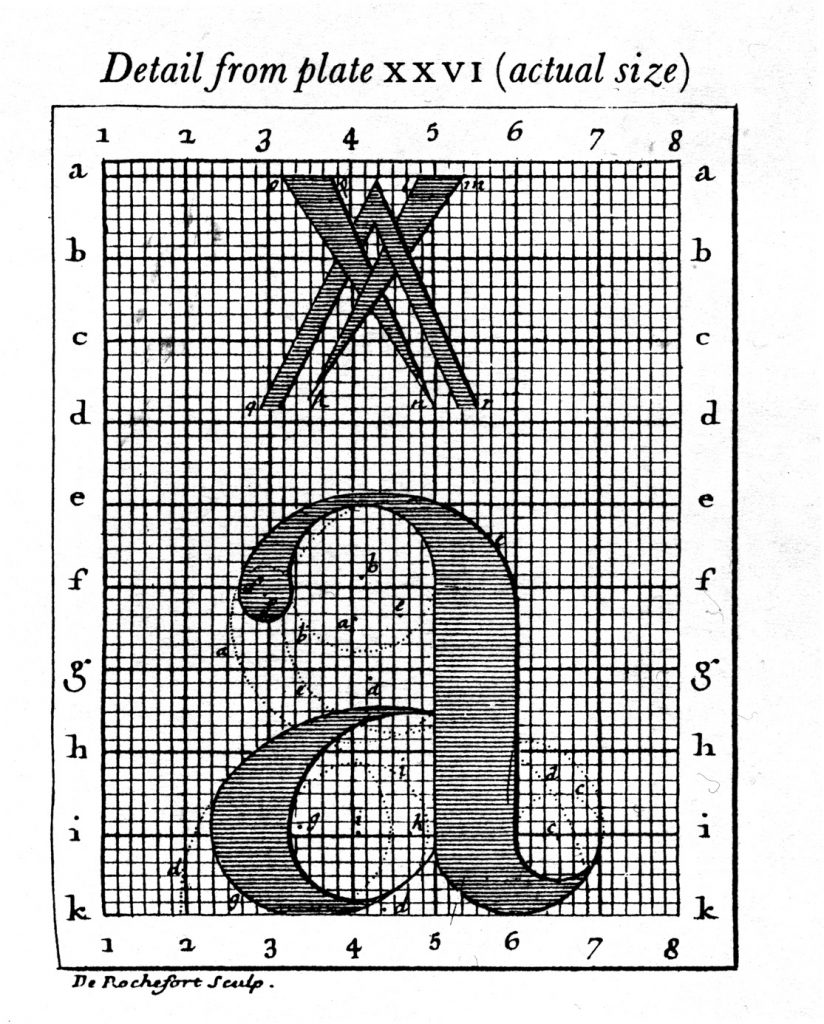
This is a particularly interesting example of the exploration of type anatomy:
MetaFont was possibly the world’s first parametrized typeface (created in 1977). It was created by Donald Knuth for the typesetting of his life-work The Art of Computer Programming. Most fonts are created by designing the outline of the font. When a typeface has to be created in different weights, you cannot just “grow” or “shrink” this outline computationally. A designer has to sit and create new outlines by hand. MetaFont takes a drastically new approach. Instead of being described by its outline, this font is represented by a series of variables inspired by handwriting:
Pen
Weight
Slant
Superness
Curlyness
By manipulating these variables you can create very different styles of the MetaFont, as shown in these screenshots.
In creating type in 3d, Ortho Type is a prominent example. It allows the user to manipulate the 3D view, width, height, depth, thickness and color of the typeface via UI controls. You can try it out here.
My only issue now that I’ve thought more about computaitonal type is….WHY? WHY DID I THINK IT’S A GOOD IDEA? Well, in our communications mini, we just started on our more in depth typeface project. I figured learning more about it in studio could be better compounded with exploration in 60212. Agh. I don’t know though. Any computational type I make I feel will not do what type is meant to do (which is be readable) while meeting the invisible standards of aesthetics that would make it valuable as art as well.
So….what am I going to do????
Jonathan Puckey has some very interesting things type-as-visuals that I think bypasses the usual hurdles computational type faces.
I love Professor Kyuha’s work – I just don’t know how to make it more than simply ‘decorating’ or making it ‘pretty’ with an added computational aesthetic.
Ben Cho (he made some really nice rule-based computational type amongst many other accolades and positions) , John Maeda and Stephen Benton wrote a paper together on computational type. It’s really long but quite interesting:
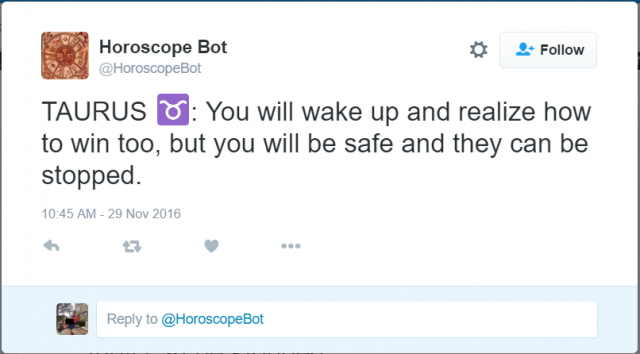
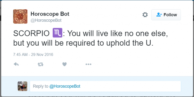
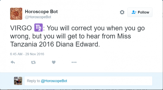
For my final project, I want to make generative horoscopes, so I investigated different projects in the same vein. The one I chose to focus on was the Horoscope Bot on Twitter, which tweets out random horoscopes, which tweets out random horoscopes created from the compilation of two user tweets.
The results have a range of tones (the second selection is actually pretty deep, while the third selection is much funnier in a “wtf” sort of way). However, after scrolling through the bot’s tweets, I realized that all of them take the form “you will …., but you will …”, which seems pretty canned after a while. I would like there to be more variation in the formatting of the horoscopes. The bot also filters out tweets with swear words, which I appreciate because it adds to the horoscope-y feel of the tweets (one doesn’t see horoscopes with swear words).
For my final project, I’d like to improve my alphabet book. As stated in my proposal, I’m working on making it actually alphabetical in the fonts that appear and more generative.
As I was looking for inspiration, I found myself looking more at generative typography than generative books. I ended up looking at Kyuha Shim’s work (Q was one of the reviewers!). I really admire Q’s work because of how effectively and beautifully he’s been able to use data and software as a medium to create such dynamic type. I really aspire to develop such technical skills in programming so I can be able to use it more fluidly in my design work. I would like to work towards making a generative book of generative typography one day. But first, improving my initial concept of a generative alphabet type book for babies. I’m not sure how generative typography would suit such a young audience, yet.
I first saw “Traces” (the above video) over a year ago, and I remember that when I did, I was simultaneously impressed with the technology and disappointed that the artwork created by the shoes was not as representative of the dancer’s movement as it could have been. There’s something to be said for an abstract interpretation, obviously, but I wished there had been more than just circles, lines, and clumps. One reason that “Traces” looks this way is, of course, that its data comes from sensors in the dancer’s shoes rather than external motion capture. This is very impressive, but limits the motion recorded to just that of the feet.
For my project, I hope to create plotter artwork that is similar in style but different in appearance, because I want to use the whole body as the basis for the brush strokes. Ideally, I want to analyze which four or five joints on the body move the most in a portion of BVH data, and then have the plotter paint only those. In this way, I think the artwork will more closely resemble the motion of the dancer/person than if I painted only the hands and feet (or any fixed set of points). For example, in a pirouette, the dancer’s spinning knee would be more worth painting than her fairly stationary foot. I’ll see if I can find a way of effectively choosing which joints to paint using only code.
Here is another video that I discovered more recently. Unlike “Traces,” the software here doesn’t generate 2D images, but rather it makes a variety of animated shapes that it places on top of the video of the dancer. This isn’t quite what my project will be doing, but I think it uses similar technology, and I really like the end result. You’ll notice that several of the animations only involve select points on the body.
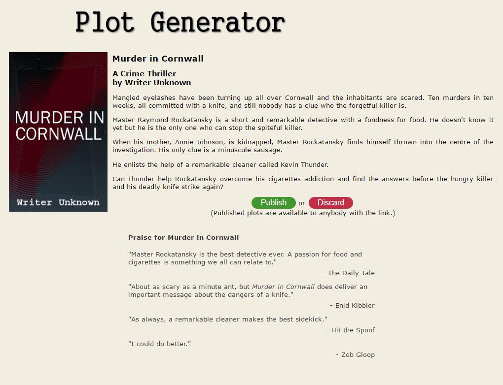
As stated in my final project proposal, I want to create a program that generates movie plot-lines. My initial influence from this project came from the short science-film Sunspring. Unlike other films, Sunspring is generated from an AI named Benjamin, which uses Long Short-Term Memory (LSTM) to develop a script based off of other scripts fed into. Although Benjamin was created over the course of a year, I hope to develop a similar AI, or algorithm, that can do the same thing but on a smaller scale. Rather than actually generating the entire script of the movie, I hope to at least generate these movie plot-lines with their corresponding characters, conflict, resolution, etc. (i.e. – film synopsis).
Very similar to this idea is the Story Idea Generator – Automatic Plot Generator. This plot generator creates a small synopsis and a few lines of “praise” for the film generated. I think this provides a good start and could definitely be improved, as this plot generator isn’t entirely generative (fills in random characters, items, etc. for an already written template for “Paranormal Romances”, “Comedies”, etc.).

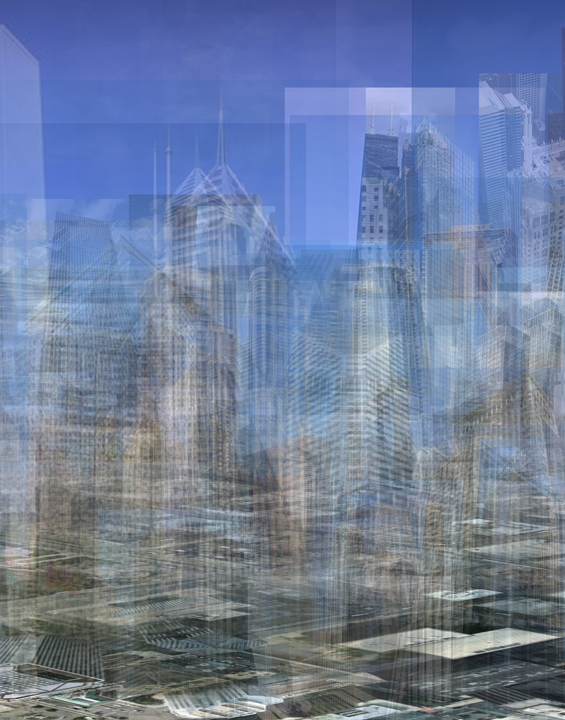 The Loop Suite
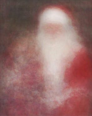 Kids with Santa