Antar-LastProject
Generative Posters
All course code is here and here.
For my final project I wanted to come out feeling extremely confident in typography and colour generation that could be used in a practical context. A significant portion of generative work that I’ve seen often creates interesting art while playing with type, but rarely have I seen it to create actual communication pieces. When I was first introduced to generative art and design, my peers and I felt a bit nervous. We were apprehensive and felt that some were saying that code could replace our jobs as designers. However, through this final project I finally understood how creating work with generative typography is no different than using tools that that are so familiar to designers, such as the Adobe suite.
My favourite project of the semester had been the book project because I was given new tools to explore a different way of thinking about type manipulation. Being able to easily create image and pattern through type is a powerful skill for a communication designer and I now feel more prepared to create pieces in the future that contain greater visual complexity and depth. As reflected in my personal work, I am very fond of repetition and intricate pattern details. Through the book project, and this final project, I feel that I can now effortlessly create patterns and length repetitions, that would normally take hours by hand. I also feel comfortable writing multiple programs to create richer work, which allows me to understand how to use the strengths of each language.
(Above) Some of Yuan Guo’s poster work that inspired me.
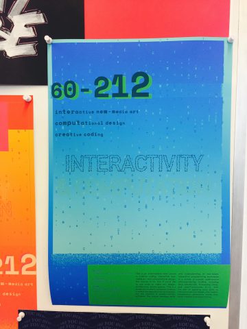
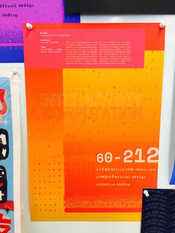
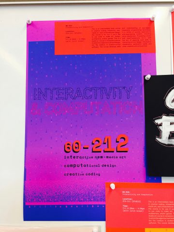
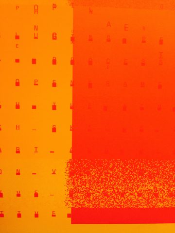
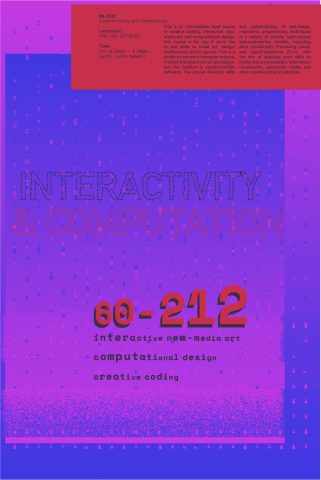
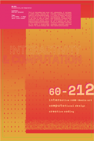
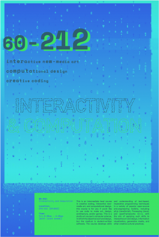
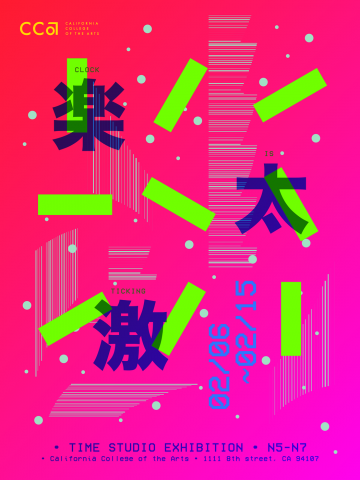
When I began this project I looked to the work of two other designers for inspiration for where to start and what type of goals to set for myself. The first designer I looked to was Yuan Guo who is very talented when it comes to colour and form relationships. His poster work was a great source for inspiration, and I began to wonder which elements from his work I could recreate with code. The first element I was interested in was his effective use of fluorescent colours and neon gradients. That became the first goal of my project, to create generative neon gradients that would translate well from screen to print. The second goal I had set for myself was to create my own style of glitching. I’ve seen this design trend overused and misused very often, but I still think it can be a tasteful way to create texture if used effectively. In think in Guo’s glitch art calendar, I think he has over used the effect, as many designers and artists do, to the point where some pieces are illegible. In terms of creating my own glitching I first attempted to use pixel manipulation, but then discovered that I would not be able to export my work as a PDF, which is vector based. I ended up creating fake “vector pixels” (single points) as pixels instead. I selected portions of the gradients and replaced rows of “pixels” with the colour of a pixel in close proximity. I think this created a subtle texture rather than the jarring distortion that is commonly seen in glitch art.
In addition to Guo, I looked to my professor Kyuha (Q) Shim for typography inspiration. Q’s site Code and Type was a good source to look to for examples for coded type that plays with form. However, Q’s work was node based which I am unfamiliar with. Using Processing I first attempted to write type on complex wave paths, then tried to manipulate the type the same way I did with the glitching, by manipulating the pixels. Later Golan introduced me to Geomerative, which made typography manipulation effortless. I was then able to create subtle generative titles that mimicked the style of the glitch art.
(Above) Some of Q’s coded typography play that inspired me.
After creating the backgrounds, which contained the gradients, the glitch texture, and the title, I used Illustrator to convert the PDF’s to TIF’s that were the appropriate size for my InDesign file. I was then able to use basil to create the growing 60-212 title, as well as the “matrix” type treatment in the background. The “matrix” pattern uses the text from the course description paragraph, then splits the page into a grid of text boxes, large enough for only one character. It then places one character from the paragraph into each text box, then arbitrarily shifts the baseline between a given scale.
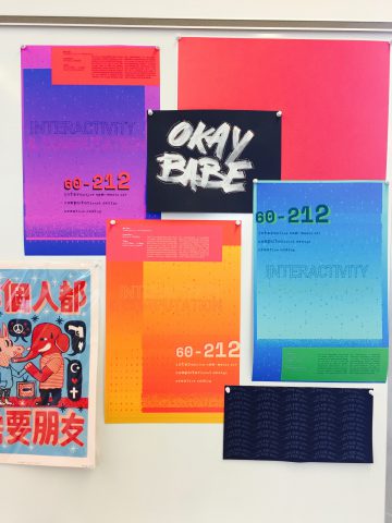
(Above)The wall behind my desk in my studio, showing the three generative posters with other work, including a page from the generative book, and a print from Brandon Ngai. Using an inkjet Epson p800 project effective for printing, as the colours turned out pleasantly neon, without being too harsh.