Rain Water-Maryyann Landlord
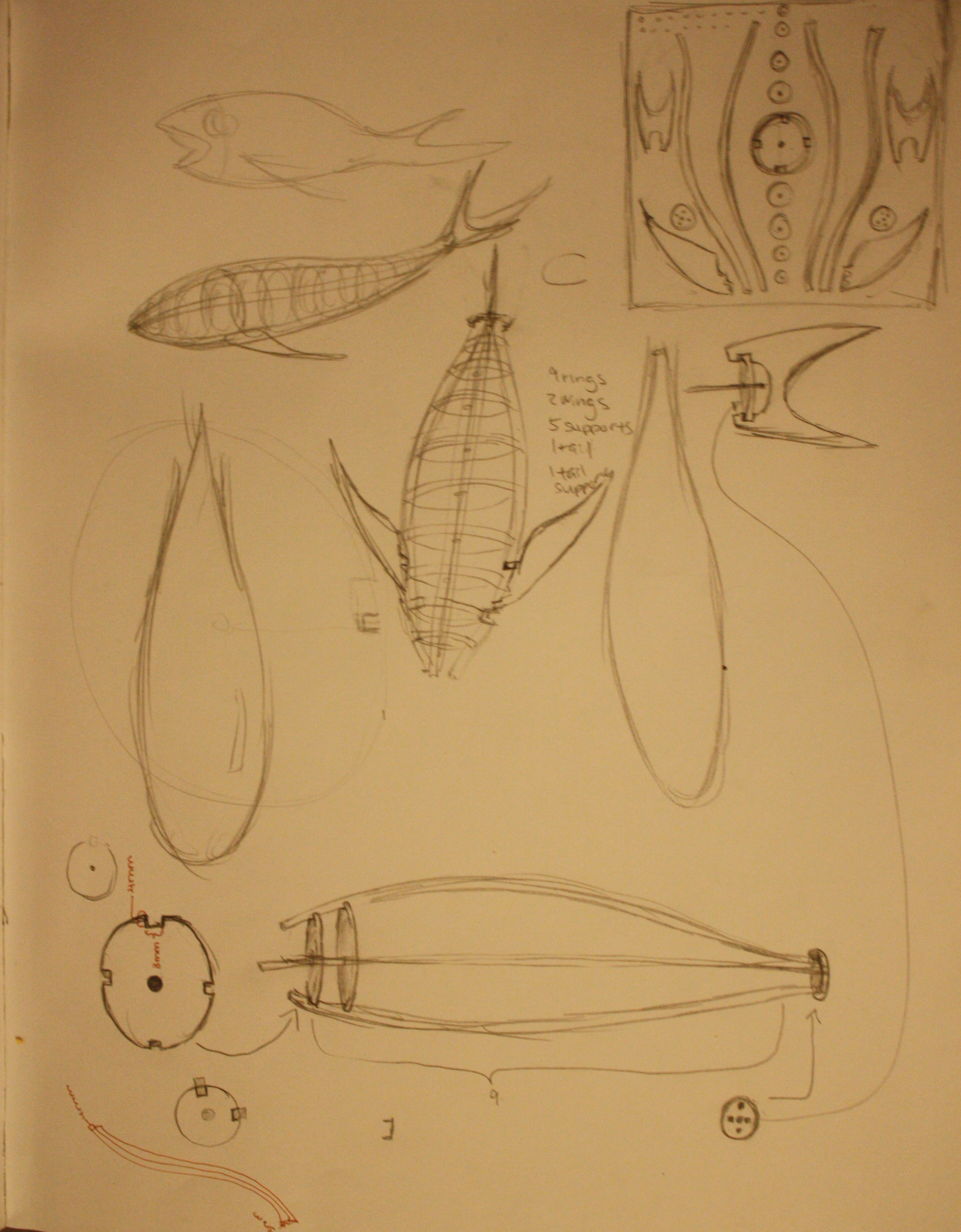
In the beginning, I wanted started with the idea of creating a 3 dimensional object from the 2 dimensional cut outs. It would be cut out into separate parts and then assembled after the pieces were popped out. My idea was a fish, with 9 circular disks as “ribs” and supporting beams going around the body as well as fins and a tail. However, after making some calculations, I realized how precise the measurements would have to be and the fact that aesthetically speaking, a generated pattern of sorts would have a better visual appeal.
Images of my idea:
Next I explored other areas that would create a more visually pleasing piece. Since we recently learned about particles, I decided to incorporate that into my piece. I thought about the effect of rain dropping on the ground on a rainy day. From there my thoughts wondered towards the comparisons of the effects of water. How could I show contrasts between the same element? I also wanted to explore text because I had never used text in my pieces before.
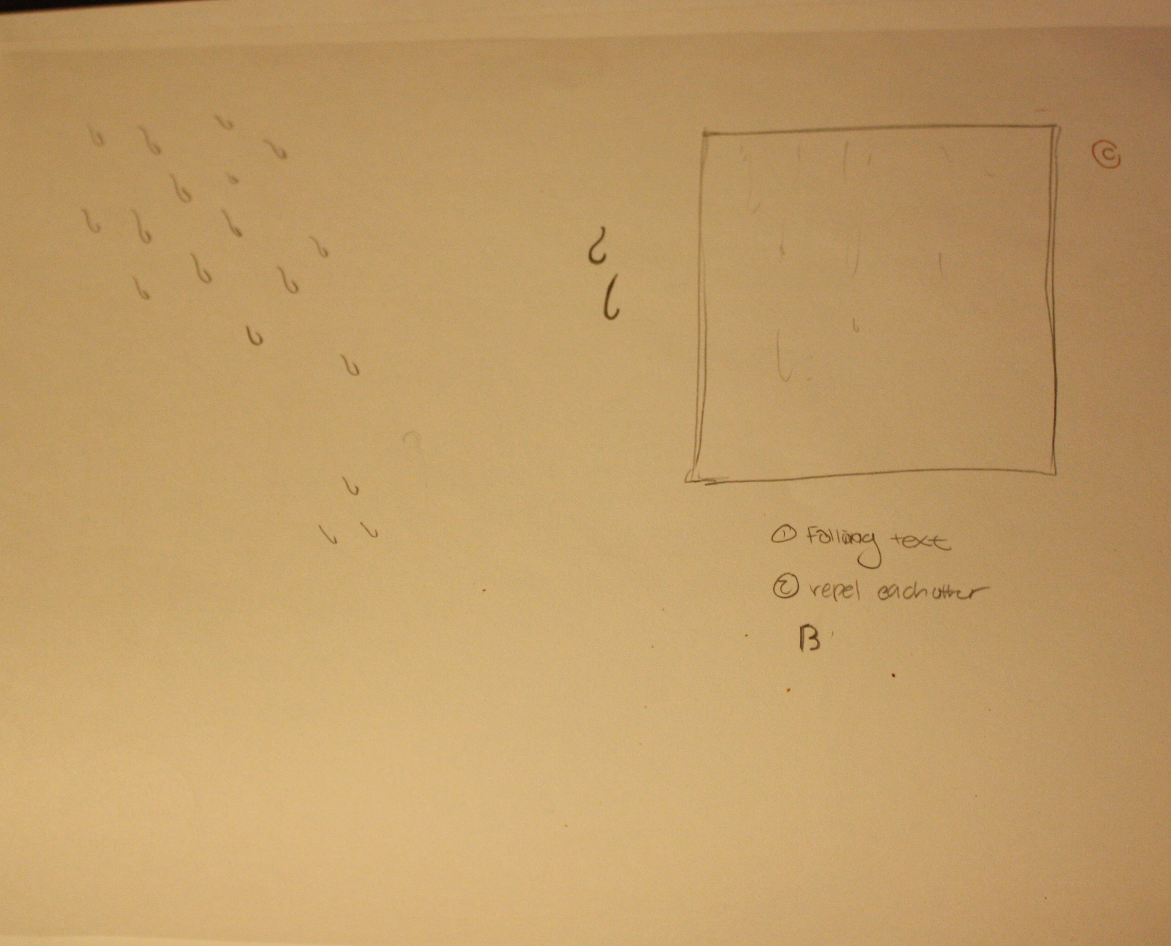
Following that thought, I decided to represent rain drops using letters of the alphabet,which was the first appearance of water. The “rain” fell slightly at an angle, at different speeds which gave it the calming appearance of rain. I needed more types of water. So, I placed an invisible pool of water at the bottom of the piece, which gathered the rain letters and slowly dispensed them to the bottom, where they were recycled back as rain. I thought it was interesting that the letters, which begin as rain(water) fall into another pool of water, but then gain the appearance of a solid object while the viewer still understood them as rain drops.
This is a fairly simple design which I think creates more satisfaction as a animated piece than a static one. A single photo merely doesn’t contain the comparison of the water against water as the moving piece contains. I do understand though, laser cutting letters may become a problems due to the little number of closed shapes that come with the alphabet, but I think it’ll be interesting to see how it plays out.
use the arrow keys to see it animate:
./wp-content/uploads/sites/2/2013/10/rain.pdf
update:
After downloading the geomerative library, I used it to tweak my code so that all the falling letters became outlines. Now, the laser cutting will be able to cut around the shape and they will become visible. One problem I realized I had after first remaking the piece, was that certain letters would have huge holes because of the way the letters connected to themselves. So, I changed the ending to the letters and reconnected it to another point and therefore leaving another space for the laser cutting to go around. I added a phrase as well in the various letters so that when people look closely, they will find a present surprise. Another add on I implemented was a repulsion force the letters had towards every other letter. However, because the library and the number of letters made the code run quite slowly, the repulsion didn’t work as well as I wanted it to. I do hope that after changing the code, the laser cutting will cut the pdf correctly.
updated:
./wp-content/uploads/sites/2/2013/10/rain1.pdf