Category: LookingOutwards

Jun-LookingOutwards-1

1. The Carp and the Seagull: http://thecarpandtheseagull.thecreatorsproject.com/

This project is an interactive film with 3D polygonal animation, and uses HTML5 and WebGL THREE.js techniques. It tells of a story about a fisherman named Masato and his encounter with a demon. I found the presentation in this animation interesting, as everything was in simple colors and shapes, and along with the narration, gave an other-worldly, but not unpleasant, feel to the story. I was a bit disappointed with the interactive part of the story. Although the animation was nice, the interactive part was very limited and the motions of the characters and scene not much different from other 2D interactive stories, and I expected something a bit more complex.

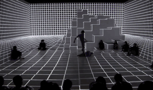
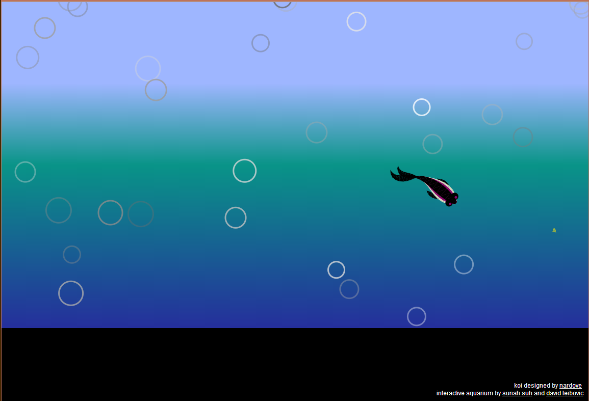
2. Big Blue Interactive Pool: https://vimeo.com/72335659

This is a projected interactive floor installation that simulates the depth of an ocean. It uses real-time graphics and depth sensors. Flocking algorithms for individual life objects are also incorporated, and the lifeforms interact with the humans differently. I didn’t expect much initially, but was surprised by the details incorporated into this project, such as the variety of ocean life and bubbles. The image quality of projection could be improved however.

3. Stone Spray: http://www.stonespray.com/

This is a robot built to use materials (sand) from the landscape to create structures. The creators’ original goal for this project was to create eco-friendly and efficient architecture using 3D printing. Although the texture of the resulting structures are very rough, the shape and forms are interesting. I was impressed how the robot created the structures. This project is similar to Kayser’s Solar Sinter, but the way Stone Spray’s robot creates the objects are much more interesting – they seem like they are “grown”, so doesn’t have the layered look the objects Kayser’s robot created.

Looking Outwards 1

Personal Crunchology

Personal Crunchology is a project by Kjen Wilkens, a former student in the Royal College of Arts Design Interactions program. Wilkens proposes a “statistical fortune telling service,” in which personal data is mined and used to inform predictive computer models. On his website Wilkens minimizes the technical aspect of the project, which makes sense since the message trumps the medium in this case. By this I mean that Personal Crunchology succeeds conceptually, at least within the confines of speculative design idioms. Like many other projects from RCA Design Interactions, there is a looming threat of impending dystopia, and sterile, possibly totalitarian graphic design. That being said, I think Wilkens’ term “data obese futures” is not necessarily an exaggeration. When applied haphazardly, “quantified self” has enormous potential for abuse. Wilkens’ prescient melding of a mystical process (fortune telling) and an “objective” one (quantified self) reveals the discrepancy between our data-selves and our personalities. It privileges human judgments via a fairly dubious application of big data.


Pendulum Choir

Typically, we control machines for our own benefit. This relationship is reversed in the case of Pendulum Choir (the winner of the 2013 Prix Ars Electronica in the Interactive Art category), in which 9 a cappella singers are made the instruments – in both senses of the word – of 18 hydraulic jacks. The performance achieves a wonderful gestalt, where the singers seem to move and operate as a single entity. Considered from an aesthetic lens, the musical virtuosity of the singers makes for an unsettling juxtaposition with the cold precision of the hydraulic jacks. I had a similar feeling when viewing Ryoji Ikeda’s video installation data.tron at the Wood Street Galleries: one of overwhelming domination by a hostile force. But Pendulum Choir generates alienation in a slightly different way; it engages actual people, and proceeds to reduce them to a sort of flower arrangement for the sake of a robot mating ritual.


Obake

Obake: interactions with a 2.5D elastic display from Dhairya Dand on Vimeo.

One difficulty of three-dimensional interfaces a la Minority Report is a lack of tactile feedback. An elastic surface that uses linear actuators to respond to the user seems to address this problem, at least partially. For this reason, I was initially intrigued by Obake, a prototype of a 2.5D input device by Dhairya Dand and Robert Hemsley. But Although Obake is a worthwhile experiment, the implementation (at least as it is shown in the project video) does little to build on a the offerings of a humble touchscreen. Dand and Hemsley do not make a compelling argument for pulling and pushing being sustainable additions or alternatives to the existing vocabulary of touch gestures (pinch, flick, etc.). The task that is highlighted – manipulating a topographical simulation – is an uncommon one, and it was difficult for me to understand why I would want to use Obake over a 3D mouse. I would have been sympathetic to the project had the gestures first been applied to a common use case such as image manipulation, and only then to a more exotic case.

Looking Out

1. The Bay Bridge: A project I condone

Another Creator’s Project: This particular project earns the second-place medal for my all-time favorite project of its kind. This giant light sculpture features 25’000 LEDS which will light up the Bay Bridge in California to put on a spectacular light show. This show will be free to the public, undeniably beautiful in a large city, and features a custom-built software with an algorithm which ensures that no pattern displayed will be repeated. The beauty of this project will therefore last longer than any singular person could ever witness if they just sat down and watched.

I also appreciate the project designers’ choice to use only a single, warm color of LED lamp.

2. .fluid: A project that could have been great, but disappointed me.

The reason I was disappointed with this project is simple. Although the idea is very innovative and interesting, all the possible practical applications listed on their website:

Your mobile gets goose skin when your lover texts you. Your WiFi controller changes the look and feel of it’s surface according to different game situations. Your sofa gives you a short massage as a warm welcome when you return home from a hard day of work. Your laptop feels dried out when battery status is getting low.

— http://cargocollective.com/hnx/fluid

Are either already possible with current technology (e.g. massaging sofas — we have a massage chair in Hunt Library) or a nice addition which does not add an enormous new dimension to your current situation (e.g. the WiFi controller which changes surface according to different game situations. This particular piece of hardware is only a controller and shouldn’t have much to do with the interaction of the game. If anything, technology such as the LeapMotion controller should eventually replace physical controllers to fully immerse the user in the game experience.)

This piece of technology was the result of a two week collaboration between students at the KISD (Köln International School of Design) and supervised by Professor Andreas Muxel.

3. A technology that surprised me: The LeapMotion controller

https://www.leapmotion.com/product

The official website is beautiful. The product seems flawless. Tiny, fast, light, effective, inexpensive. What surprised me about this particular piece of technology is that it should be possible. Watching the demonstrations, the software seems to work flawlessly, and will be useful for almost any user, be that the gamer, the artist, the average user, or any other. The system is designed to interact with humans, but one may also use a pencil or paintbrush to make drawing or painting motions. I can only imagine the practical applications for 3D sculpting and modelling!


See this diagram by David Cohn, about Graphic Design, but applicable to other situations.


The company, LeapMotion Inc. has already been met with considerable success and signed deals with HP regarding imbedding their technology into HP laptops. This is HCI at its best.

Chloe – LookingOutwards 01

A Project That I Admire:
The Sound of Honda by Daito Manabe

I have always admired the work of the multimedia artist Daito Manabe–in fact, it was his works such as the music video he made with Nosaj Thing that all the more fueled my passion to pursue interactive art and this class. In this commission by Honda, Manabe helps viewers relive the historic moment of the Ayrton Senna setting the world’s fastest lap during the F1 Japanese Grand Prix Qualifying Rounds in 1989. A ghost-like reliving of the experience is enabled through LEDs dotted throughout the Suzuka Circuit, programmed with OpenFrameworks and a library of data from the blueprints of the circuit to the special telemetry system of the Senna.

Beyond the profound implications this has for the creation of experiences, the experience of history, and the experience of data, I also really admire the visceral feel of the project’s documentation, which all the more enhances the nostalgic notion of the project, as well as help Honda become become (somewhat) more personable with their customers.

A Project That Surprised Me:I
The Human Harp by Di Mainstone
http://www.humanharp.org/

The Human Harp is a convergence of art, music, dance and architecture, where the artist is ‘parasitic’-ally attached to a bridge via a special holster custom made with digital sensors that detect and measure the vibrations of suspension cables, with the sounds harvested and remixed by the artist’s movement. Essentially, the artist becomes one with the bridge in the creation of music.

I was surprised by direction it took, which was completely different from what I interpreted from the introductory titles and photos. At first I thought the installation actually involved something along the lines of plucking the suspension cables and creating an instrument out of it. However, upon exploring it it seems that it is actually a musical interface that remixes rather than creates sounds from scratch. I was also pleasantly surprised hearing the Mainstone explain her concept of synergy and bridges, which is a concept that I myself really identify with.

Given that the project is still fairly new, I look forward to seeing further developments on this project–especially if the artist were to bring it to Pittsburgh, the so-called City of Bridges.

A Project That Could Have Been Great, But Was Disappointing:
The Color Chaser by Yuri Suzuki
yuri-suzuki-colour-chaser_03

The Color Chaser is a cute little device that relies on miniature sensors that detect and follow a black line while translating any colored lines it sees and turning that data into sound. Users can create unique tracks for the device to run upon, providing a new way with which to create music.

Perhaps its because of the limitations of the data upon which this project functions, or the way that it was documented, but my disappointment mainly comes from two areas. 1) The sounds that are created from the machines seem limited, and the sounds have yet to have aesthetically pleasing quality to me. Although the project aims to generate richness off sometimes hectic drawings, the sense I get is that the drawings themselves feel like they have more harmony. 2) The designer in me is disappointed that I couldn’t get the possible implications and applications of the device, or the spirit with which it was made beyond just having fun and finding a new way to visualize music.

I realize my disappointments seem a bit low-level, but I have to admit that its difficult for me to be disappointed with new media projects because of my overwhelming admiration for them. And if they all get the publicity of being viral on such blogs and websites, in my opinion they have already exceeded a threshold/standard. And after all, the generation of happiness and entertainment can be in itself an already ‘worthy’ function.

Madeleine-LookingOutwards-1

Microtonal Wall

Microtonal Wall by Tristan Perich is a massive installation at the MoMA that consists of 1,500 1-bit speakers, each tuned differently to create a giant soundscape that changes depending on the viewer’s distance. It’s elegant and minimal in execution, Microtonal Wall is an extension of a piece Perich has been working on for several years called Drift Multiply, another large polyphonic composition, and Machine Drawings, a drawing program that deals with the intersection of randomness and order. I love pieces that force the viewer to move around and engage with the work, which this does nicely.

Cloud Tweets

Cloud Tweets is an installation piece created by David Bowen that maps a video feed of clouds to a virtual keyboard, which is used to type and post tweets. I was pleasantly surprised by this, the twitter is unexpectedly iterative, with certain sequences frequently occurring (e.g. “?><“). It’s an interesting take on a sensor-to-tweet Twitter feed, and makes for a delightful pun on “cloud computing”. David is also responsible for “Fly Tweets”, a similar piece where a group of flies trigger keyboard strokes via video, which is then collected and posted on their collective twitter account. I would’ve liked to have seen more variation from Fly Tweets–although novel without the context of the earlier piece, Cloud Tweets seems like a slightly different variation on his previous work.

Vertwalker

Vertwalker, created by Berlin-based collective Sonice Development (initially designed by member Achim Meyer), is a robot with a marker attached to it that can move vertically along walls. The piece draws inspiration from compact autonomous robots like the Roomba, and emerging vertical cityscapes. The group has previously run two different trials with older prototypes. I love the idea of drawing robots, especially one that can draw directly onto walls, but I was disappointed that the drawing was determined by collision detection. I feel that this piece would’ve been more interesting and engaging had there been some sort of concrete image it was attempting to create, perhaps having a computer vision system communicate with the robot.

Adam-LookingOutwards

Admire

Tele-Present Water | David Bowen

An older piece but a good one for sure. David Bowen takes data from a buoy located in the ocean an re-interprets it with a kinetic sculpture. I love this piece because of its beautiful literal yet abstracted representation of the data. I like to think of it almost as a type of “uncanny valley” – If we have a large projection or video screen that is showing a live stream of the ocean somewhere we expect it to be perfect, we expect to to sound, feel and smell like the ocean. Anything less is a disappointment. But Bowen is not presenting his sculpture as a stand-in for the real thing and so we can enjoy it’s beauty and perculiarities for what they are.

Surprise

Fly Revolver | David Bowen

Also by David Bowen – When I watch the video, with the gun flailing around madly I can’t help but think of scenes that I have seen in movies and on reality TV shows (cops) where the criminal is waiving his gun around at all those that are trying to put a stop to his antics and I cannot help but ponder – could this acrylic ball, with the flies flying around in it be a representation of the criminals mind?

Disappoint

Descriptive Camera | Matt Richardson

Descriptive camera is a camera that takes a photo, uploads it to mechanical turk where a real life human then sees the image and is instructed to write a description of it. The description is then printed by the camera in place of an actual image.

I am disappointed by the piece because I think that using human computation has so much interesting potential (sheep market) and this could be a really interesting implementation (do you really implement humans?) but there is no compelling narrative. I feel like it is more of a technical demonstration than a finished piece of art or design.


joanna – lookingOutwards – 1

NeuroKnitting

Knitting hacks are super popular for the last years. And therefore are the expectations quite scaled up. NeuroKnitting transforms affective states while listening to Bach’s “Goldberg Variations” recording with an EEG headset into a knitting pattern. Openhardware knitting meets quantified self… I worked on both topics and maybe that’s the reason why it’s hard to impress me. For me it would be nice to have various scarfs where different music is visualized. Then the data would be more “readable” or “comparable”.

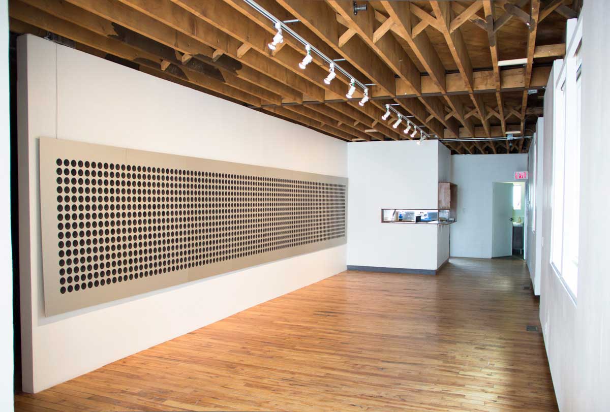
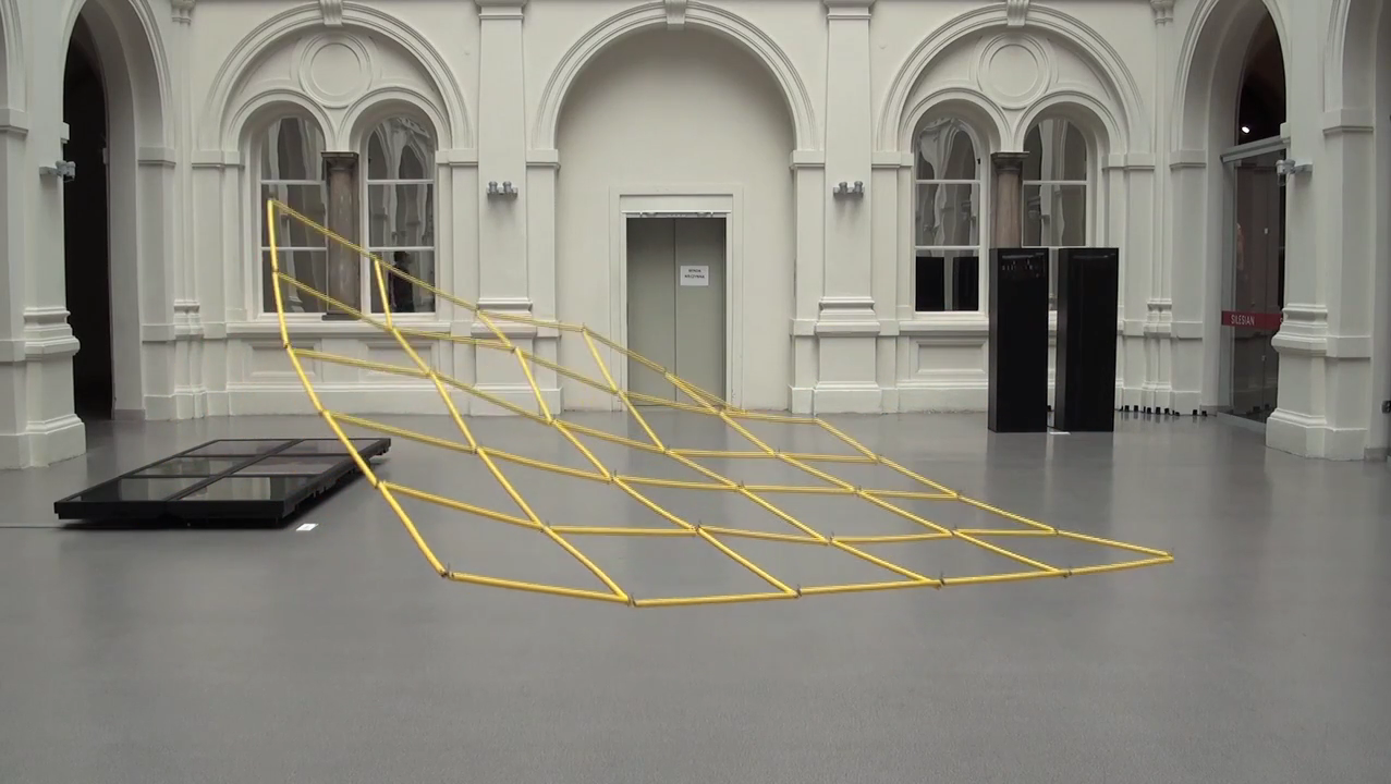
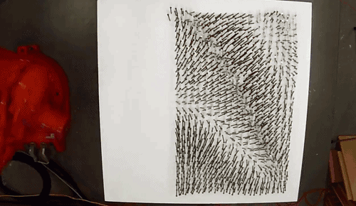
A nice fact is that the artists were inspired by an old “programming language”: knitting.
Related work: http://fabienne.us/


Access Marie Sester

Eyebeam9

It’s an an interactive installation that lets web users track anonymous individuals in public places, by pursuing them with a robotic spotlight and acoustic beam system.

I’m suprised how impressive and meaningful a very reduced work could be. Even the work is now 10 years old it is still relevant and up-to-date. Google glasses or PRISM, surveillance and privacy are important topics especially we as artists should discuss.

Related work Seiko Mikami Desire of Codes

Avena+ Test Bed – Agricultural Printing and Altered Landscapes

This project brings landscape, agricultural and digital fabrication together and carries the possibilities of digital fabrication over into farming. The experiment applies algorithms to partition and create an environmentally beneficial structure into a standard biomass/energy production field.

I really love how Benedigt Groß brings art, political statements and digital fabrication together.

Related work Hortus.Paris


JuliaTeitelbaum-LookingOutwards-1

Discovery 1: Connections

“Connections” is an experiment made with Processing. The particles in the animation move randomly and connect with each other at a certain distance. I like this project because although it is simple and small scale, it’s really well executed. I love the aesthetic—color contrast, line weight, speed of animation—it makes it hypnotic. I also like it because it ties into ideas I have for visualizations about relationships between people.

The creator of the project is Lucas Cabral, a multimedia artist from Brazil. The project is not particularly well documented (likely because it is small scale), but based on Cabral’s other sketches, I think the intent was just to experiment with Processing and how to make the simple algorithm he used work well (aesthetically). I also think Cabral was probably inspired by some of the demos of the Processing language (the ones that come with the software when  you download it) since they tend to have similar simplicity and often use relatively simple algorithms to create dynamic and hypnotic animations.

Discovery 2: Blackbar

Blackbar

The Creative Applications Network describes the game Blackbar as “a sci-fi story of a dystopian future told as a word puzzle.” It a smartphone app that is a combination of a text adventure and a riddle. I admire the project because although it is making a political statement, the statement balances out with the game itself. I also like it because it seems like a project where the creator worked out of their head—taking their idea and making it work on an iPhone, rather than going along with existing paradigms of UI or genre for iPhone games.

Neven Morgan and his friend James Moore collaborated to create the game (which launched a week ago.) The game is a dark satire, exploring the implications of government surveillance, particularly PRISM. The nature of the story and the fictional world of the story were both inspired by Orwell, but likely by other dystopian literature (but I might tweet Neven Morgan about this and also ask about how he and James Moore collaborated, because I couldn’t find that information anywhere.)

Reviews:
Gizmodo
The Blaze

Discovery 3: Cindermedusae

Cindermedusae is a program which generatively creates and animates 3D models of jellyfish. This project caught my interest at first because it combined a drawn, ink and paper aesthetic, with 3D modeling. The program also interests me because I’m fascinated by how algorithms can generate natural forms, especially in three dimensions.

This project really impresses me on a technical and aesthetic level, and the process documentation is practically art in itself. However, aside from awe, it really didn’t draw much of an emotional reaction from me. If I actually played with the program, I think I might have been delighted, but I think that the creator could have put more thought into how they presented the program’s output (maybe showing how the jellyfish change, considering the background more) or framed the concept (perhaps with some amount of story?).

The project was created by one artist, Marcin Ignac, whose work is inspired by the complexity of biological structures. In particular the Cindermedusae project was inspired by the work of Ernst Haeckel. Haeckel a German naturalist, illustrator, and scientist. Looking at the medusae, Haeckel’s influence is clear. Understanding how the project was inspired by Haeckel (and reading his Wikipedia page) actually makes me more impressed with it. I can imagine this being something Haeckel might have created if he had the sort of tools that exist now because of its focus on detail, biological structure, and mathematical relationships. Ignac’s work takes it further by encoding variables in biological structure and capturing motion as well.

Ticha-LookingOutwards-1

Robot Nail Art by Charles Karim Aweida

In an effort to ‘create tangible artifacts from intangible forces’, Aweida uses a robotic arm to place nails in a foam board in a manner which emulates wind movement. I admire this project profoundly for its simplicity in addition to the fact that very organic patterns using inorganic materials. What I find most interesting about the project is how entrancing it is to watch the robot carefully place the nails in the board with such precision – the strange gratification that results from watching such a meticulous action is evidence of the fetishization of the robot, and enticed me to think about how robots are fetishized in modern society.

Some improvements:

  • Documentation could have been a little bit more descriptive. I really like the whirlpool patterns that he added at the end and it’s easy to infer that those were created by the robot, but I wish the artist elaborated on what the color choices meant.
  • Perhaps the artist could experiment with different materials that can be placed into the foam board to see how it alters the piece.


Belowrez app by Adam Mathes

As someone who holds high expectations for all iOS-related products, I must say that I was rather disappointed in this app. While Belowrez achieves its goal of evoking a certain nostalgic feel towards old-school NES games, I feel like the developer is not pushing the app to its full potential. When I took 15-122, we had to write code that manipulated images in different ways, and one of the effects was exactly the same as the one for this app. While I really appreciate that the developer added some additional color scheme choices for the sake of variation and like the fact that the user is able to control the pixel size, I cannot help but feel like the camera is missing something more.

Some improvements:

  • Could make the images even more stylized to truly set it apart from other cameras with posterizing photo filters.
  • Perhaps add some features that push the concept of creating an NES-inspired app further.


Seventh Sense by Ultra Combos and Anarchy Dance Theatre

I both admire this project profoundly and am intensely surprised by it. Seventh Sense is certainly not a conventional dance performance with fancy stage effects – the specially designed interactive space created by Ultra Combos both creates a unique visual experience for the audience and redefines the meaning of contemporary dance. What I like most about this project is how the environment reacts so smoothly with the dancers – giving the viewer the impression that they are truly a part of this surreal space. This beautiful marriage between dance, art, and technology is truly a pleasure to watch.

Some improvements:

  • As I have only watched an excerpt of the performance, I am not entirely sure of how the space was used to enhance the dancing. So far my only suggestion would be to experiment with as many environments and effects as possible without looking too over-the-top.

Maryyann-Looking Outwards-1

“Discuss one project that you admire profoundly (why?)”

http://skyartsignitionmemorypalace.com/palace/index.html#lev

memory

The interactive App piece created by Johnny Kelly and produced by Nexus Interactive Arts, called Memory Palace explores the possibilities of the combination of technology and audience. He was commissioned to create a piece about a story where the main character is allowed to provide the future generations with one of his memories. Johnny’s piece invites viewers to draw their most precious memories onto a tablet and digitally send them onto a viewing board, which is then printed into a poster after the board is filled. I found it extremely admirable that through the sharing of memories, people of many cultural backgrounds and ages are brought together to share their most valued thoughts with strangers. It is really a beautiful and magical display. The ability of the project to create a new bound between strangers is very phenomenal, seeing how memories are such important to being human. One aspect I think that could have made the project more successful or just more playful was to also create a animated version of the board, where some drawings slightly moved. That would almost bring the long past memories back to life.

“one project that surprised you (why?)”

Corona Perspectives – JWT Spain

corona_tennis

With the help of JWT, a global advertising and marketing agency in New York City and support from the development studio Espada y Santa Cruz, Corona Perspectives was born. This program allows a tennis match to be recorded, played back through a 360 degree perspective, as well as represent ball distance and where the ball touched the ground. This creation not only allows the audience to experience the game in a whole new level, but also will be very useful for tennis coaches or tennis players since it captures tiny details of the ball. The project can be related to the US Open Tennis Real-Time Data Visualization project. Presented by the US Open Pointstream, this project explores the statistical data generated during a tennis match in 3D. I found the heat-mapping of the ball, which allows the viewer to accurately distinguish the landing of the ball on the court and the trajectory filters most impressive because they will not only create a playback effect, but as contribute to the tennis world as training guides. I think another touch that could have been successful was a playback option of the match, so that the viewer can see the trajectories in action. I was really surprised and amazed by the ability softwares can have through the combination of design and computer programming.

“one project that could have been great, but disappointed you (why?).”

fish

“My Life Aquatic” is an interactive game by David Leibovic, Ricardo Sanchez, and Sunah Suh that involves a fish of a randomized color and size which follows the mouse slightly when the user moves the cursor. Food is then displayed on the screen by ones, which the user can feed the fish. At first glance, the interactive exhibition seems very interesting, combining the color choice and the music, along with the natural movement of the fish. However, after several minutes, the motion becomes too repetitive to capture any further interest. I found the fluid movement of the fish to be very eye catching. One improvement I would have made was to add more creatures in the background or to interact with. Furthermore, the user would have been more involved if there was some progress in the interactions. Ricardo Sanchez possesses his own website which is littered with little animated designs present in this project.