Category: LookingOutwards

Ticha-LookingOutwards-3

Pixelate by Sures Kumar

Well, I must say I have seen a fair share of games involving food and eating, but never have I seen one that involved eating food the way Pixelate by Sures Kumar does. Albeit simple in its concept, Pixelate can be a surprisingly thought-provoking piece of work; in our current culture that is dominated by cheap fast foods and deliciously unhealthy meals, we tend to be less mindful of eating a balanced diet. As the more wholesome foods tend to be costly and not as easily accessible as the non-wholesome ones, it is understandable for many individuals to not feel inclined to make healthier choices. Pixelate is a simple statement of encouraging people to eat nutritious meals, but what I find most endearing about it is that since it a game it causes the act of eating healthy foods to feel rewarding. This characteristic is very much like the Wii Fit games.

The way the game is able to use pressure to detect which foods are being eaten is a particularly useful feature. However, this may be prone to error or limit the variety of foods. Additionally, the gameplay can get tedious, so the developers will have to adding more features to make the game more engaging.


Listen Carefully by Jonas Breme

Listen Carefully is an interesting project by Jonas Breme that makes us reflect on how we experience music today. It speaks to me on a personal level in particular, as I listen to music on a regular basis – but only as a secondary task. I cannot recall the last time I truly focused on listening to a song without simultaneously doing something else.

This project also touches upon the concept of multitasking, its prevalence in our daily routine, and how it prevents us from giving a single activity our full attention. What is poetic about Listen Carefully is that it forces the user to pause and unwind, commanding their full attention – just so that they may experience a moment of slow listening in a fast-paced life.


A Beat of Your Heart by Jason Mingay

Jason Mingay’s A Beat of Your Heart uses an Arduino and a pulse sensor to evoke certain emotional reactions from the viewer as they watch a sequence of video clips. What interests me about A Beat of Your Heart is that, while conventional art is made to passively induce emotional responses from the observer, this project almost forcefully injects certain reactions into the observer by provoking changes in heart rate. This project can possibly be seen as a complement to Listen Carefully, due to their similar objective of holding the user’s attention but different emotional reactions.

To me, A Beat of Your Heart  still feels more like a ‘detailed sketch’ than a final product. Regardless, I feel that this idea has a lot of potential and would like how it can be applied in different contexts.
Melanie-LookingOutwards-3

arca from tony olsson

It’s a game! Looks like a co-op. I’m already intrigued by the manipulation of physical space to affect virtual space. Are there more levels, more variations? How about its gaming potential? I greatly enjoy the use of sound to give each shape a different feel. The only disappointing part about is that I can’t find other documentations–wait, look! There’s a blog! So turns out it is a two-player “game” self-described as a “full body experience which is created by interaction, communication and play within an space where computer games meet abstract electronic art, video and sound installation.” It’s true! I’m in love with it. I want to play it with my roommate as we troll each other to death. More effective documentation would’ve been nice, though; I had to dig a lot to actually find out its purpose. Other than that, I want this to be a little bigger, and the physical objects to be less ordinary to be extraordinary. Anything other than bunch of cylinders.

[in]security camera from Dennis Rosenfeld

There’s a security camera, but it’s actually not a very effective security camera. It shies away from what it’s supposed to be watching–humans–and finds the wall very interesting instead. It says some things about surveillance and almost subverts it in a non-cynical, adorable fashion. I like the message and the concept; I don’t really like the execution though, as I expected more variations in movement to give the camera more personality. Rather than insecure, it just seemed startled half the time. Take a cue from this cute little robot.

INSIDE-OUT, a sound art performance from Andre Borges

There’s something powerful about the body’s sound reverberating throughout a giant room. INSIDE-OUT is a sound art performance using a man’s body as a musical medium. As he breathes in and out, various sounds play according to the internal sounds of his body. Most prominent is his breathing; it’s a constant loop, soothing and overarching. I’d imagine it would be like you’re really inside something when you enter that room–a soundscape of the body. I feel like it could’ve been better with improvement in presentation, as the presentation doesn’t feel organic, but I do like the rawness of the performance.

DAVE-LOOKINGOUTWARDS-3

Printer Orchestra is made by isthis.gd from old computer hardware which are synced to play MIDI arrangements. The music they chose is lively, and I instantly became happy after seeing how cute these old parts are being as they clicked and clanked to make music. This reminded me of the MIDI arrangements played on floppy drives I had seen in the past. The only thing I wished that the makers would do is for them to upload a making of video, so we can see their “orchestra” play other musical arrangements, and how they configured and set up such a whimsical piece.


Fire Hero is by oswaldonfire as a version of Guitar Hero which instead of the original computer graphics effects, uses flamethrowers to represent notes being hit. When I first saw this project, I was struck by how insane the creators were; fire is scary, and I would never choose to use it as a medium. But seeing the flames sprout out in beat with the music, I am deeply impressed. The closest thing I have seen resembling this is equalizers, but this takes that to an extreme and dangerous territory. If only the video quality is more professional and they arranged it more dramatically, then that would bring out that edginess of this project even more.


It turns out all the projects I found are somehow related to music. Playa is made by rubendhers, and it uses motors, cables and cloth to play a chillingly ambient arrangement on 14 guitars. This provides a striking contrast to the previous 2 projects, as this generates a mysterious atmosphere, while printer Orchestra is whimsical and Fire Hero is hardcore extreme. The autonomous spinners, cables, and the brownish background gave me a steampunk impression, which contributes even further to that otherworldliness of the music and the mysterious atmosphere. This reminded me of my first visit to CMU: I walked into CFA, and I heard an ambient sound. Someone explained that it was Beethoven’s 9th played over the period of 24 hours. It created a feeling that one is constantly discovering and unraveling the secrets of the universe.

MichelleMa-LookingOutwards-3

The Tropism Well


The Tropism Well by Richard Harvey and Keivor John takes a spin on the organic bending mechanism of plants to give their “well” near human traits. When the structure sees a person approaching, it “bows” in his/her direction through the movement of water (or some other drink) and fills that person’s glass. This well is incredibly well-crafted in my opinion because it does its job of inviting the spectators through its quirky personality and its functionality. Although I may not carry a cup around me at all times, I think this would be much a more pleasurable and sanitary way to distribute water in public places. Some downsides I would worry about are its fragility, its uncovered opening at the top, and perhaps the slow wait for water (especially if there is a line of people viewing it as an art piece). But overall, I would definitely like to see a whole collection of Harvey and John’s solutions to public resource distribution. From there website here: http://www.harveyandjohn.com/, I became immediately fascinated by their ventures into gravity-defying interactive art, which maybe where they got their inspiration for upward moving water, but I can’t see many other pieces that are meant for the outdoors.

Cubepix

Since we are almost on the subject of projection mapping, the Cubepix by Xavi Trivo goes up a level to kinetic projection mapping. They appear to have an array of cardboard boxes that twist and turn with movements coordinated to the projection. In addition, the whole sculpture interacts with the presence in front of it. In fact, Daniel Rozin’s Wooden Mirrors, which I mentioned in my first Looking Outwards, was a source of inspiration for this project. I greatly admire the quickness and sleek movements of the sculpture, which are almost seamlessly in tune with the projection. There seem to be a few boxes that got stuck in the video, but that is pretty minor compared to what they have produced. I also don’t know if I like the cardboard brown color. While it shows the viewer how this project exemplifies “rags to riches”, I don’t think it effectively shows the contrast between analog and electronic media quite like the Wooden Mirrors do. Other than that, I think Xavi’s Lab did a great job creating a piece that viewers will want to play with for a long time. I don’t know if the sound in the video is incorporated in the actual piece, but I think it really adds to the playing experience.

The Singing Plant

In this project, Mads Hobye uses Arduinos inplace of the theremin to make a plant “sing”. He uses a sensor to measure the capacitance of a plant, and if a person touches the plant, that interaction can be converted into sound. I’ve heard of the idea of communicating with animals, plants, and inanimate objects before through electrical pulses, but the fact that a person can build a simple version of such a device with Arduino is really inspiring. The project here is a very basic sensor-output system, but the fact that it’s cute and applicable to any homely plant is quite charming. It allows the viewers to fulfill a dream of “conversing” with the plants they’ve been raising. But on a much larger scale, the capacitance sensor can be used to characterize just about any body that humans wish to have communications. For example, it can be used to create a collection of the “voices” of a forest or ecosystem over time so that people may try to guess what it is saying. I’m thinking of Green messages mostly, but the applications are very far-reaching.

According to his website, Mads Hobye has several large scale installations, including a soundscape playground, as well as many other instructables that serve to disseminate the how-tos of transforming everyday life with digital media. Most of his work involves sound machines, and I can clearly see the theremin as inspiration for this piece.

Adam-Lookingoutwards-02

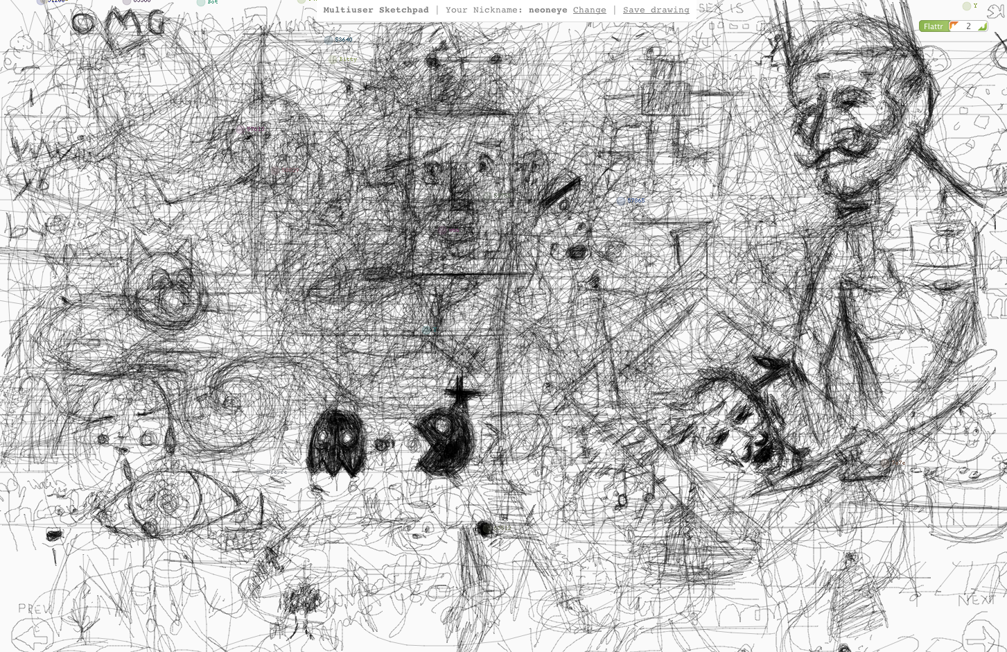
Multiuser Sketchpad | Ricardo Cabello
www.ricardocabello.com/blog/post/701

Multi-user sketch pad is just what the the title suggests – a sketchpad that can be drawn on my multiple, anonymous users around the world. I see this as a different kind of generativity. A kind where the code facilitates rather than creates the product. Similar to Aaron Koblin’s sheep market, but this is an open market. What makes this project most exciting to me though is the ability to use it as a screen-saver. I love the idea of a screensaver that reflects something real, happening live in the world. Similar to – http://pcheese.net/software/soundstream/

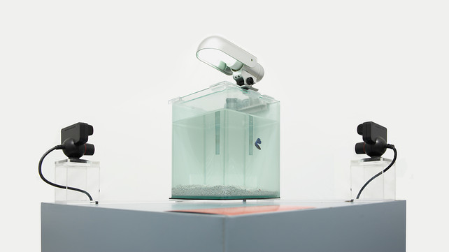
.Float | Krzysztof Goliński
http://www.fastcodesign.com/1670804/a-fish-swims-in-a-tank-carving-a-sculpture-as-it-goes

.Float uses a living organism as an input into an algorithm which then generates a 3d form. Similar to the Mutliuser sketchpad but in this case the organism(s) are unaware of their involvement the creation of the final product.

Drawing faces | Matthew Plummer-Fernandez

Drawing faces is interesting because it uses a human as the tool to draw. As the human starts to draw a face, the algorithm decides whether the line that has just been drawn makes the drawing more or less face-like. If it is less, the stroke is erased. If it is more, the stroke stays. The resultant drawing will be facelike but ultimately random.

Looking Outwards : assigment 4

Looking outwards:

For this assigment, I stumbled across a huge variety in things I like and things I didn’t. Here is the first thing I didn’t like:

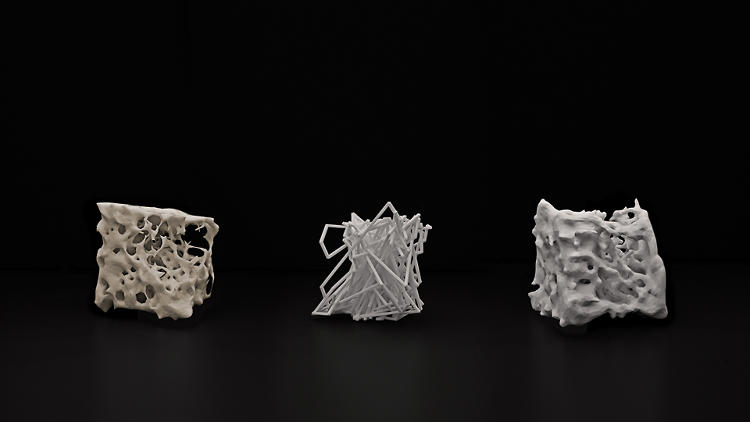
This particular artist took common everyday objects and distorted them using 3D software. Unfortunately his finished products are exceptionally useless: For example, if he scanned a watering can or a vase in, the end result will not be functional as either a vase or as a watering can, or for anything else for that matter. The reason this irritates me (as his forms are indeed beautiful) is that 3D printing is an exceptionally precise, controllable art! There is nothing preventing the artist from taking his design one step further. Perhaps he felt that by creating a functional object his art would no longer be considered art?

Next, here’s a project which has a lot of potential but I don’t consider a veritable success:
http://www.the-product.org/soundmachines

Soundmachines from The Product on Vimeo.

The idea is to sproduce a much more visual connection between sound and physical records, in this case. The reason I found this project somewhat uninteresting is very similar to the first: The sounds simply aren’t that interesting! As a prototype this device works fabulously, and I condone The Project for showing how devices like records work. At the end of the day, however, I would have like to have a slightly better result.

Finally: Something (or somethings I liked):
The Creative Applications Network: What is there NOT to like? Every project I’ve found by them is incredible. My favorite has unfortunately already been taken by Miles, but I liked it so much I’m going to mention it anyway. The project where the memory taken from your computer is used to weave a tapestry — which I think is a great demonstration of (1) just how reliable we have become on computers (a generic statement, I know) and just how interchangeable our memories and those of our computers are, and (2) how it is important to have a constant reminder of your memories around you. Tapestries are made for display, and textiles are undoubtedly one of the more “useful” art forms. You are but the product of your memories and experiences.

Fragmented Memory Process (Edited for Wired 2013) from Phillip Stearns on Vimeo.

Looking Outwards 2

BLADE RUNNER revisited >3.6 gigapixels – François Vautier

BLADE RUNNER revisited >3.6 gigapixels from françois vautier on Vimeo.

In his installation for WORLD EXPO Shanghai 2010, François Vautier composites all 167,819 frames of Ridley Scott’s Blade Runner into a colossal 3.5 gigapixel image. Since it is impossible to show in detail on a single display, Vautier employs a virtual camera – represented by a glowing cube – to pan across the image. This creates a zootrope effect that echoes early projectors, as Vautier explains in the description of the video. Insofar as there is no visual indication of a continuous image, the artwork’s premise diverges its visual impact. There is tension between the proposed concept – a continuous image – and the way in which the eye interprets the succession of what appear to be separate frames. We have to take on faith that there really is a single image, since this fact is unknowable from the visual evidence alone. The conceptual layer of the artwork alienates and deconstructs its visceral draw.

Mickey Mouse Club – Matthew Plummer-Fernandez

“Blurring images has become both a widely recognised cultural aesthetic and also used to obscure the identity of persons photographed or filmed. After recent clashes with 3D printers over IP concerns I’ve chosen to disguise my latest derivative of Mickey Mouse and to explore this smoothed 3D aesthetic that is counter to the popularity and push for highly detailed 3D printing.” – Matthew Plummer-Fernandez

Plummer-Fernandez appropriates and deforms Mickey Mouse in “Mickey Mouse Club”, a wry response to recent concerns about the impact of 3D printers on intellectual property. As explained in a Creative Applications post, Plummer-Fernandez’s process is straightforward; he smoothes the Mickey Mouse mesh in Processing (akin to blurring a 2D image) before 3D printing the output. Although the final mouse is unrecognizable as Mickey, one can conceive of an intermediary stage in the blurring at which time the iconic mouse is recognizable, yet somehow perverted. This raises an interesting question: at what point in the smoothing of the mesh does it cease to be Disney’s property?  And by extension, how does a corporation like Disney react to the widespread remixing of objects? I anticipate artists will continue to critique institutions and mass culture in coming years, leveraging generative and/or digital fabrication techniques in innovative ways.

InfObjects – Johannes Tsopanides

Tsopanides’ “InfObjects” are data visualizations in physical form. The design of each cup, bowl or plate depends on the energy cost and price of the food to which it corresponds. In addition to mapping one signal to another (I recall Campbell’s prescient Formula for Computer Art), there is a functional and symbolic dimension to Tsopanides’ objects; their usefulness as dinnerware is determined by the CO² quotient of the dish in question, which in turn determines the number of holes in the object. So the plate generated by butter (517 g of CO²)  is less usable than the tomato plate (315g CO²), which calls into question the relative merits of butter. The important point is that through generative design, Tsopanides makes tangible and even humorous the grave threat of greenhouse gasses. He furthers an environmental agenda by challenging our assumptions about the function of everyday objects. In doing so, InfObjects exemplifies art as activism: art making in the service of a social good.


Chloe – LookingOutwards02

BALL MAZE BY DAVID THOMASSON

Using the newly released LeapMotion, Ball Maze use the ‘Leap Motion For Processing’ library from voidplus in Processing on the laptop, which talks to Arduino in the maze. I admire this project for its tangibility, breaking the boundaries between the real and the digital, making for a much more intuitive gaming interface. The smoothness of the board’s movement really surprises me, as I have played with the LeapMotion before and found that even on the screen, it can be a bit glitchy.


TYPEFACE BY MARY HUANG


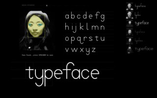
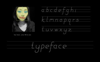
TYPEFACE is a study of facial recognition and type design, creating a typeface that corresponds to each individual, like a typographic portrait. As a communication design student, this project pushes at a lot of my buttons. There is a lot of talk about content driving form, the message defining the medium, etc. This is especially true for things that concern branding and identity, the most effective ones allowing for variation across many platforms while still maintaining a general level of quality and cohesion throughout. At the same time, for there to be a human touch in the formation of the type despite its digital interface shows yet again another wonderful example of bridging the gaps between humans and technologies.


EYES ON THE SKY BY JED CARTER

“I believe that most people respond more intuitively to simple colours than to the complex units of data found in weather reports and downloadable apps. My phone can instantly inform me of the current temperature outside in degrees of Celsius, but this reading tells me nothing of how warm or cold it actually feels. How warm is 18°C, exactly? Does that mean I need a jumper or a coat? We can access a multitude of different kinds of data relating to the weather, but can this information be used to create something beautiful or intuitive to read?”

Jed Carter used 64 public-access web cameras across Europe, recording the colour of the sky, at each point, at regular intervals and produced a book that collects a week of paintings where cameras paint the weather, once every hour. Processing was used to map RGB values collected from the photos to geographic locations, rendering a huge sequence of color maps of the sky.

With the erratic weather that has been plaguing my health and sanity this week, I find myself appreciating the quiet poetry of this work. Although it took me a while to figure out how exactly his system worked and to let go of the disconnect of the final product from its initial driving idea, I think it is in itself a beautiful artifact. I would love to see this idea of enhancing weather data using intuitive colors, with plays on the HSB scale depending not just on temperature, but how that temperature is changed with windchill, humidity, etc. It certainly would have helped with me wearing the right things this weird week and helped me avoid getting sick!

Jun-LookingOutwards-2

Rotation Recurtion Tree (ArtBotHack): https://openprocessing.orgsketch/108420

What originally made me curious about this piece was because it came from the OpenProcessing collection “Simple (but not simple)”. This one uses recursion to create beautiful images. From afar, they look like complex lace/embroidery patterns. I actually haven’t really considered using recursion for visual appeal much, so this would be something interesting to think about for a while. Colors here would have also been nice, but I understand keeping it as simple as possible as its appeal too. Only down side is that images produced are better for viewing from afar or small, since looking at the image in detail reveals awkwardly terminating line segments.

magnet-ink (Giovanni Carlo Mingati): https://openprocessing.orgsketch/765
I quite like this one. The interactivity is well-done, and the colors and the way particles come together create very beautiful images. It’s like playing with auroras. Simplicity of the code is also impressive (noted need-to-study-and-patch-up-own-skills).I just don’t like the downward motion/gravity of the dust very much, but I don’t think it’s too significant of a change. With gravity, it’s just dust. Without gravity, it would be like space dust.

USphHarmonics01 (Marius Watz): https://openprocessing.orgsketch/64705
3-D modeling of a series of wave functions. The colors come together nicely and images produced look like attractive flowers. I think this is a good combination of simple math and visual aesthetics. Code seems very short and simple but imports a lot of things, hmm, so I’m actually not sure what is going on here or what the curves are.

Looking Out

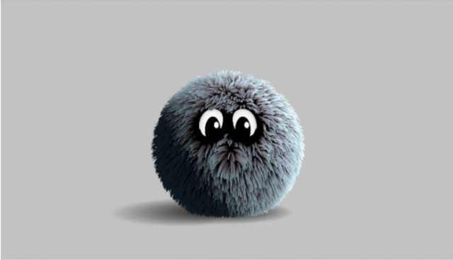
1)  Hair Ball: Edward Porten

hairball

The project Hair Ball caught my attention because of it’s interesting textures and realistic fur movement. I enjoy tinkering with 3D computer graphics and would also hope to explore the 3D features on open-processing as well. I found the “hair ball’s”  ability to change it’s coat so smoothly and react to the viewer’s cursor naturally very alluring. The jump is a little sudden, however and I would have liked it better if there was more elasticity in the creature’s jump and body as it went up into the air. The code includes classes for it’s coat, it’s eyes and it’s movement. There are many properties involved with the eyes that creates a realistic feel to the little creature. Even though the form is so simple, its ability to interact with the viewer creatures an urge to interact back and discover all the little details in the form. Another observation I noticed while messing with the program was that when the mouse is placed over the creature, his fur spreads out a bit near the mouse. I do wish that a better job was done with the fur spreading.


2)FLUX: Avcansaray  Caddesi

red

Flux is a fantastical video devoted to the famous sculptor Illhan Koman. It involves a series of generative randomized transformations on red sphere. The continuous movement reminds me of the mimicry of natural patterns or phenomenons, such as tornadoes, whirlwinds and clothes. The sphere evokes strong emotions through its movement and brilliance in colors. There was no source code present in this work, so I wasnt’ able to peek into the artist’s brilliance. In the near future, I would like to incorporate some of this brilliant movement into my pieces as well.


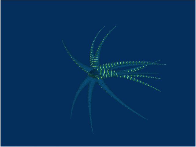
3)MagTentacles: Giovanni Carlo Mingati

tentacles

MagTentacles proved to be yet another impressing art piece. Created by Giovanni, mag Tentacles follows a large loop that cause tentacles to emerge and submerge into a green from. It’s randomness and slow speed draws the viewer into the art piece because it almost looks like you’re about to see the other side, but then the tentacles rearrange into another view. For a moment, you see an octopus, then the next it’s gone and turned into a start, then next an anenome. I really like how the form rotates and almost seems to swim around in a blue vacuum, pushing the “water” aside as it moves its tentacles around. I do wish that the background was a bit darker; I think that would bring out the presented object even more. The Rings on the arms make good indicators of where the legs are positioned in the object until the sinc back. The source code is pretty short. It involves different vertices to the draw the beautiful “legs” of the “tentapus:)