Krawleb-Vizualization
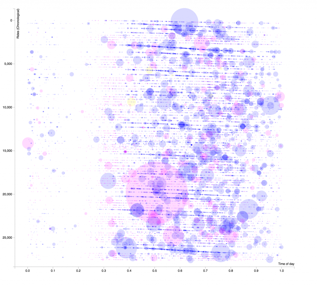
This is a graph of all the rides in their most recent quarter. The Y axis is rides chronologically, the first ride at the top and the last at the bottom.
The X axis is the time of day, from early in the morning to late at night.
The size of the circles indicates the duration of the ride, and color corresponds to the type of rider. Pink is subscriber, Blue is customer, and Yellow (very rare) is daily pass.
The number labels are misrepresentitive, as I had to do some hacky conversions to make this work. 😉
(more documentation coming soon!)