Catlu – Visualization
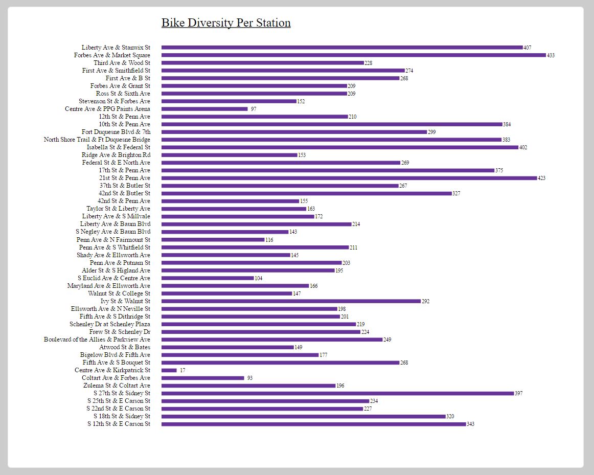
On this project, I was initially curious about how many times each bike returned “home,” based on the station they were parked at the beginning of the year. Later, I realized I wouldn’t be able to do this because the Healthy Ride data did not come with dates. I then focused on the idea of bike “diversity.” I wondered how many different bikes had been to each station. This information I thought would be best shown in a bar graph for clear comparison. More than information, I guess I was trying to draw out a story. First, I pulled the Healthy Ride file into Processing and used Processing to calculate and turn out the “diversity” per station. This I then saved as a TSV file. As for the making of the visualization, D3 proved a bit confusing. I tried to load the TSV into my code, but just couldn’t get it to show up. In the end, since my data that I wanted to use D3 on wasn’t that long, I ended up just hard-coding it into the code as 2 arrays. I changed and tested a lot of things from the code (taken from the D3 Workergnome bar graph example), and ended up with my graph.
The screenshot is a little blurry for some reason. Here is a link to a clearer version you can zoom in on:
Here is the Processing code for the bike diversity calculations (github):
Here is the D3 code used to make my bar graph (github):