Category: Looking Outwards

Josh Lopez-Binder, Looking Outwards 01

1)This project is an experiment in prototypical architecture.  It is a bunch of spheres smashed together and constructed from pieces of aluminum riddled with holes.  I think it looks awesome, although the text explaining the piece is somewhat incomprehensible. Words and phrases like “amalgamated”, “divergent sets” and “spatial nuance” seem to muddle what appears to be the essential idea: computational tools help us make stuff that is awesome.  It appears that they used an algorithm that broke the spheres up into a minimal number of developable sections while constraining the size to standard manufactured sheet.  Then the sections were riddled with holes (the method for doing this was not described). How this could be functional as architecture seems to be a mystery (though they do mention storage). Perhaps if they called it art the descriptions would be less confused. However the form itself is wonderful.

2)This next one, Harmonic/Rhythm Study, by Realitat, is a video composed of various black bars that stretch towards the bottom of the screen.  When each bar hits the bottom it makes a noise, starts shrinking upwards, and produces another noise when it reaches the top of the screen. According to the makers these noises differ by the golden ratio (how does that work?).  Different arrangements of bars, some more random than others, produce sequences of noise that range from highly order to chaotic.  The noises themselves are rather unpleasant synthesized screeches, but the overall effect is, at times, interesting.  As a study it is quite interesting, but hard to listen to. Project was made using processing and super collider.

it reminds me of this:

Much nicer.

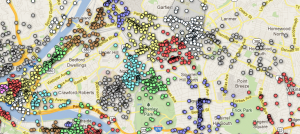
3) The internet map, http://internet-map.net, is pretty fascinating: a visualization of websites as dots, color coded according to country of origin, spatially organized according to number of links, and scaled according to traffic. It looks awesome, like some sort of star cluster or nebula.  One can zoom in and move around, and click the dots for a pop-up link the website it represents.  It really gives one an idea of the immensity of the internet and its bizarre, unorganized structure. Similar projects have been made, although this method of representing sites as dots seems new. I tried visiting the dot for thisiscolossal.com.  All of the neighboring sites appeared to be clothing and accessory sites and completely unrelated to art.  As a tool for navigating the insanity of the internet it is lacking, that’s what google is for, but I can imagine future search engines incorporating visual navigation tools that make it easier to find related websites.  Visual search engines do exist, although they are not so pretty:, kartoo, and grokker. The later two are dead or dying.

Also the visualization was made using an algorithm based on a cmu cs paper about better graph drawing: http://reports-archive.adm.cs.cmu.edu/anon/1998/CMU-CS-98-189.pdf

Other internet visualizations:

internet visualizations

Looking Outwards Assignment 1 : Connie Dai

[youtube http://www.youtube.com/watch?v=_gk9n-2lBb8&w=640&h=360]

There are three record shaped objects with certain visual patterns that are read by a machine and then translated into different sound patterns that then through manipulating and overlaying said sound patterns create something that resembles music. This project is interesting to me because I am interested in how the records have on them visual representations of sound. In a way it is almost as if one can “see” sound. I am also intrigued by how interweaving a few simple repetitive sound patterns one can create a tune that carries much more complexity and depth than any of the individual tracks would have alone. Perhaps if there were more records or a greater variation in the sounds that could be created more depth could have been achieved. Though I do feel that the aesthetics of the piece dialogue very well with the song they managed to create.

[youtube http://www.youtube.com/watch?v=K_jWA_o-Cvg&w=640&h=360]

This is a collection of seemingly perpetual motion wheels made with lighted bottles filled with sand. The visual effect created by the different wheels overlaying each other spinning (seemingly) forever on their own is very striking to me. The way the lights wink in and out as they overlap has a hypnotic quality that I find visually compelling. Though I feel that this piece does capture the timeless quality it aims to posses the presence of the sand was not immediately evident to me (and really only became evident after reading the artist statement). In fact, while this is a piece that I find very visually beautiful and somewhat hypnotic the greater message it seeks to communicate was somewhat lost to me until I had it spelled out to me – though to be fair the idea of eternity is not really an easy one to communicate.

[youtube http://www.youtube.com/watch?v=PjgVeJkdBn0&w=480&h=360]

This is basically a printer that prints latte art into one’s coffee. This is interesting to me because as a machine it is able to produce elaborate patterns with incredible accuracy that cannot be achieved through traditional means (i.e. by hand). The very nature of it is interesting because latte art is has a few traditional patterns that are always used (leaves, hearts, or some combination thereof) and though it is the same variation of these few patterns there will never be two that are perfectly identical because of the human element. With this printer any variety of patterns are at one’s proverbial fingertips but each pattern will essentially be identical to itself creating a strange paradox of having a very numerous variety that is exactly the same.

Sarah Anderson-LookingOutwards-1

Lotus 7.0 – Daan Roosegaarde

[vimeo 18002972 w=400 h=300]
I found this really cool blog by an artist named Leigh Davis. He fills his blog with projects he’s done or been working on and projects other people have done as well. This one project that I though was really powerful is called Lotus 7.0 by  Daan Roosegaarde. The Project is a “wall” of “breathing” aluminum foil that opens and closes in parts as it senses people walking by it. The wall is lit up red on the inside. The aluminum pieces open up like flowers.

This project is powerful to me because of the scale of it, as well as the mechanics and programming behind it. I’m not exactly sure what it is saying; maybe something along the lines of “if you get close to opportunities or people, they will open up to you,” but I feel that it’s more along the lines of a genuine curiosity to just experience the project and see what it does. I wish that the artist would have included some sounds or maybe some movement of air, to make the project more of a feeling than just something pretty. If that red lights give off heat, that would be cool as well.

The artist is also commissioned to build a larger structure called Lotus Dome that blooms to the touch.

SnOil – Martin Frey

[youtube http://www.youtube.com/watch?v=uAO5dTBMDkY]

Martin did something really cool with ferrofluid. For anyone who doesn’t know what ferrofluid is, it is a liquid that acts as some metals do in that it has magnetic attraction. Lots of people do cool projects with ferrofluid including mixing it with paint to created interesting effects and images or magnetizing a metal structure that the fluid can form itself around. Martin however, made a box containing a large circuit board and a grid of electromagnets and placed a tray of ferrofluid on top. He can make letters, shapes, designs, and even play Snake all with some programming. I found this project really cool because it treated ferrofluid like a grid of LEDs that could be turned on and off all with the press of a button. There is no real practical use for this as ferrofluid is a lot messier than LEDs are, but it is an interesting concept and structure with interesting programming. Another interesting aspect about this construction is that it has an accelerometer in it; to play Snake, you tilt the board, like some Ipad games. I wish he had utilized the structure to do some more interesting things, perhaps show off the strange spikes that ferrofluid can make by changing the intensity of the magnets, but it’s still really cool.

LED Hard Drive Clock – Ian Matthew

[youtube http://www.youtube.com/watch?v=K1asNB0te0o]

This project does have a practical purpose but I found it so ingenious and pretty that I think it deserved to be up here. Ian Matthew created a clock from an old computer hard drive and a multitude of LEDs. The cool part is that it works because of the high frequencies being displayed to the human eye. The drive spins at over 90 times a second which allows us to see solid blocks of color instead of blinking colors. TVs work the same way. So I thought it was really clever that he utilizes the  speed of the spinning drive as well as custom software to control the lights. What also interesting is that it resembles a zoetrope in that there is a slot cut through the drive to let the light in. The clock can also go into light show mode. What would have been really cool was if there had been sound also set to it. However, I love when people reuse old computer parts in interesting ways, so I really like it.


RobbGodshaw-LookingOutwards-1

Föhnseher — Julian Oliver


In Föhnseher, Artist by Julian Oliver integrates a salvaged television with a Linux computer that is constantly sniffing an open WiFi network for transmitted images. It displays these images on the screen over a video test pattern background. Those nearby who are connected to the network have their thought to be private traffic prominently displayed in the gallery.

I find the execution to be clean and responsive. I appreciate that all of the technology that does not resemble the old television is hidden from view. Perhaps inside the TV chassis  itself. The idea that we are sometimes broadcasting our activity to black hats and artists is likely disturbing for the viewer. The TV is as strong a symbol of publicity as our personal devices are of privacy and security.

An interesting albeit illegal method of scaling this project might include a mobile device that provides open and fast WiFi. In the same manner, images are sniffed and reproduced and converted to video signal. The signal might then be fed into an illegal television transmitter set to an unused channel. In this way, WiFi stealing neighbors would have all of their browsing habits broadcasted to the whole neighborhood on a mysterious and ephemeral channel.


Vimeo Embed Problems...
Föhnseher (Seer of Warm Winds)
from Julian Oliver on Vimeo.
source

DVD Dead Drop — Aram Bartholl


In this gallery installation, a unlabeled slot is cut into a blank white wall. Patrons insert their own blank dvd into the slot and it is burned with mysterious and evolving content from various digital artists.

This piece has a weirdness about it I find intriguing. Unlike USB Dead Drop, another Bartoll initiated project where USB flash drives are permanently embedding in public space, users of this installation will have no idea what they have received until they go home. DVD dead drop is also read only– giving the artist full control over what content the viewer receives.

The content Bartholl selected to be burned to the disc is not his own, but that of fellow digital artists. In this way the artist acts as nothing more than a novel and quirky content delivery mechanism. The experience of sacrificing a pristine instance of optical media to a hole in the wall for a few minutes would feel very strange. With no feedback one would likely begin to wonder when their disk would be returned. Imaginations would run wild with possibilities of content. Some users might grow to fear obscene content or malware.


source

Paper.JS — Jürg Lehni & Jonathan Puckey


Paper.JS is a port of the popular Illustrator Plug-In Scriptographer to the browser using HTML5. The landing page is a very fun little example of its Bezier capabilities. It is lively, attractive, and editable. This reduces any barriers to engaging with the tool. Until tonight, I had never heard of it. I used Scriptographer a great deal in high school for making vector half tones of graphics for screen printing. I look forward to having enough java experience to use this tool to add some spiffy and subtle interactivity to my personal website.

Looking Outwards Assignment 1 – Rosey Denton

[youtube http://www.youtube.com/watch?v=gusJeslMbLc?rel=0&w=640&h=360]

This project is a fountain in Osaka Station City which uses falling water to display things like the name of the station, the time, and various designs for the enjoyment of the passerby. To me, it’s extremely interesting to watch the way the creators have used such precise timing to turn falling water into an art. I think that while this is a good start to a technology that has potential to be utilized in many places for a different kind of aesthetic pleasure, but perhaps the designers could experiment with some extra things like the idea of adding color to this using something like laser lights. I’m sure this fountain was inspired by other more traditional fountains, but now taken a step further by utilizing timing of the falling of water instead of just playing with a constant stream like many others have done.

http://www.talkingdogstudios.com/ar/faceball/

[youtube http://www.youtube.com/watch?v=jKIv3Pt6zjI?rel=0&w=480&h=360]

This is a video displaying a small group’s efforts with using Augmented Reality technology. Using a marker and tracker, you can display various things on camera – in this case, a copy of your own head. Though this technology is not widely known yet, I think it has a lot of potential to be utilized in things like interactive books and games and the way it combines reality and computer generated imagery is pretty neat. Though this is obviously something made just for fun, the project could be taken further in the future and there is a potential for AI to get mixed up with AR technology, which would lead to even more interactive possibilities. If you look around the web, a lot of people have toyed with AR, one of the more well-known would be Nintendo and their 3DS, though they are certainly not the first. AR technology seems to still be in production, but it seems like with the track they’re on, it won’t be long before it makes a bigger breakthrough into our everyday lives.

[youtube http://www.youtube.com/watch?v=BtbBHR8LC6Q?rel=0&w=640&h=360]

This group became known during their audition on the NBC show America’s Got Talent. They use lit wires in a dark environment to perform various musical-based skits. To me, it’s amazing that they can get such realistic-looking movement out of the creatures that they create with the wire and create the illusion that it isn’t humans operating everything.  I think that if they continue creating a wider cast of animals and make longer, more narrative story lines they would have a fantastic show to offer the general public. In the past, I have seen videos of groups that have done a similar feat using lit wire (Team iLuminate, WRECKING CREW ORCHESTRA, etc), but this is the first group that I have seen which goes past using just the body and creates different creatures using this light-in-the-dark technique.

Oliver – Looking Outwards – 1

Livehoods

Livehoods.org is an interactive website created by several researchers at Carnegie Mellon. The site shows a map of a city (Pittsburgh, New York, and others) and uses Foursquare check-in data to separate that city into “Livehoods,” which are designated using an algorithm determined by the relations between places where people check in. Livehoods turn out to be different than the formal neighborhood lines that separate, for example, Shadyside from East Liberty. It’s possible to see the connections between different neighborhoods by clicking on a location and then looking at the top 5 related Livehoods. I think that this site is very well done. It’s aesthetically pleasing and easy to use. Livehoods uses the Google Maps API, which creates a background map that most people are familiar with already, and then adds colored dots to represent the Foursquare data. Each Livehood is shaded in a particular color when the user scrolls over it. I think an improvement would be to also show the formal neighborhood separation lines, as well as the Livehood separation lines, so that the viewer could compare.


Vizify

Vizify is an online visualization tool that takes information from a user’s various social media accounts (Facebook, Twitter, LinkedIn, Foursquare, and Instagram) and creates an interactive visualization based on some of the data. I tried it out, and this link shows the result. Visually, I found the result to be impressive. It looks clean and it’s easy to navigate and interact with. However, some of the content could use improvement. For example, I use Twitter very rarely, and have only posted one tweet within the last year or so. Vizify used that one tweet to create a page of “Words I say a lot on Twitter,” which only had one word. I post on Facebook quite a bit, but the tool did not visualize words I say a lot on Facebook. It also didn’t seem to use any data from my Instagram account. I thought the tool did a great job of visualizing my Foursquare account data, because it separates my check-ins into categories which the user can click on and see in more detail.


Come To Your Census

[youtube http://www.youtube.com/watch?v=h34aNRbajPE&w=560&h=315]


The Australian Bureau of Statistics made datasets available, and those datasets were visualized by a group called Spinifex. Not only did Spinifex create interactive visualizations, they also managed to project them on a large building, which was connected to a touch screen that could be manipulated by the audience in order to look at different demographic statistics. The audience could also interact with a network visualization of some kind, though I couldn’t tell exactly what the network was. It appeared to be towns or cities, but I’m not sure how they are connected to each other. Other parts of the presentation looked more like short cartoons demonstrating various characteristics of Australia’s population. I like this project because of its ability to use interactive media to get people interested in census statistics, something that otherwise may be considered boring to many of them. In the U.S., much of our census data is available to the general public, but remains lifeless as tables on the Census Bureau’s website. One critique that I have of this project is that the building they projected on did not make the best screen – it had many windows that got in the way of the image. I would have preferred a more blank canvas.

Stephanie, Looking Outwards no.1

Hunting Arrows

http://open.adaptedstudio.com/hunting_arrows/

This isn’t a Youtube video, but it’s definitely worth clicking on anyway!

I was Stumbling through the Internet and I found this interactive herding simulation game. You guide groups of colored arrows with your mouse around the screen, and if any of the black arrows touch them they disappear into colored inkblots on the screen. As you play the screen gets more colorful as all the colors start mixing together, providing a record for the amount of “prey” that has been killed and where they were.

I loved the smoothness of the animation in this piece, and I was captivated by just gathering large herds and watching how they interacted with each other as I moved the mouse. Their movement looks a lot like the behavior of flocks of birds and insects as well as schools of fish. I was also interested by the way they seem to take on life of their own as they break formation to avoid the black “predator” arrows. Their colors are also pleasing to look at and remind me of animals like deer, fish, birds, and butterflies.
However, I do have some critiques for this piece. I think it’s a little too easy to avoid the predators because of their slow acceleration compared to the prey. It only really becomes a challenge to keep your herd intact when there are large amounts of either predators or prey involved. I also wish for more variety in the shapes of the ink blotches left behind by fallen prey.

Falling Girl

[youtube http://www.youtube.com/watch?v=7rmd44OwMgk&w=420&h=315]


This is another piece by Scott Snibbe, the artist we were introduced to in class the other day. In Falling Girl, a silhouette of a girl leaps off a tall building and falls slowly and gracefully downwards. As she falls she passes windows that are filled with recordings of the silhouettes of audience members, who she can interact with.The overall message of the artwork was to convey the shortness of life, and that the act of living is itself a part of dying.

I liked all the pieces by Scott Snibbe that we saw in class, and I like this one just as well. The movement of the girl is graceful and convincing and the audience interacts with her in a way that doesn’t seem forced or contrived. It was interesting to me that the audience’s interaction with the piece did not affect the outcome of the narrative or the message of the piece, and that they remained onlookers even though they had been fully injected into the artwork. While this makes incorporating the audience’s actions easier for the artist, it may also be difficult for the audience to pick up the deeper meaning without being caught up in how their own interactions are affecting the girl.

Lilypad Embroidery


I’m having a hard time embedding the video of it working because it’s hosted on a non-Youtube site that WordPress doesn’t seem to play nice with, but here is the link to her page with the video: http://sternlab.org/2008/04/lilypad-embroidery/

This is a piece that entrepreneur Becky Stern made as a tribute to Leah Buechley’s LilyPad Arduino. The Lilypad is woven into fabric with electrically conductive thread, which is connected to a photoresistor, some LEDs, and a small speaker. Bright light causes the speaker to play lower tones and the LEDs flash slower, while dim light causes the speaker to play higher tones and the LEDs flash faster.

I like this piece very much from an aesthetic point of view. The weaving is beautifully executed and does a wonderful job of fully incorporating the Lilypad. However, I wish this piece had taken the functional side of the Lilypad as seriously as the aesthetic side. The LEDs do not seem to be arranged according to the weaving pattern, which would have been really cool to see. I also wish that the speaker was placed in a location that would not break the symmetry of the embroidery. To me it almost seems that a random circuit and embroidery pattern were superimposed on to each other to create this piece, and I feel that she could have done so much more to make it great.