Category: Assignment-03

Assignment 3 – OpenProcessing – MacKenzie Bates

My username at OpenProcessing is: itbmac
Here’s the URL of my account: http://www.openprocessing.org/user/20736


PSSSSSSTTTTTTTTTTT!!!!!!!!!!!

Check out what I made in Processing!!! LOOK AT THIS!

It’s a FANCY T-REX THAT CONTROL!!!

http://www.openprocessing.org/sketch/68556

Sarah Anderson – Assignment 3 Drawings

My instructions for the drawing were to start from any corner of the paper and draw a line to a midway point on the opposite side, leaving 2 sides between the start of the line and the end of the line. Then draw a line to a midway point on the adjacent side in a counterclockwise fashion without crossing any lines, until you can’t go anywhere. Then start from any corner of any created triangle and repeat the previous steps. Do this 20 times.

I gave these instructions to three friends (one was an art major and the other two were CS and Math). The results looked like this:

The results were really great! I know my instructions weren’t very clear, as I am not too great at that, but apparently they made enough sense. One turned out a little underdone. The others didn’t continue as far as I’d like, but they at least got the general pattern down. Next time I’ll have to think of different and more clear ways of describing the instructions to get the output I seek.

Oliver – Looking Outwards – Assignment 3

MIT Media Lab Identity

by TheGreenEyl and E Roon Kang

http://www.thegreeneyl.com/mit-media-lab-identity-1

[youtube http://www.youtu.be/tgT6FaV3VJ0]


I’m really excited about this MIT Media Lab Identity project. A design group called The Green Eyl wrote Processing code to produce multiple iterations of logos based on the same general shapes, colors, and movements. Each student, faculty, or staff member at the Media Lab can customize their own logo based on this design that they can then use on business cards, etc., as a sort of personal branding and a way to show their affiliation with the Media Lab. It seems like a relatively simple script (though the code was not available), including a certain amount of randomization in the movement of the shapes and a certain set of rules determining how the shapes move and interact with each other. The result is aesthetically pleasing, and looks simple and complex at the same time. I’m not sure what the customization interface is like, but I imagine it allows the user to toggle with color and some other aspects of the design. I am applying to the MIT Media Lab for graduate school, so this is especially exciting for me to think that I could possibly have my own personalized logo like this next year.


Cascade

by NYTimes R&D Lab

http://nytlabs.com/projects/cascade.html

[youtube http://youtu.be/yQBOF7XeCE0]


Effectively visualizing the way that information spreads throughout social media is quite a challenge, and the NYTimes R&D Lab has done a great job of it with its tool called Cascade, built using Processing along with a database called MongoDB. Network visualizations are difficult because they are often very dense and complex, which often gives a “ball of yarn” visual effect. Cascade unravels the yarn by allowing not only a 3-D look at the network of people sharing a particular news story on Twitter, but they also add in a 4th dimension – time. The network starts at the middle of a circle, and expands outward with each hour. The user can also zoom in on particular nodes in the network, and see the cascades of information diffusion that stem from each. Of course, it’s still difficult to comprehend the complex spread of information through a network, but Cascade makes the job of deciphering such a network and gaining insight much easier.


EarthQuake viewer

by Johan Terryn

http://www.openprocessing.org/sketch/48871

This is a visualization of earthquakes around the world from 2010 to the present. It shows a world map, and goes quickly through time. Each earthquake is represented by a circle in the location where it occurred. I assume that larger circles mean more severe earthquakes, but it doesn’t clarify. The program scrapes data from the National Earthquake Information Center’s website, so that it can present up-to-date data. I think that this program works well and looks cool aesthetically, but as a source of information it’s a little bit lacking. It would be much more useful if the user could enter a date to look at earthquakes that happened on that date, and a Pause button would be extremely helpful. It would also be good to have the capability to zoom in on certain areas of the world map. I was impressed by how little code it took to write a program like this – only about 60 lines of code, which I’m assuming includes the website scraping! I don’t understand much of the code yet but I hope to be able to soon.

Connie Dai: Assignment 3 – Direction Drawings

A. Draw a vertical line starting from the top side and ending at the bottom side of the page that bisects the point.

B. Draw a circle of about the size of your palm that is centered on the center point of the page.

  • In the left half of the circle draw a semi-circle with the flat side facing the bisecting vertical line.
  • Repeat this process with increasingly smaller semi-circles until no more will fit.

C. Halfway between the first circle and the bottom of the page draw a circle that is about half the size of the first circle (this circle should also be centered on the bisecting line).

  • Within this circle draw a slightly smaller one, centered around the same point as the first circle
  • Repeat this with ever smaller circles until no more circles can be fit within.


Looking Outwards 3 – Stephanie

Pop-Up Video: Tesla, Synesthetic Hallucination, and Augmented Book Science

Pop-Up Book of Tesla

So being a fan of Nikola Tesla, this video immediately caught my eye. Tesla was one of the most brilliant and peculiar inventors ever and I feel like this project did a fairly good job of portraying that. I loved the pop-up book and how they used to projector to animate it. Pop-up books by themselves are a beautiful and immersive method of storytelling, but the animation took things to a whole new level. I also loved the way that the narrator interacted with the animations by picking up Tesla in his hand and putting on the hat to become Telsa himself. The gears in the table that showed the date were also a very nice touch, and I thought it was so neat how they clicked and turned like a clock whenever a page was turned.


A Ballet of Quadrotors: Helicopter Spectacular from Saatchi & Saatchi [Vicon, OpenFrameworks]

Helicopter Lightshow Ballet

This video is pretty neat, though it starts out slow. The mini helicopters look like like a cross between fairies and ufos as they float around and flash their lights to the music. I’m not sure what function the pyramid has in all this, but it looks cool. Like a flock of alien fairies converging on Giza or something. The spotlight effect done towards the end was also pretty neat. I was impressed by the relatively high degree of precision in the aerial formations they were in. My brother and I used to have mini helicopters about the same size as these and it was always so difficult to control them. Even though some of the helicopters look slightly wobbly and unsteady during the performance, it doesn’t detract too much from the spectacle. I’m not quite sure what the winking smiley face they made at the end was all about, but that was just a little creepy and uncanny.


Chronotopic Anamorphosis

Wibbly Wobbly

In this video a guy figured out how to make any moving object look like it is undulating and twisting by using Processing to manipulate video in real time. This illusion is pretty interesting because everything looks perfectly solid and normal until it moves and begins to take on this effect. An especially cool demonstration is when he moves in and out of the door that is behind him. Not only does the door ripple as if it’s made out of water, but the guy moving through it looks almost as if he is a ghost. His outline stretches and seems to curve smoothly around the door, then snaps back to normal once he is though. There are some flaws, like the jumpy lines that pass though everything that moves and the jagged outlines on what should be smooth curves, but even in it’s unrefined state this project has a lot of potential to be used in other really neat creations.

Josh Lopez-Binder, LookingOutwards, Assignment 03

Life ; History

http://openprocessing.org/sketch/7508

Another Cellular Automata Visualization.  But this one is pretty cool.  Each generation of cells falls and gets rendered progressively darker each frame until it disappears into the black background.  The Cells are in a 2d grid. Each cell is a small colored tile, and each generation’s tiles sit directly below its child.  The result is a 3d form. When there is a  high degree of change the structure appears branched . This particular implementation uses the rule that less than 2 or more than 3 neighbors causes death, and exactly 3 neighbors causes the cell to come alive. In addition the cells are colored according to their neighbors.  The cells are initially colored in random patches. This gives a sense of which cells “took over” or had dynamic behavior that caused them to move about and influence other cells. Pretty interesting.  They should 3d-print it or make it somehow. With those colors.

This project makes me think about how cellular automata could be a macroscopic model for population dynamics.  Each color could represent a tribe or tribe of tribes, that takes over other regions, grows, and dies.  Maybe this could even be a model for civilizations.

In fact it has been used in this way in relation to biology. Here is one example:

http://www.exa.unicen.edu.ar/ecosistemas/Wetland/publicaciones/papers/29_ISRSE_RM.pdf

We Met Heads On


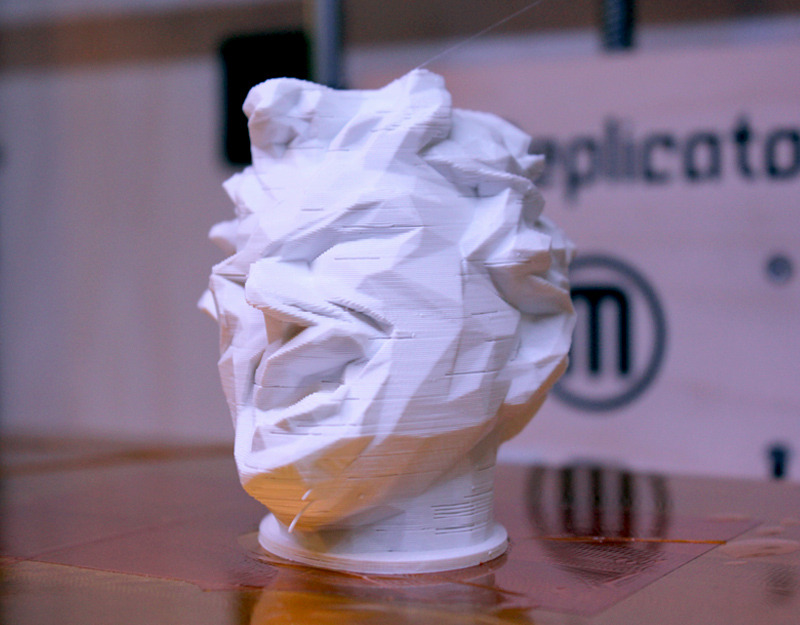
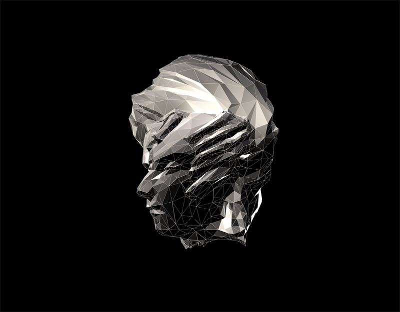
This project takes a mesh and deformes it using sound as input. The vertices of the mesh are twisted according to the strength of the soundwave.  The objects were taken from 3d-scans made available on thingiverse.  I like the idea of being able to visualize sound by using it as a parameter in distorting a mesh.  It seems like many computational tools, and art being made with those tools, allow for creating simulated synesthesia.  Synesthesia, the confusion of different senses, seems like a data mapping phenomena.  Input like sound might be mapped to another sense like vision.  While the ways that the human brain does this are undoubtedly insanely complex, I imagine that the mathematical and computational methods for mapping data to other sets of data are related to synesthesia.

It would be pretty interesting if this project could be re-created in physical space realtime.  Maybe if each vertice of the mesh was a physical node, and each edge a small gas-spring, and motors or solenoids pulled on the mesh, one could get a rough approximation of what these people have done using processing. Obvously it would be way slower than the animation, but it might be pretty interesting. And it has the potential to be interactive.
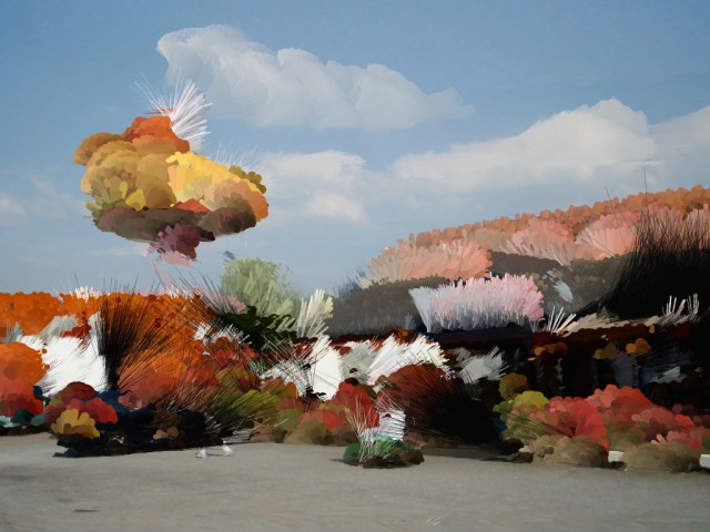


Pixel Knitting

This project, by Pierre Commenge, takes a digital image and draws lines and circles whose properties are determined by the pixels’ color, brightness and saturation in the images.  The code is beautifully simple, yet the output is bizarre and complex.  While clearly generated from photographs, the images take on a cartoonish or surreal nature.

I would like to see a set of images where the output from one image is fed back into the algorithm.  Perhaps the algorithm, when run once, would make very minor tweeks, but over many iterations of feedback would produce wild results. Or maybe that would just produce mush (it probably depends alot on the details of the algorithm).

An even more ambitous extension of this idea would be taking it into the 3d realm.  The input would be a 3d scan.  The algorithm would add points, spheres, cubes, rods, etc. according to the point cloud or mesh.  Maybe local curvature, relative position in space, or surface roughness could be used as parameters in generating new geometry.  If the 3d-scan was one of those fancy ones with textures as well as 3d information, then similar methods used in the above video could be used: color, brightness, saturation.