Category: Assignment-03

Assignment 3 Drawings – Rosey

Instructions:

Read all of part 1 instructions before beginning. Do not read part 2 or 3 until part 1 is complete.

Part 1: 

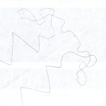
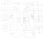
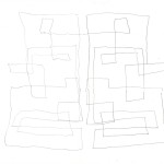
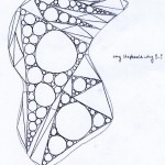
Use a Sharpie/permanent marker. Start by drawing a straight line of any length and direction on your paper. Then, draw a concave or convex curved line in any length and direction from the end of the straight line. Then, draw a straight line from the end of the curved line with any length and direction. Repeat the curved-to-straight line drawing process until you are satisfied. Try to at least fill the page. Your lines can touch, but cannot cross each other. Draw the combination of lines without picking up the marker until you are completely finished. You may hold the marker still on the paper if you need time to think about the length and direction of the next line but do not pick the marker off of the paper.

Part 2:

If there are pointed tips at the junctions of straight and curved lines, connect it to another pointed joint. You can connect multiple points to a single point if you wish, as long as all the points are connected to another one in the end.

Part 3:

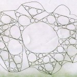
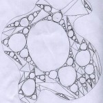
Shade in any closed shape that has been made by using a hatching technique (all lines are parallel to each other). Shapes that share a line/are touching cannot have shading lines going in the same direction as each other. That is to say, if one shape is shaded with vertical lines, a shape that is touching in cannot also have vertical lines. Lines can be neat or rough and spaced as closely or far from each other as you like from shape to shape.

Results:

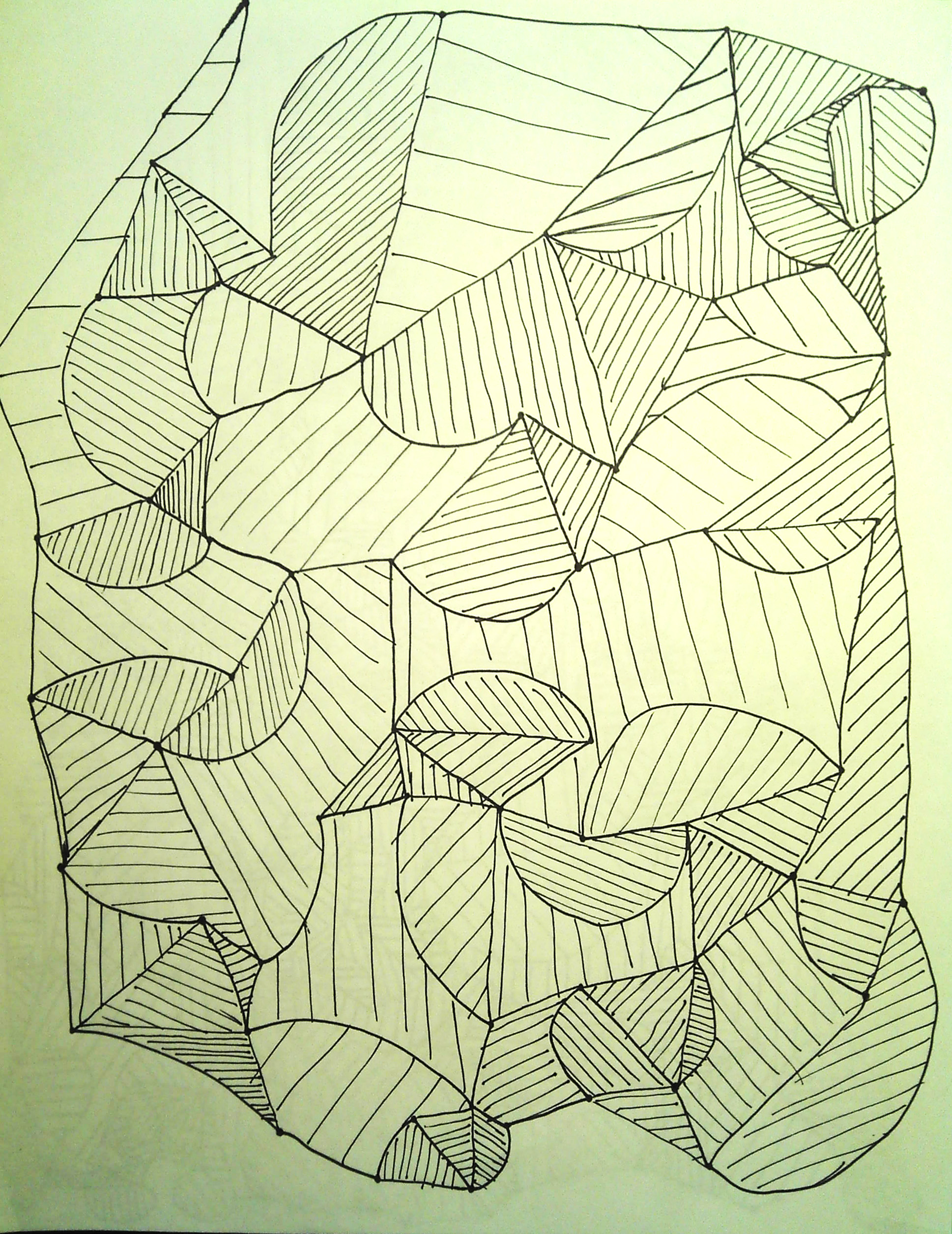
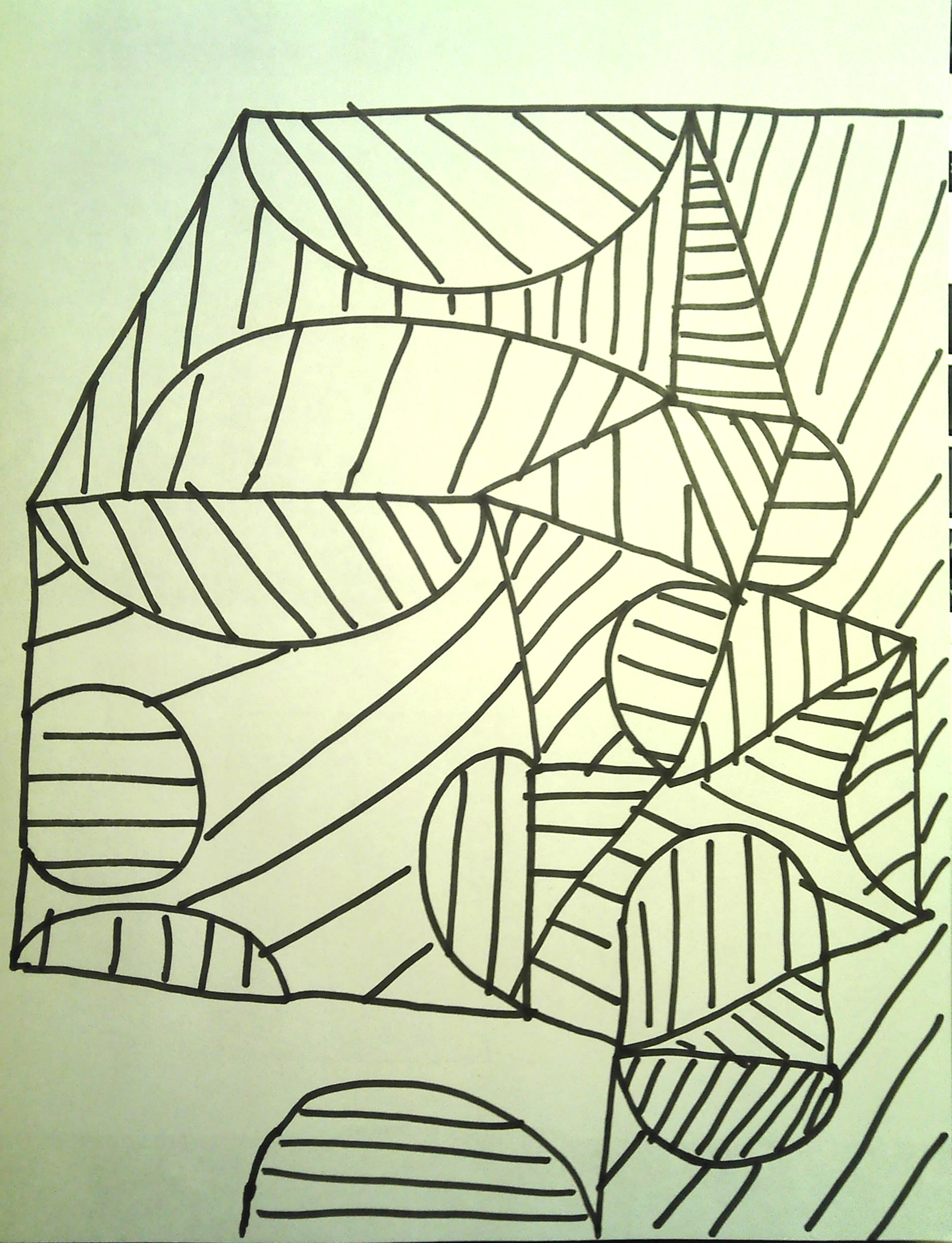
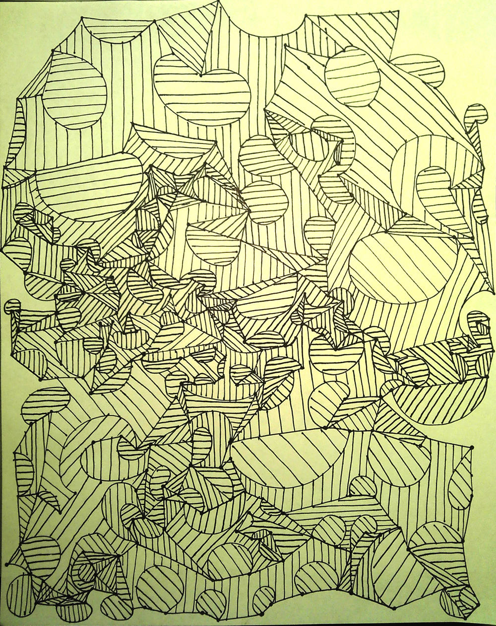
The reason I wanted people to use a sharpie/permanent marker instead of a pencil was because I wanted to try to gauge how spontaneous or thoughtful each person was in creating their work. If left still, markers start to form dots on the paper, so since the artists were allowed to rest the markers on the paper but weren’t allowed to lift them, you can see who stopped to think about their next move and who just ran with the next things that came to their head. Also, the artists had the choice when shading shapes to space the lines as close or far from each other and make them as neat or messy as they wanted as long as it was clear which direction the lines were going in, which gave even more choice to the artist to decide how much time they wanted to spend on the piece and have more input to the overall appearance of the work. For me, it was really good seeing results that all followed the rules that were given but also observing that each piece was clearly different from the other two.


Oliver – Design of a Drawing Process – Assignment 3

Here are the instructions for my drawing process:


TOOLS:

1. 1 8.5×11 sheet of paper

2. pencil

3. computer

DRAWING INSTRUCTIONS:

Note: erasing and redrawing is okay!

1. Fold the sheet of paper in half length-wise, making a drawing surface that is 4.25 inches high and 11 inches wide.

2. Draw three large boxes, like a comic strip. The boxes must all be the same height but must all be different widths. Try to fill up most of the page (keep the margins small).

3. In the first frame, draw a picture of a house. The house should resemble the house where you grew up, however, the front door must be a very large blank rectangle.

4. Within the large blank rectangle, draw another house. This house must also have a front door which is a large blank rectangle.

5. Continue to draw houses within the front doors of houses until they get too small and you run out of room to draw.

6. In the second frame, draw a quote bubble large enough to fit a sentence or two within the top half of the frame.

7. Also in the second frame, draw a picture of a radio, so that the words coming out of the radio will go in the quote bubble.

8. Think of the year that you were 12 years old. Go to this website on the computer: http://www.bobborst.com/popculture/songoftheyear/ and find that year. There will be a list of five songs. Pick the song that brings back the most memories.

9. Fill the quote bubble in frame two with lyrics from that song.

10. Draw several musical notes around the radio and the quote bubble.

10. In frame three, draw a picture of a memory that this particular song brings back. Be as detailed or as abstract as you wish.

11. Think of an appropriate title for your comic strip, and write it at the top of the page.

12. Sign your name in the bottom right corner.

Thank you for your time! You are finished with the drawing task.


Here are the three drawings:


I am very pleased with the results of my design of a drawing process. All of the drawings look similar, but they each have a distinct artistic quality unique to the person who drew the picture, which I was hoping for. I was glad that my three draw-ers were different ages, which means that the song lyrics come from different time periods. One thing that was surprising was the fact that all three people drew an old-fashioned looking radio in the second frame, even though I did not specify what the radio should look like. It seems that they each drew a radio as it would look in the year when they were 12 years old. The design of this drawing process made it impossible for the drawings to be identical, since each person has different memories associated with particular songs and years in their lives. Each drawing depends very much on the person who drew it.

Josh Lopez-Binder, Algorithmic Drawing, Assignment 03

Here were my instructions:

Read all instructions and definitions before you start drawing.

Definitions:

RoughHorizontal line: any line within 15 degrees (plus or minus) of true horizontal(0 or 180)

RoughVertical line: any line within 15 degrees (plus or minus) of true vertical (90 or 270)

LocallyPerpendicular: if you magnified the area where two curves or lines intersect, they would appear to be perpendicular.

Instructions:

1) Fold paper in half, unfold. This crease will act as the line about which the figure is mirrored, like rorschach print.

2) with a pencil in each hand, start two lines at one point somewhere along the crease.

3) start drawing two RoughHorizontal lines, the right hand pencil extending a line to the right, the left hand pen to the left

4) at anytime begin the following, with both hands simultaneously, so as to make a symmetrical figure about the crease:

without lifting the pencil:

–make smooth transitions to alternately RoughVertical and RoughHorizontal lines.

–intersect the growing line with older portions of the line so that they are locally perpendicular

–attempt to always intersect older portions of the line before you have made 5 transitions (changes in direction

–do this until you feel you have come to the end: then stop.

Results:

While the instructions were completed correctly for all 3 cases, I was hoping for more organic shapes.  The Rough horizontal and vertical definitions were supposed to allow people to draw lines that were not parallel to either edge of the page. Also the instruction to make smooth transitions between horizontal and vertical lines was intended to give the drawing a curvy, organic look.  This effect was produced in one instance, but clearly I should have been more exact or perhaps used a better phrase, like “curved transition between lines” or simply stated that the figure should look rather loopy and soft.  Anyway the drawings came out nice.


Drawings – Stephanie

Drawing instructions:

Draw a large enclosed shape with curved lines .
Draw the biggest possible triangle inside the shape, with only the corners touching the sides.
Repeat until space inside the shape is filled:

  • Draw the biggest possible triangle inside the remaining space.
  • Do not draw triangles inside of existing triangles.
  • You may use the sides of existing triangles to form new triangles.

Then…
Repeat until all space inside triangles is filled:

  • Draw the biggest possible circle inside a triangle.
  • In the remaining space inside the same triangle, fill with the biggest possible circles.
  • Do this on at least one triangle, then repeat for as many as you see fit.

Results:


Comments:

I am satisfied by the ways the drawings turned out, and I think it’s interesting how the quality of the drawing changed from person to person. The drawing starts out easy with just a closed, curved shape, then each successive step adds more and more complexity and takes longer to do. In the end, it’s the circles that end up dominating the work even though they are added last. I found by looking at the finished products that the quality of the circles and the number of triangles filled in could be used as a measurement of the patience and persistence of the person carrying out the drawing. The drawing on the left probably took the least time, and the ones in the middle and on the right probably took about the same amount of time.

Minnar – Assignment 3 (OP & Looking Outwards)

Part 1: Open Processing Account

username: minnar

link: http://www.openprocessing.org/user/20930

Part 2: Looking Outwards

See Something or Say Something by Eric Fischer is a data visualization project that analyzes where people are uploading images to flickr (mapped orange) and where people are tweeting (mapped orange), or both (mapped white). I’m fascinated by the exploration of what differentiates a place that someone wants to capture visually, and a place someone has something to comment about. I really like the ability to see concretely the differences between place to place, and I just generally really enjoy data visualization because I see it as a really great starting point for exploration and discussion about components of what defines our culture and how that varies from other cultures. Like is it that people want to take more photos instead of talking at places that are scenic? Or is a preference for people talking evidence of a more verbally intellectual community? I think it would be interesting to also parse the data from twitter and flickr to reveal what the top three topics these concentrated areas are talking about and taking photos about (or, even better, the distinctive things they’re talking about or taking photos of) given in real time when hovering over an area.

Watch the super neat video!

Cloud Pink by Everyware is an interactive installation where visitors are invited to touch and poke a sheet of fabric stretched across the ceiling, where a projection of swirling pink and blue clouds swish around in response to the participant’s movement. I’m not entirely sure how the mechanism behind it works, but I’m guessing they’re using a Kinect sensor to determine where the fabric is punctured, and Processing deals with the movement of and generation of the colored swirls. I mostly enjoy the sheer whimsical-ness of the installation, and just the physical realization of people’s childhood fantasies of being able to touch clouds. I think it could be even more interesting if the colors of the clouds were dictated by a sensor that measures the actual weather conditions outside of the gallery (ie: sunny daytime clouds are white on blue, rainy clouds are grey, sunset clouds are vivid orange and purple) as a way to bring the outside, inside.

Affection Station by Salvador Orara is a series of three booths that allow participants to tangibly experience the faint, inherent sounds produced by their mobile or handheld devices. One booth amplifies the little sounds emitted by their phone though a series of small speakers lined up against the wall (watch the video) where each speaker transmits one frequency, providing a surround sound-like experience. Another booth translates the little small sounds into gesture (video) that a person can visualize, and a final booth translates the small sounds into light (video). It reminds me a bit of FELD’s to hear the grass growing piece (that I blogged about last week) in the sense that the motivation is to reach a more tangible way to experience something that is very subtle and passed over in day to day life.

Luo – Looking outwards 2 (Assignment 3)

Game mod

This project was conducted as part of a six hour long workshop that involved modifying the code of the classic Atari game Breakout. The source code provided didn’t allow for game overs, which meant that participants didn’t have to worry about dealing with the game ending unexpectedly. I love videogames, and a huge fan of pixel art, so this is really relavent to my interests. The great part is that the participants have never even heard of processing before this workshop, and yet were able to create these pieces within a span of six hours. The participants came up with a lot of creative pieces with this, like making the path of the ball visible, making multiple balls and redesigning the wall.

This project shows how experimentation and creativity can lead to great results, and that extensive knowledge of a technology is not necessary to be creative with it. I’ve already downloaded the source code myself, and might experiment with it in my free time.

You can read more about it and download the source code here.

Cascade

Cascade is a project by NY times R&D to visualize and analyze sharing activity on Twitter. I think it’s a really neat way of visualizing how information travels through the intricate web of the net. The design of the cascade itself is really slick, although they could have included a legend that explained what each of the colored boxes mean.

It would be interesting to compare how different types of information travels, like the death of a celebrity, or the announcement of a scientific breakthrough. Integration with other social networking sites would be great, and they are working on that. I would also like it if there were more visualization of the information about the participants of the cascade. Something like highlighting what age group they’re in or where they are from. With the integration of other social websites more information would be available for them to analyze, which would make gathering information about the participants a lot easier, but may also raise some questions about privacy and such.

You can read more about it here.

Oasis

Oasis is an art installation that involves participants interacting with virtual creatures in a simulated pool. I love the way the creatures move and interact with their environment, and the sketchy texture makes them look really unique. However, I do prefer the color versions in Oasis 1, because the creatures look a lot more vivid and alive this way. The sand also adds another level of texture to the piece, and it looks really fun tracing out different shapes in the sand and seeing how the creatures respond to it.

This installation reminds me a little of the videogame Spore. It would be great if the creatures could interact with each other, or maybe even evolve. Maybe they could allow people to feed the creatures, and if the creatures get hungry enough, the bigger creatures will start trying to consume the smaller ones. Overall, I think it just needs a lot more interactivity instead of just responding to touches. Many aspects of this project could be expanded upon, because of the different kinds of biology involved.

Assignment 3 – Looking Outwards – MacKenzie Bates

Lb to Sf via bike:
http://createdigitalmotion.com/2009/04/a-bike-journey-reimagined-as-an-arty-3d-game-with-blender-processing-real-bike/

[vimeo 4049839 w=500 h=338]

lb to sf via bike from vince mckelvie on Vimeo.

I found this to be a really interesting use of various open source materials. The 3D game uses processing and the blender game engine. The only non-open source material is a Wii controller, which is very reasonable priced. The game is a fun, arty and “out there” experience as you travel from Long Beach to San Francisco. Game creator Vince McKelvie described his interactive installation/game as a documentation of “a bike trip my friend and I took from long beach to san francisco”.

Sea Snakes with Steering:
http://openprocessing.org/sketch/11105

Sea Snakes with Steering is a simple yet fun game. You are a marine biologist in a way, and you are tasked with releasing sea snakes (drag mouse), releasing prey/fishes (click mouse) and destroying snakes (hold mouse). The sea snakes try to eat the fishes while avoiding each other. Longer snakes get tangled in themselves and others, while short snakes move with ease around the open waters. The resulting game is quite and the predators self destruction makes for interesting and engaging game play.

City Symphonies:
http://www.creativeapplications.net/maxmsp/city-symphonies-the-future-sound-of-traffic-by-mark-mckeague-di-rca-2012/

[vimeo 44197369 w=500 h=281]

City Symphonies – Westminster from Mark McKeague on Vimeo.

The movement of traffic has fascinated me for a while now. Thousands of cars moving together and forming a sense of order among the chaos. In City Symphonies, Mark McKeague puts a soundtrack to the transportation system. Instead of cars noises changing according to their engine, the sounds change according to their location relative to other cars and the environment they are in. The mixture of sounds combined with sleek, ascetically-pleasing vector based artwork make for a very well designed simulator. City Symphonies uses Processing and MaxMSP.

Kyna – Assignment 3 Looking Outwards

Medusa #2 by Denis Hovart

http://www.openprocessing.org/sketch/25908

The most interesting aspect of this piece to me is how organic the movement feels. There is another version of this piece done by someone else in the most favorites section on openprocessing.org but the motion of this piece I think is much more convincing. He adds an undulation to the path that makes the movement much more believable. I really admire anyone with the ability to make pretty basic code that has a very organic feel to it.


Star Nursery by Ryan Alexander

http://www.processing.org/exhibition/works/starnursery/index_link.html

Star Nursery is a piece created in processing for R.E.M.’s music video animal. The stars interact with motion, becoming brighter and clumping to form their own constellations when motion is detected, whether from underlying footage or mouse movement. This is another example of a very organic project. Though stars don’t ever achieve this sort of motion in life, there is something about the simulated physics of this piece that I find very appealing.


La Gabbia (The Cage) by auroraMeccanica

http://vimeo.com/25831269#

La Gabbia is a simple piece wherein when a suspended bird cage is disturbed, the shadows of small birds are projected flying out of the cage’s shadow, as though freed by its disturbance. What attracts me most to this piece is the simple way in which it manages to incorporate interactivity while still maintaining aesthetic beauty and a meaning beyond itself. The choice of the cage as the object to be moved makes the act of interaction also one of liberation.

Assignment 3 Looking Outwards – Rosey

One Perfect Cube

http://florianjenett.de/one-perfect-cube-making-of/

This is a combination of three clocks that form a perfect cube once every twelve hours for only one second. Processing was used to create the design and make sure there would be no unwanted collisions during the rotation times. For me, it is interesting that the piece is constantly changing and it seems like we long for it to be in its perfect form, but the completed cube occurs so rarely, and for only a moment. It is kind of nice though, that even when the piece is in its “imperfect” times, it can still produce interesting forms from the three hands of each clock. In the future, perhaps the artist could explore making even more shapes or forms using the concept of clocks and time, but I like the fact that the piece itself is always moving and changing in a set cycle. I’m sure this piece was inspired by other mechanical kinds of artworks that use things like motors or gears that give a constant cycle of action.

Mycelium

http://onecm.com/projects/mycelium/

This project written in processing, called Mycelium simulates the growth of a fungal hyphae that is “fed” with images. The hyphae grow more into lighter area (because branching and growth speed are affected by the lightness of the image) and avoid their own trails. It’s cool that this program leaves a very expressive, yet somewhat organic trail as it moves and essentially recreates the image that it is fed in black and white using only small lines. I like that it really does seem like the image is only made from plants like vines and keeps such a natural form. I almost wonder if it would be worth it to add an element of color to the fungus, or if such a thing would ruin some of the organic feel of the piece. Part of the fun is also simply watching this happen – on the link there is a video of the fungus moving around, and to me, it’s interesting to see something that starts as just a few rogue lines turn into a complete piece of work in less than a minute.

Boids + Perlin Noise Flow Field

http://openprocessing.org/sketch/8407

This sketch on open processing where these tadpole-like objects, if left untouched will naturally move about and eventually start flocking with each other. But, if you click the mouse near them, they will try to avoid your cursor by all means, even if they have to split up from their group. I like these sorts of projects because to me, it is really cool seeing something like a computer program recreate something that is very natural looking. The crossover from technology to nature is also kind of neat because nature is something that simply happens without much explanation, yet we seek to comprehend it and use things like programming to try to make it into something calculated. This project would be pretty cool if it became a 3D thing so it could be looked at from different angles and seem more like birds flocking rather than tadpoles or something swimming together.