Oliver – Looking Outwards – Assignment 3
MIT Media Lab Identity
by TheGreenEyl and E Roon Kang
http://www.thegreeneyl.com/mit-media-lab-identity-1
[youtube http://www.youtu.be/tgT6FaV3VJ0]
I’m really excited about this MIT Media Lab Identity project. A design group called The Green Eyl wrote Processing code to produce multiple iterations of logos based on the same general shapes, colors, and movements. Each student, faculty, or staff member at the Media Lab can customize their own logo based on this design that they can then use on business cards, etc., as a sort of personal branding and a way to show their affiliation with the Media Lab. It seems like a relatively simple script (though the code was not available), including a certain amount of randomization in the movement of the shapes and a certain set of rules determining how the shapes move and interact with each other. The result is aesthetically pleasing, and looks simple and complex at the same time. I’m not sure what the customization interface is like, but I imagine it allows the user to toggle with color and some other aspects of the design. I am applying to the MIT Media Lab for graduate school, so this is especially exciting for me to think that I could possibly have my own personalized logo like this next year.
Cascade
by NYTimes R&D Lab
http://nytlabs.com/projects/cascade.html
[youtube http://youtu.be/yQBOF7XeCE0]
Effectively visualizing the way that information spreads throughout social media is quite a challenge, and the NYTimes R&D Lab has done a great job of it with its tool called Cascade, built using Processing along with a database called MongoDB. Network visualizations are difficult because they are often very dense and complex, which often gives a “ball of yarn” visual effect. Cascade unravels the yarn by allowing not only a 3-D look at the network of people sharing a particular news story on Twitter, but they also add in a 4th dimension – time. The network starts at the middle of a circle, and expands outward with each hour. The user can also zoom in on particular nodes in the network, and see the cascades of information diffusion that stem from each. Of course, it’s still difficult to comprehend the complex spread of information through a network, but Cascade makes the job of deciphering such a network and gaining insight much easier.
EarthQuake viewer
by Johan Terryn
http://www.openprocessing.org/sketch/48871
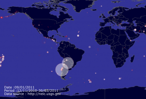
This is a visualization of earthquakes around the world from 2010 to the present. It shows a world map, and goes quickly through time. Each earthquake is represented by a circle in the location where it occurred. I assume that larger circles mean more severe earthquakes, but it doesn’t clarify. The program scrapes data from the National Earthquake Information Center’s website, so that it can present up-to-date data. I think that this program works well and looks cool aesthetically, but as a source of information it’s a little bit lacking. It would be much more useful if the user could enter a date to look at earthquakes that happened on that date, and a Pause button would be extremely helpful. It would also be good to have the capability to zoom in on certain areas of the world map. I was impressed by how little code it took to write a program like this – only about 60 lines of code, which I’m assuming includes the website scraping! I don’t understand much of the code yet but I hope to be able to soon.